

-
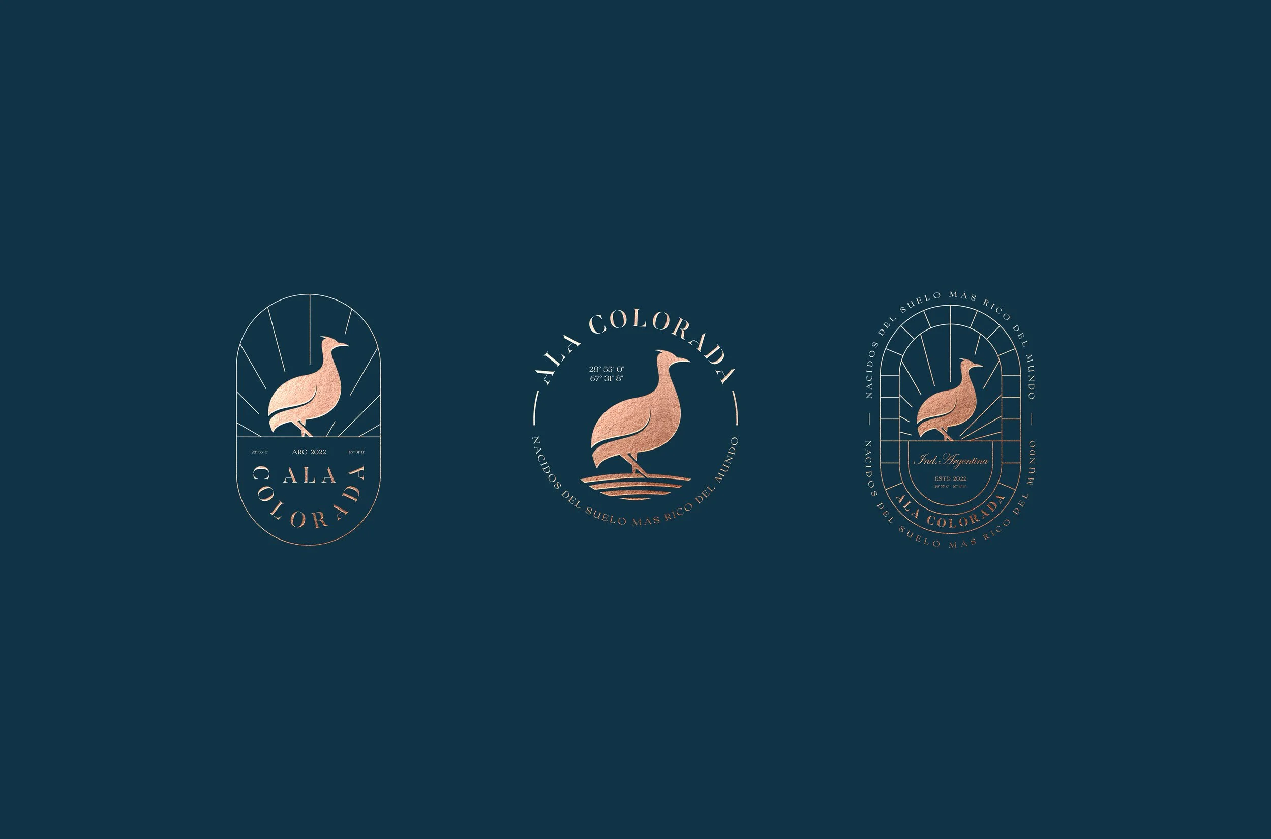
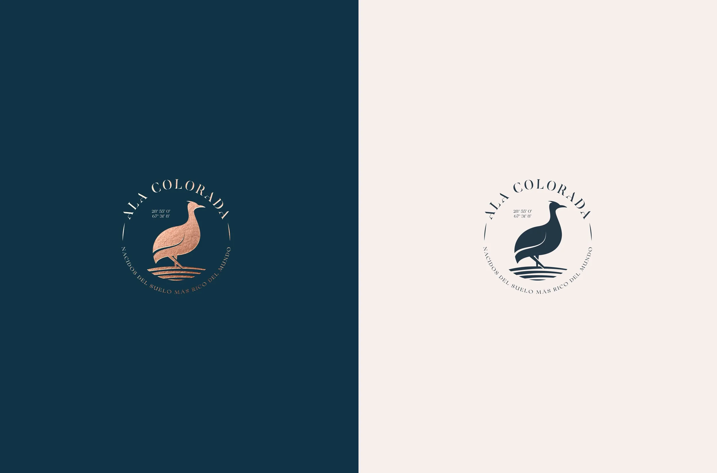
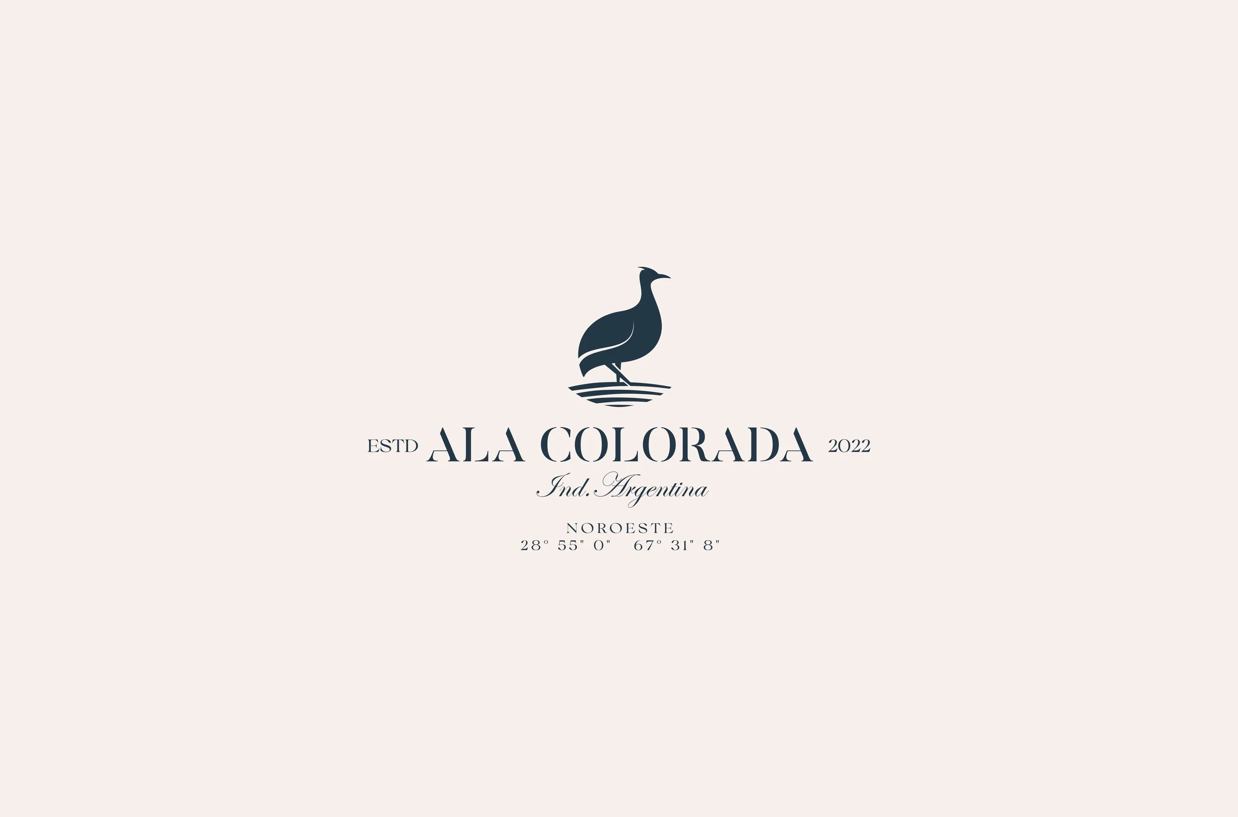
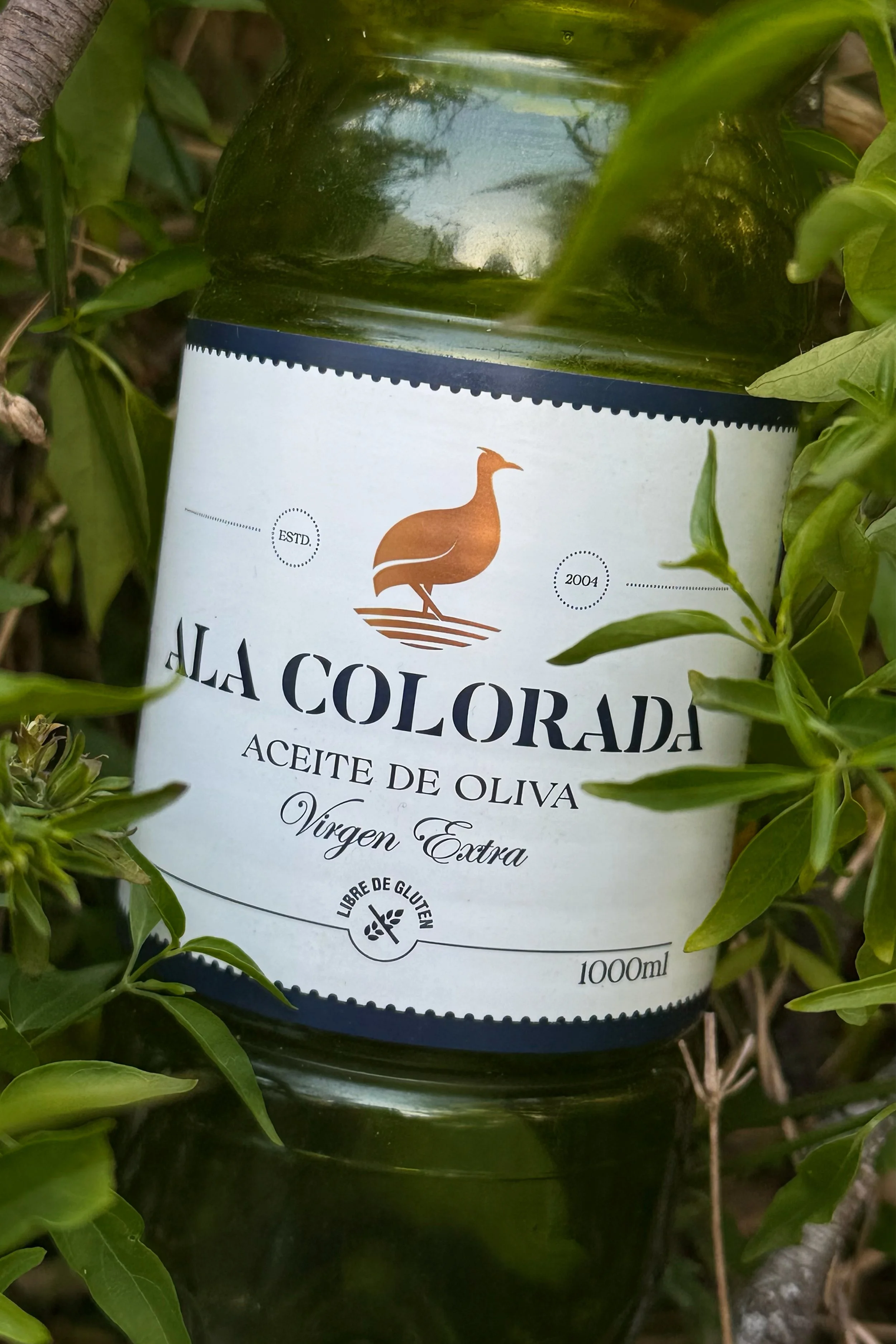
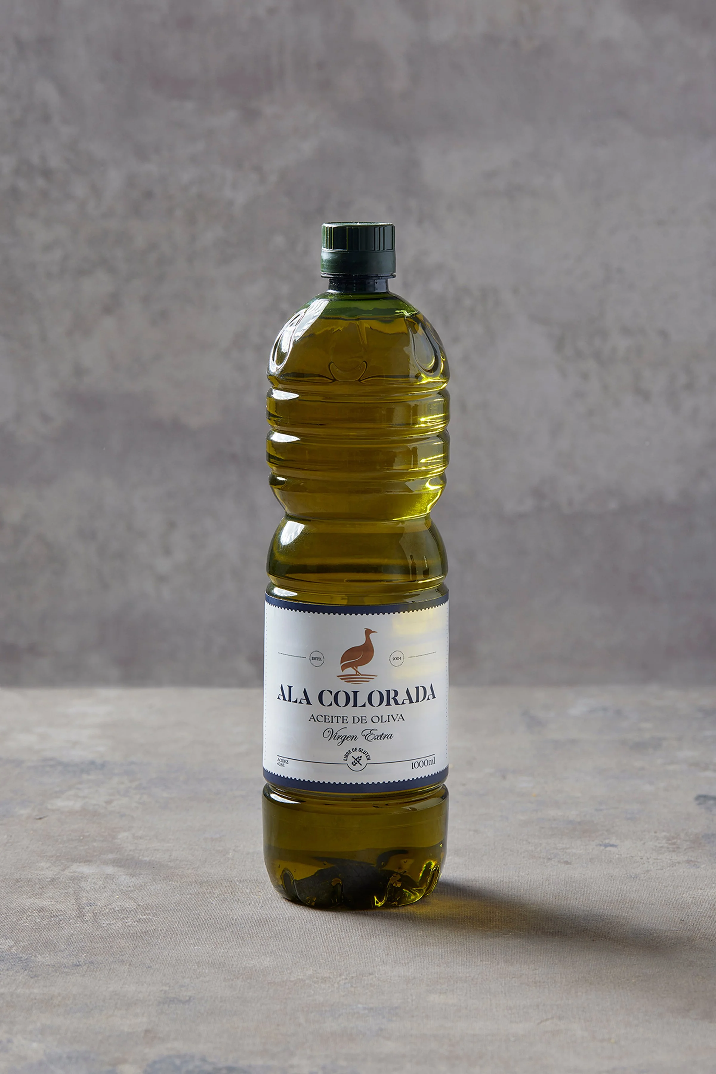
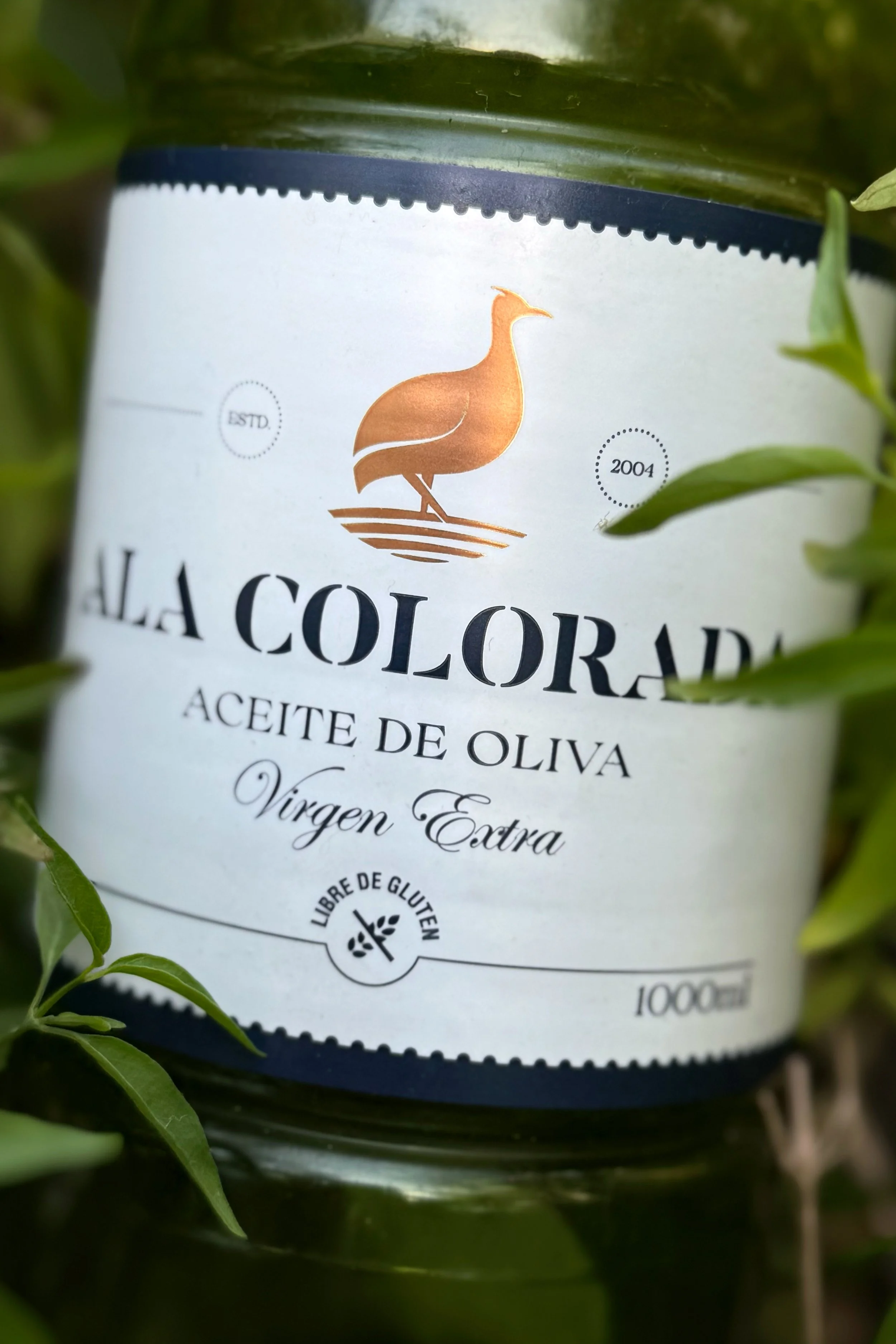
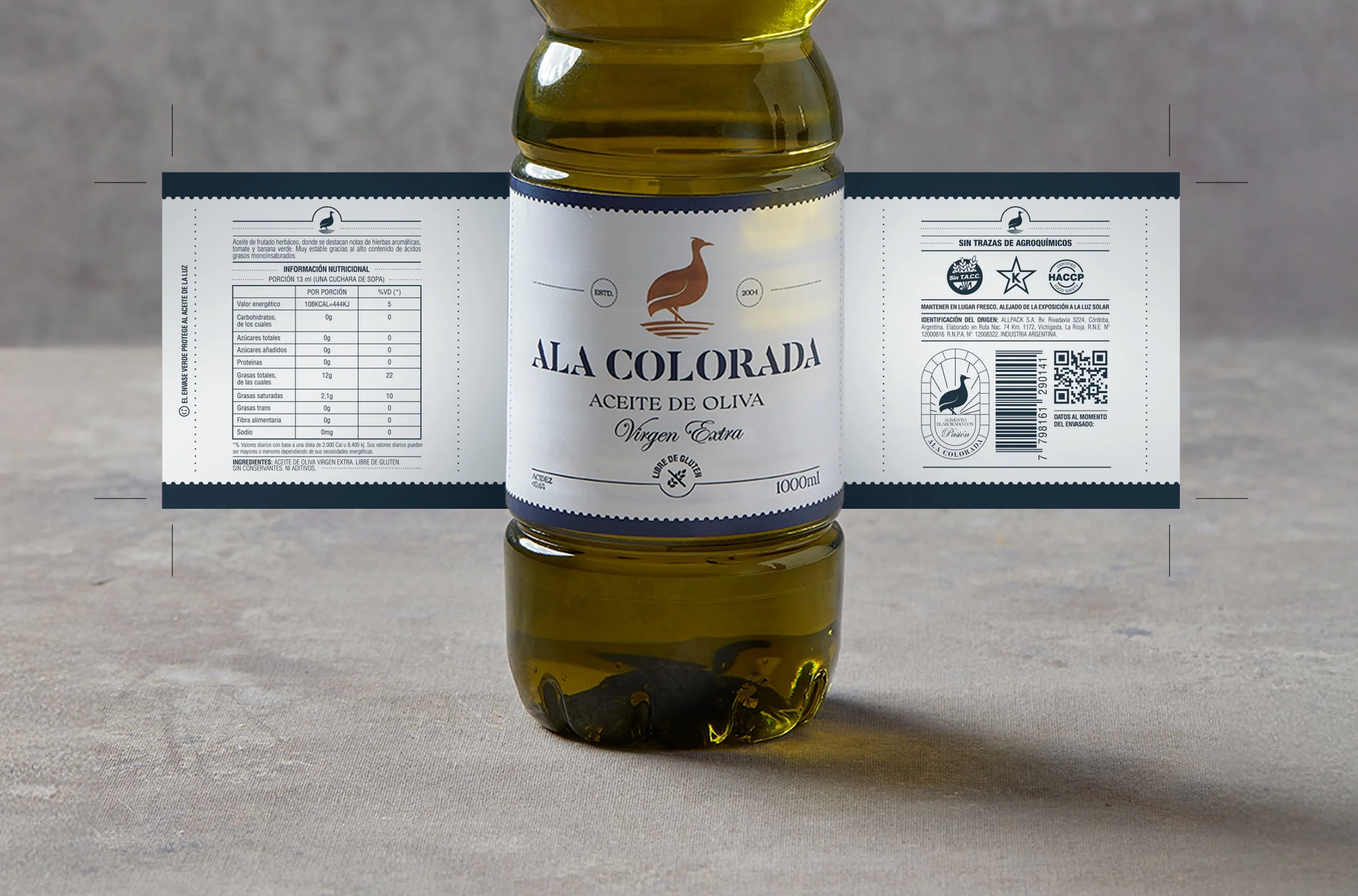
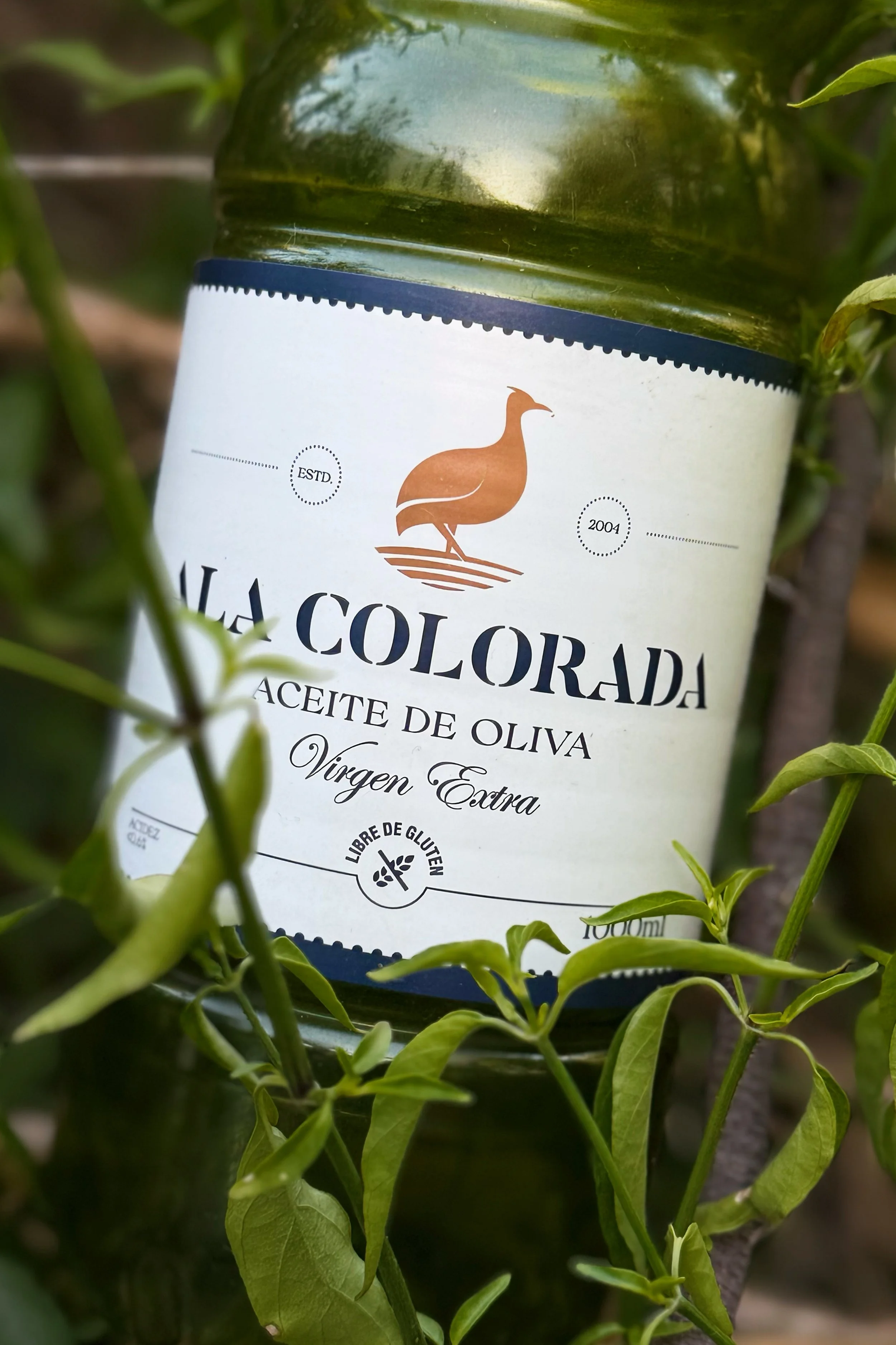
The logomark—featuring the iconic red-winged bird—anchors the brand in its regional heritage while delivering a distinctive silhouette for shelf recognition.
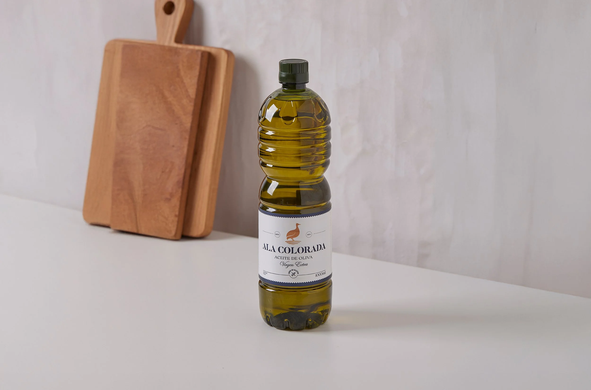
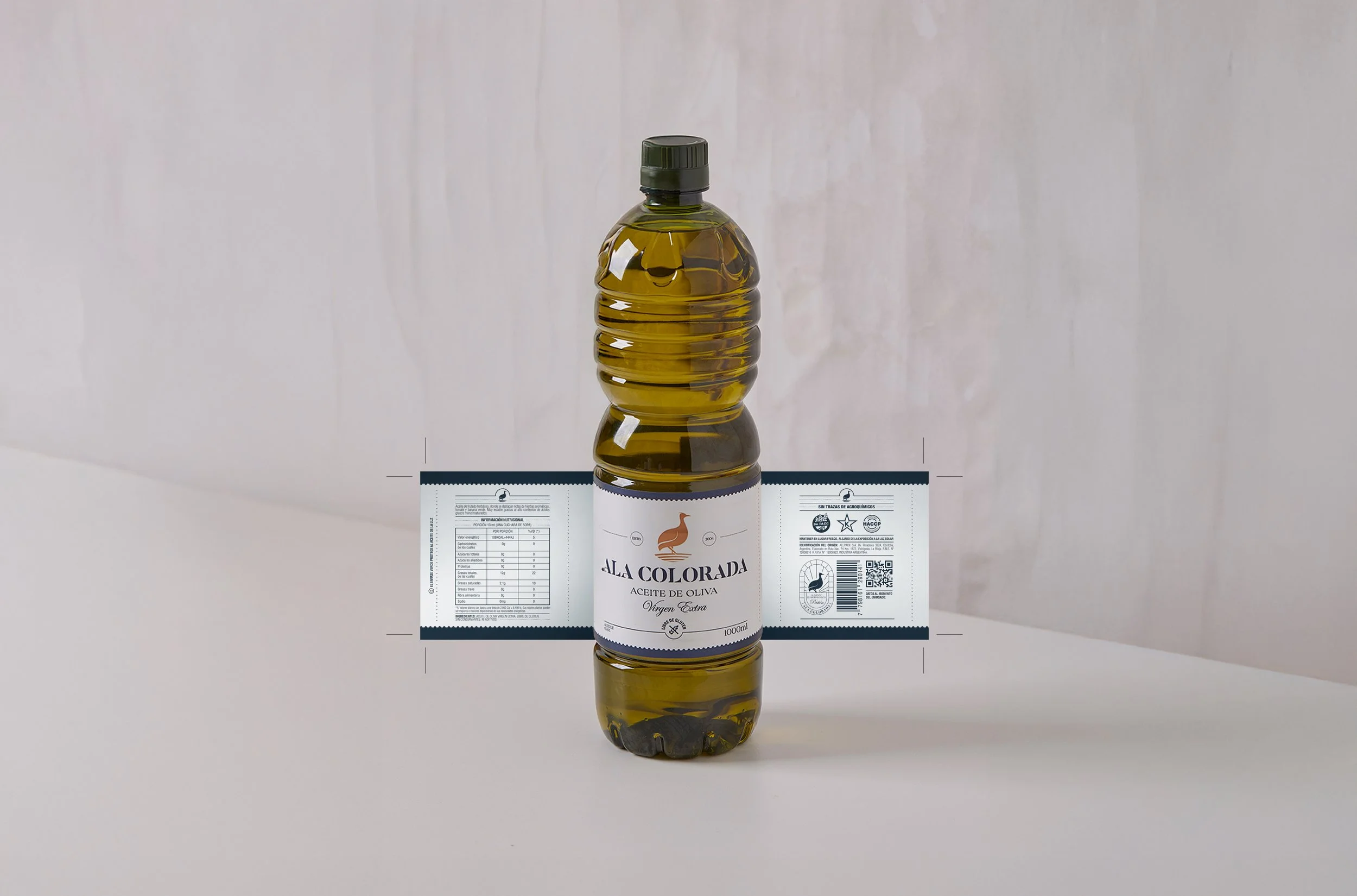
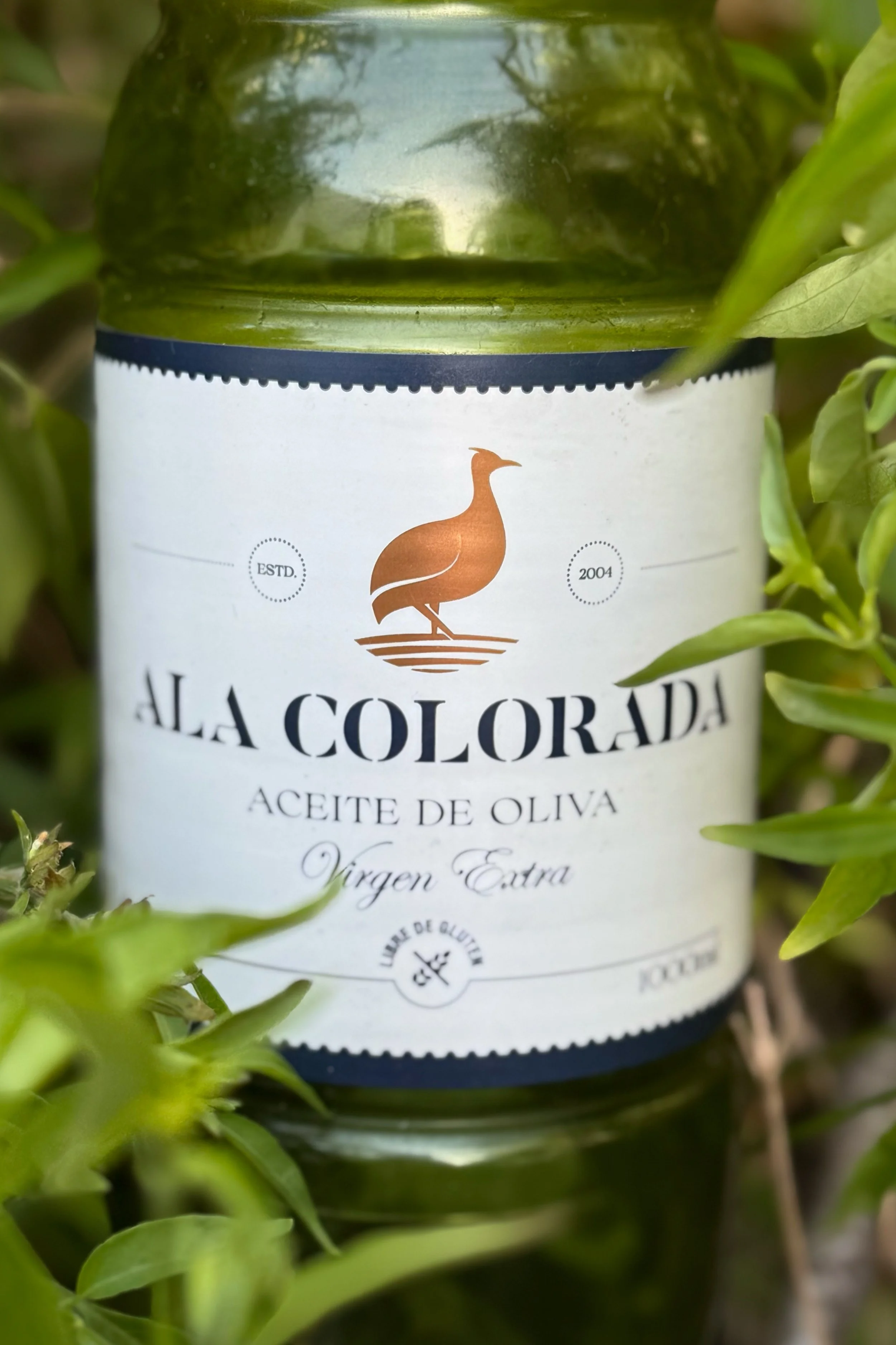
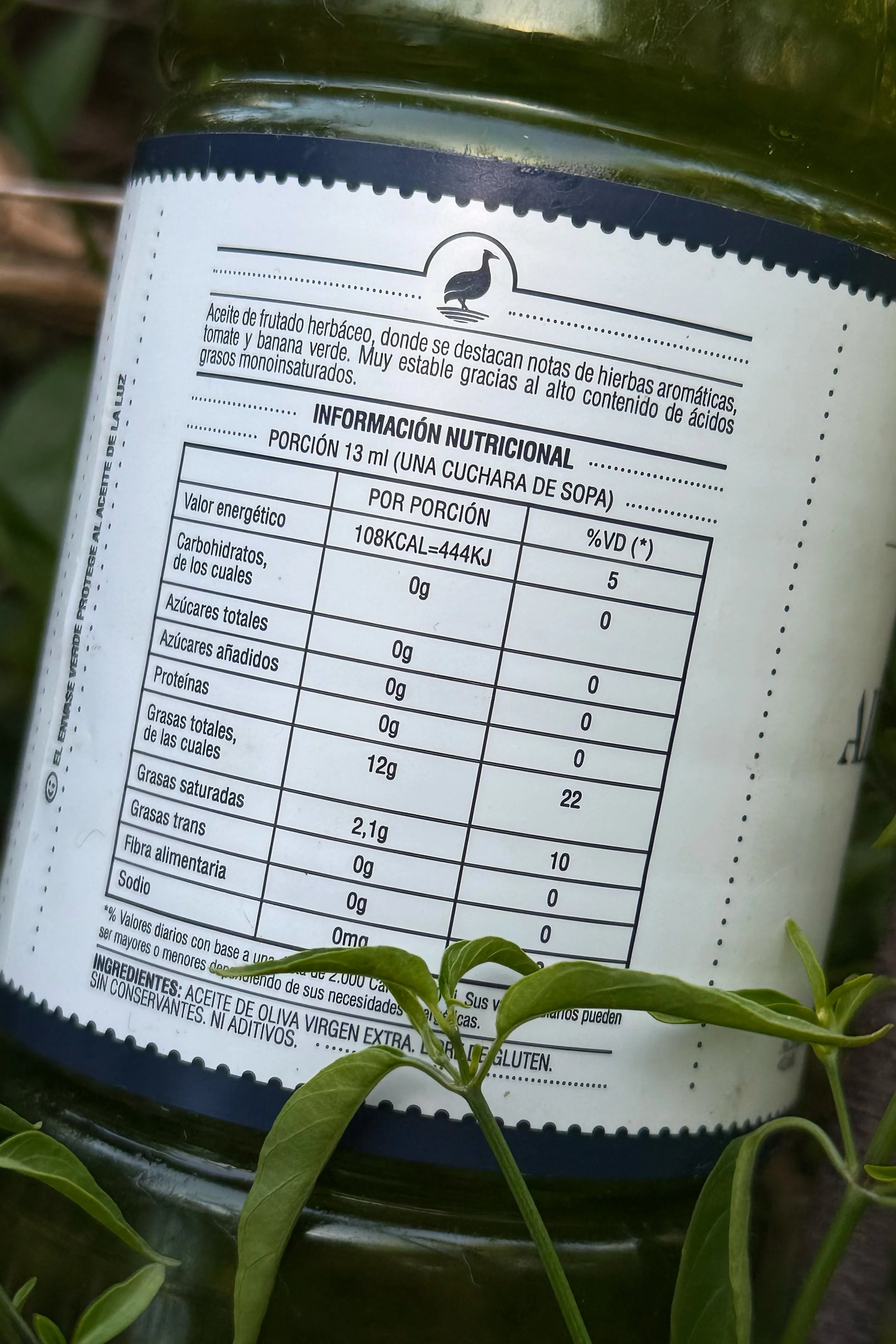
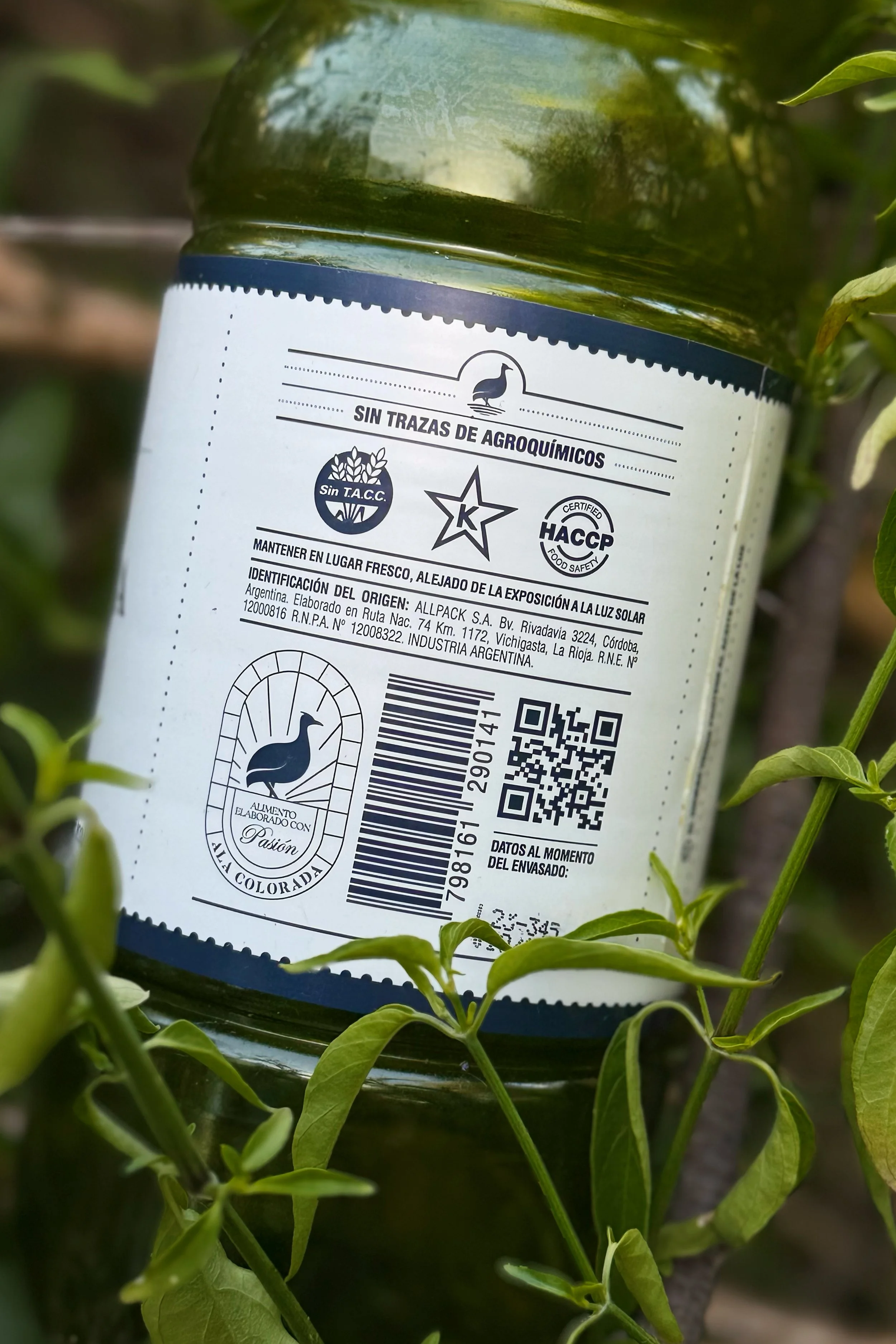
For the 1L PET bottle, we designed a label that emphasizes clarity and product integrity: a structured typographic hierarchy, minimal color palette, and subtle ornamental details that communicate tradition, quality, and everyday usability.The product’s sensory attributes—harmonious fruitiness, acidity below 0.6%, and soft herbal and ripe tomato notes—influenced the brand’s visual tone: warm, honest, and approachable.
The result is a unified brand system that supports scalability, reinforces storytelling, and ensures consistency across future product lines and communication materials.
Agency: Chance Design®
Client: All Pack S.A.
Services: Logo Design, Packaging, Label Design, Graphic Design.
Ala Colorada

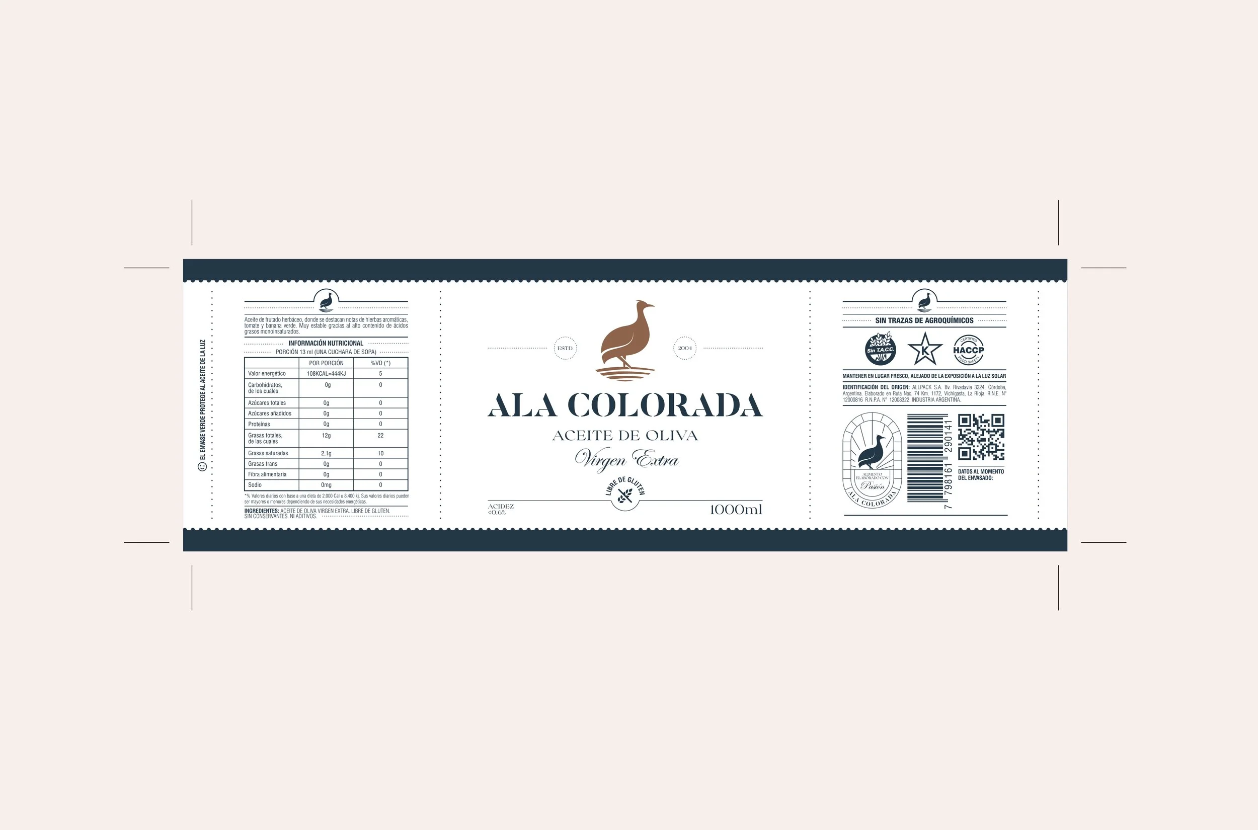
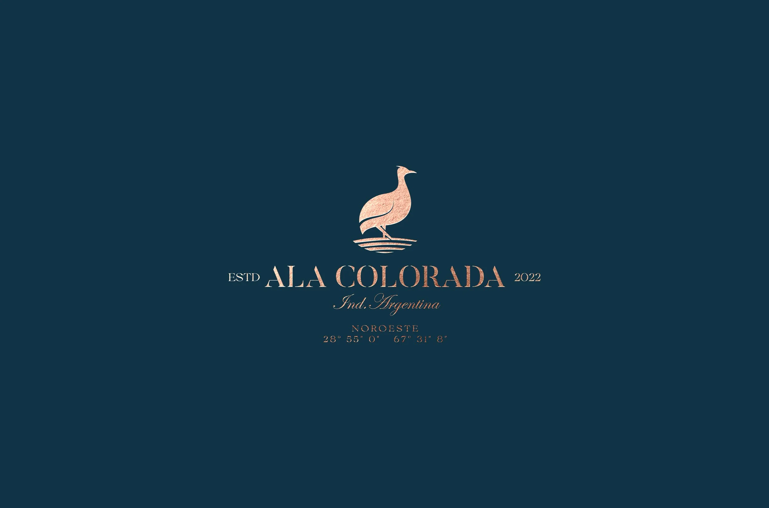


The Ala Colorada—the Red-Winged Tinamou—is a native bird from central Argentina, known for the subtle reddish tone on its wings and its close connection to rural landscapes. It symbolizes authenticity, origin, and a natural way of life. Its silhouette in the logo reflects these values, grounding the brand in its regional heritage.