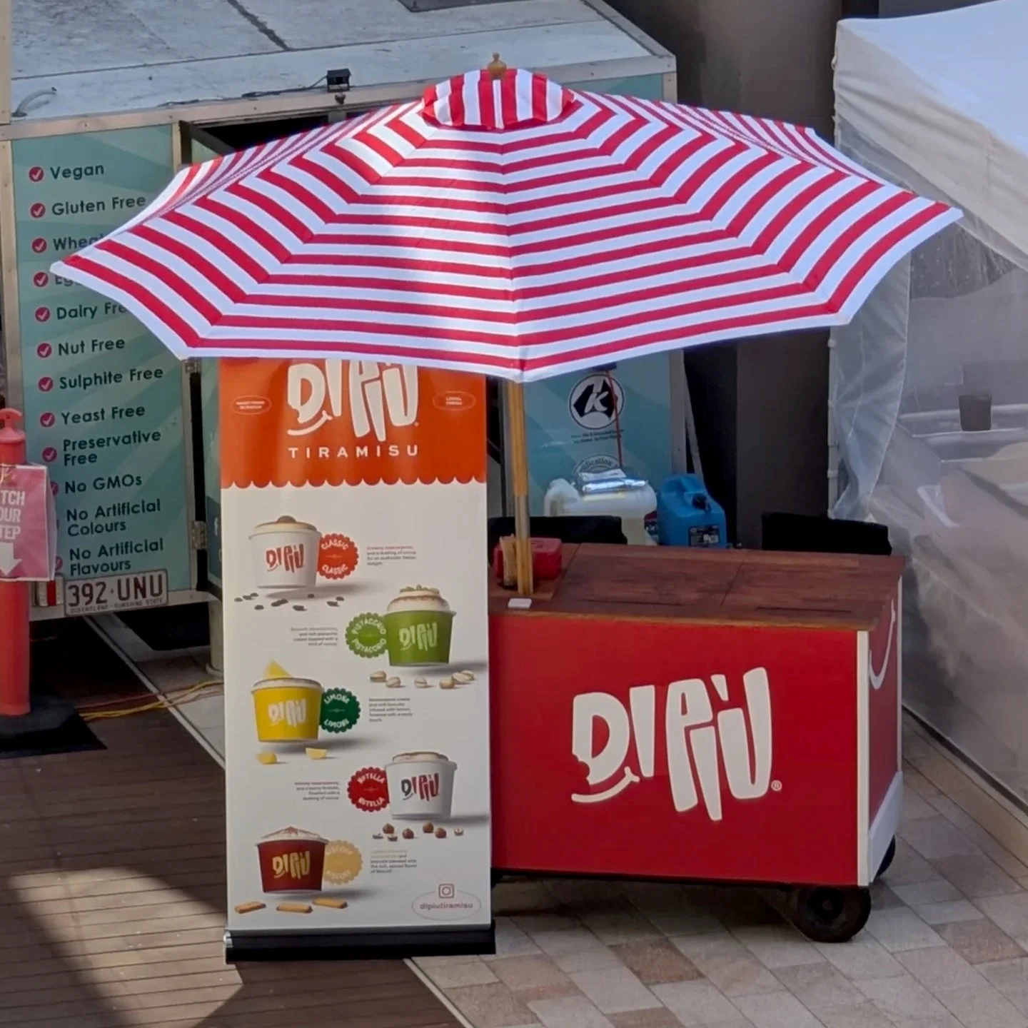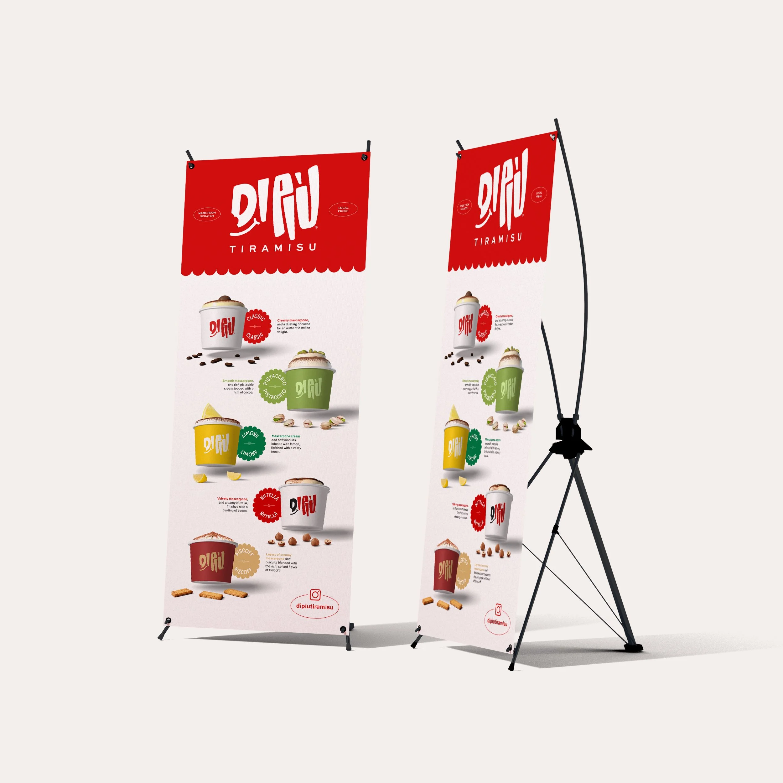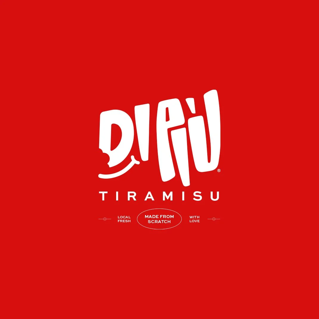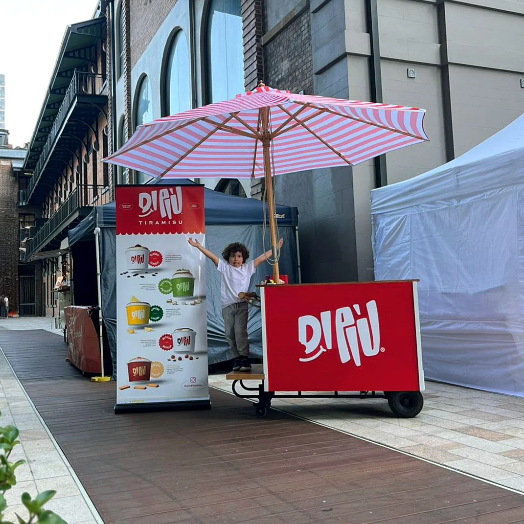

DI PIÙ
-
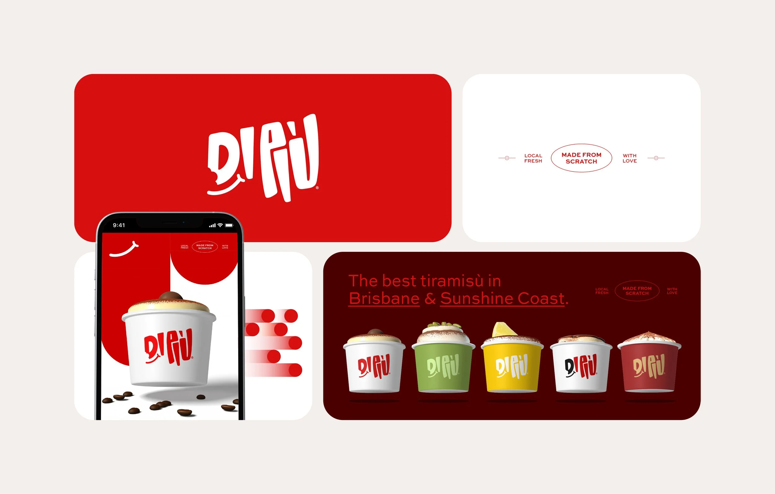
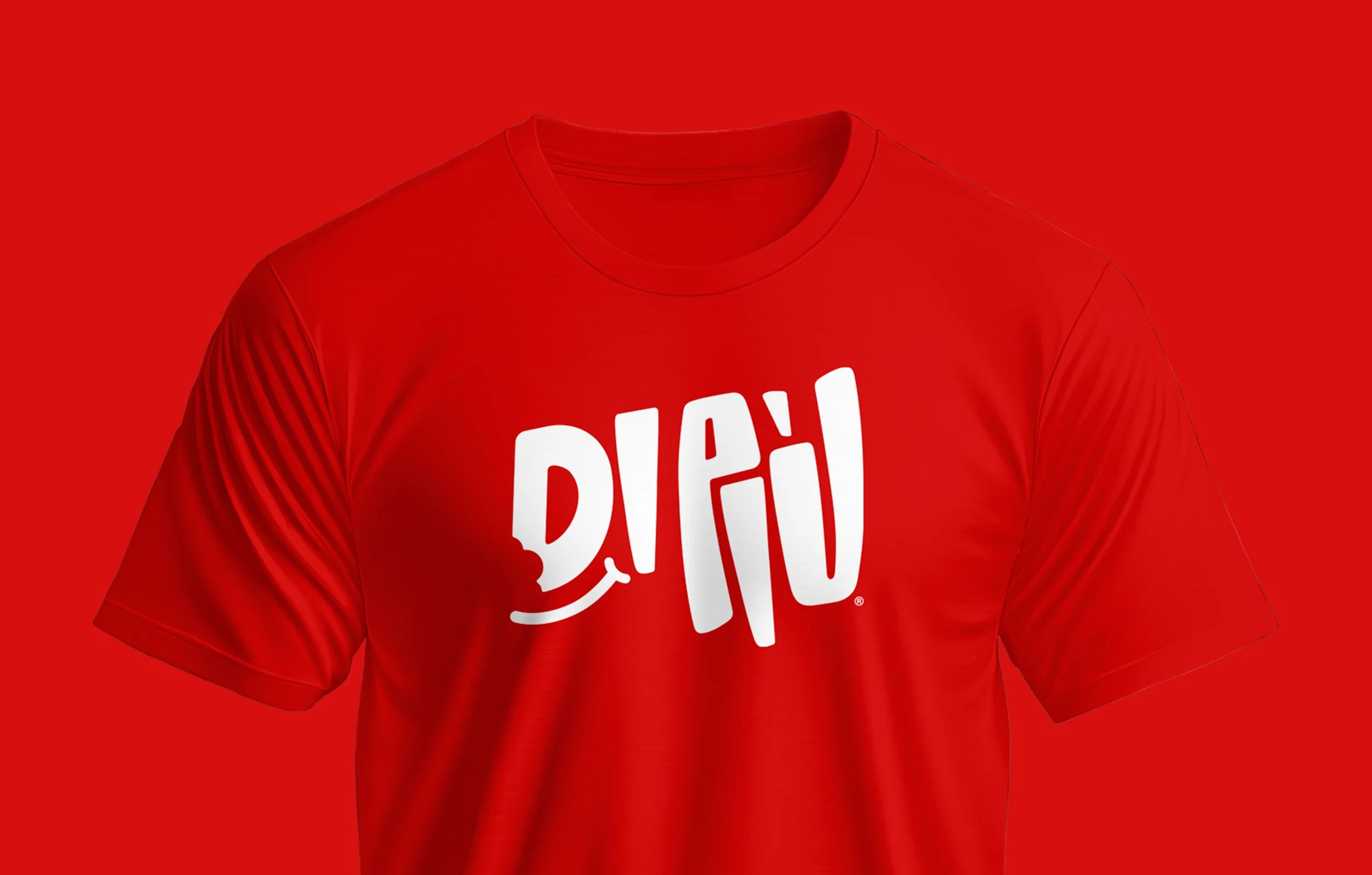
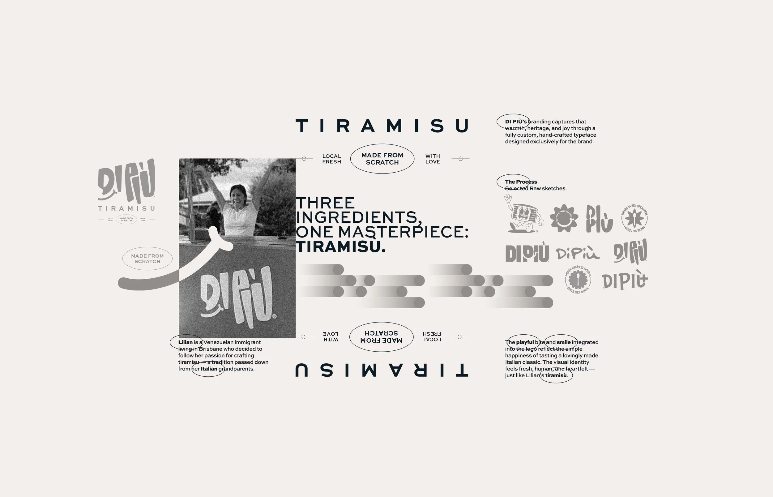
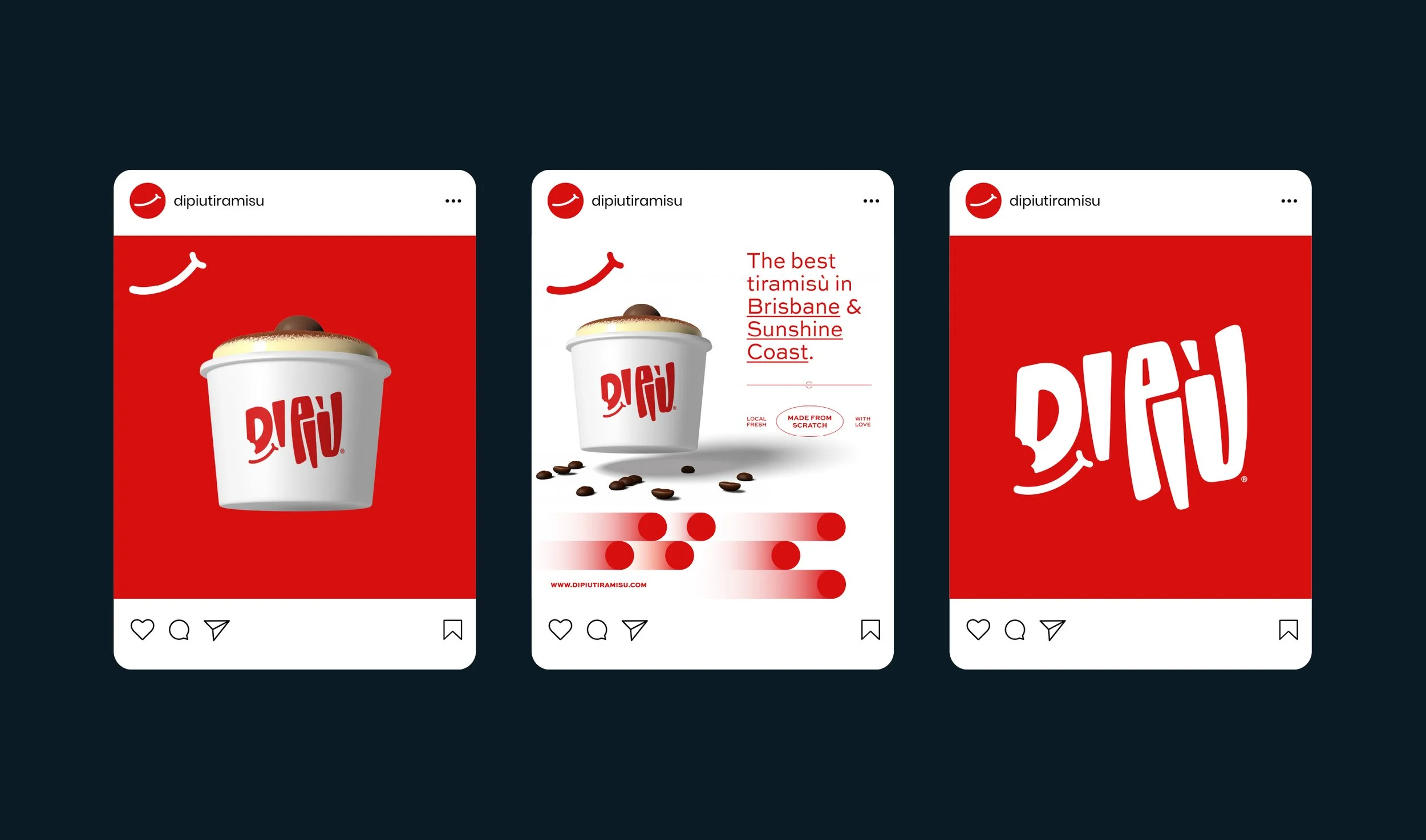
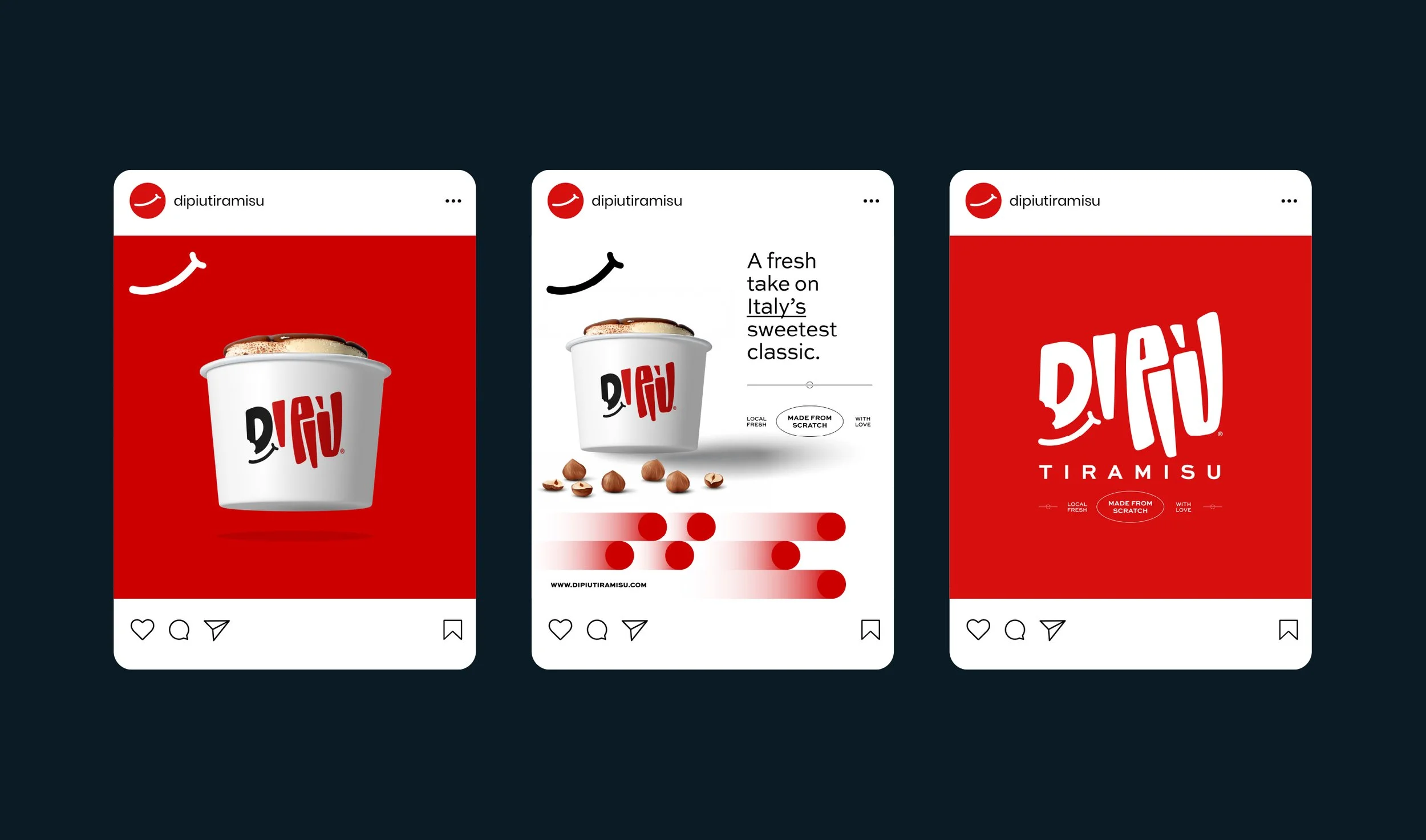
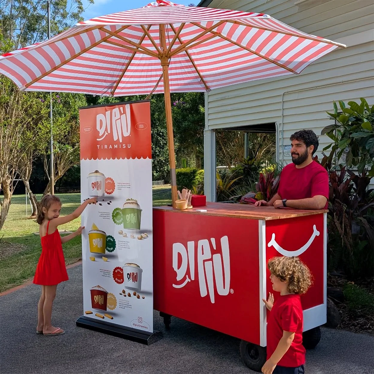
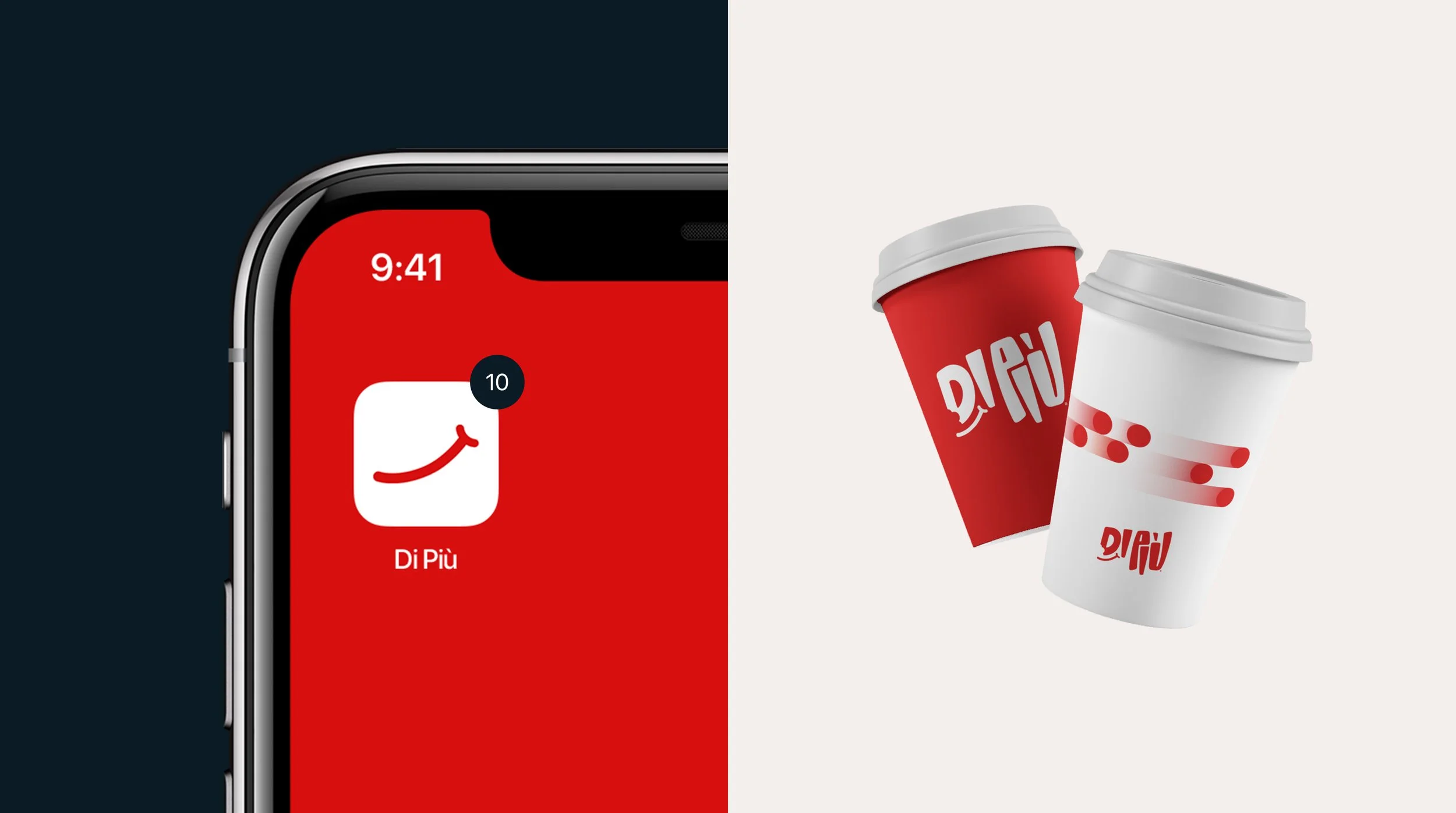
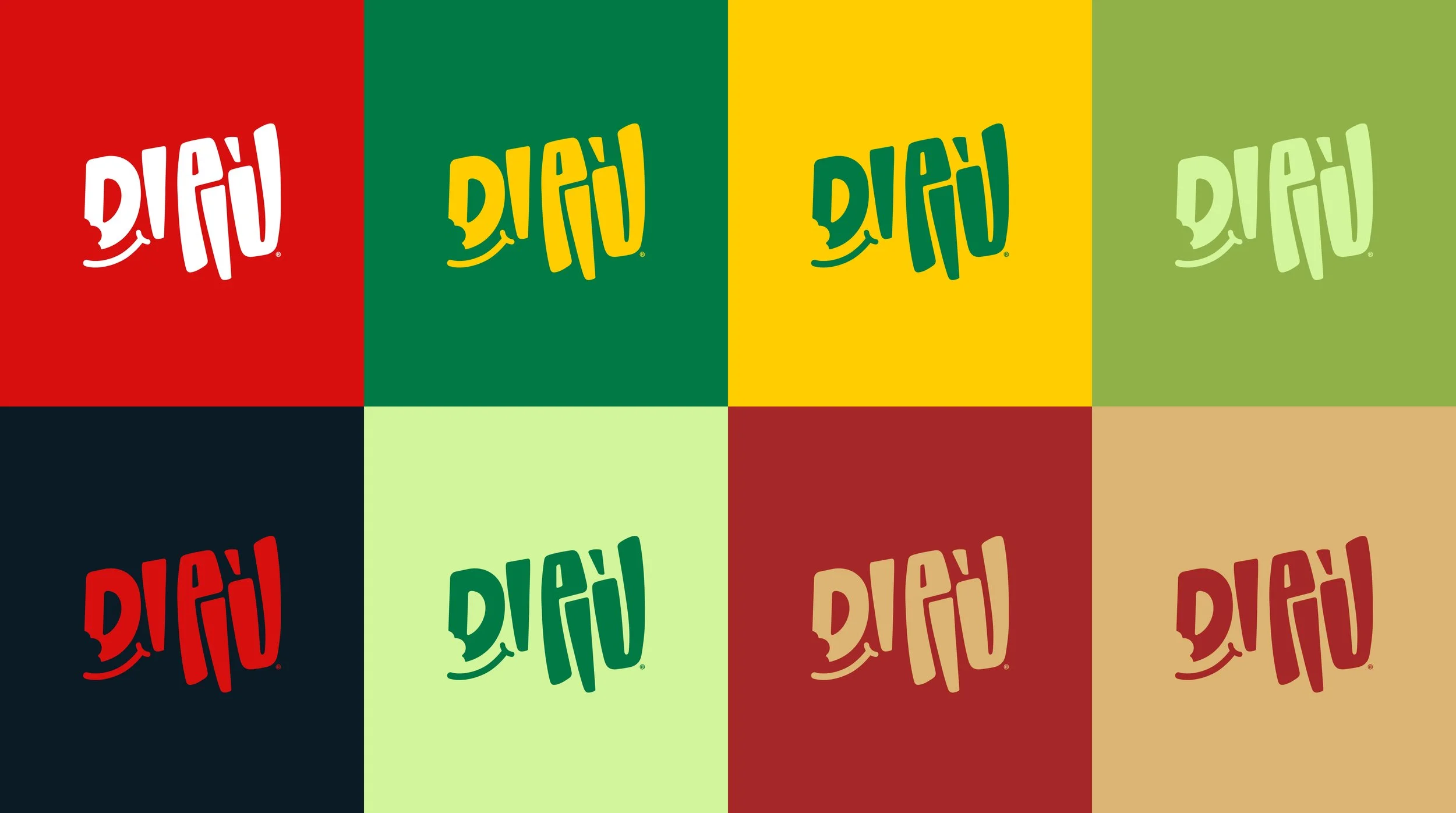
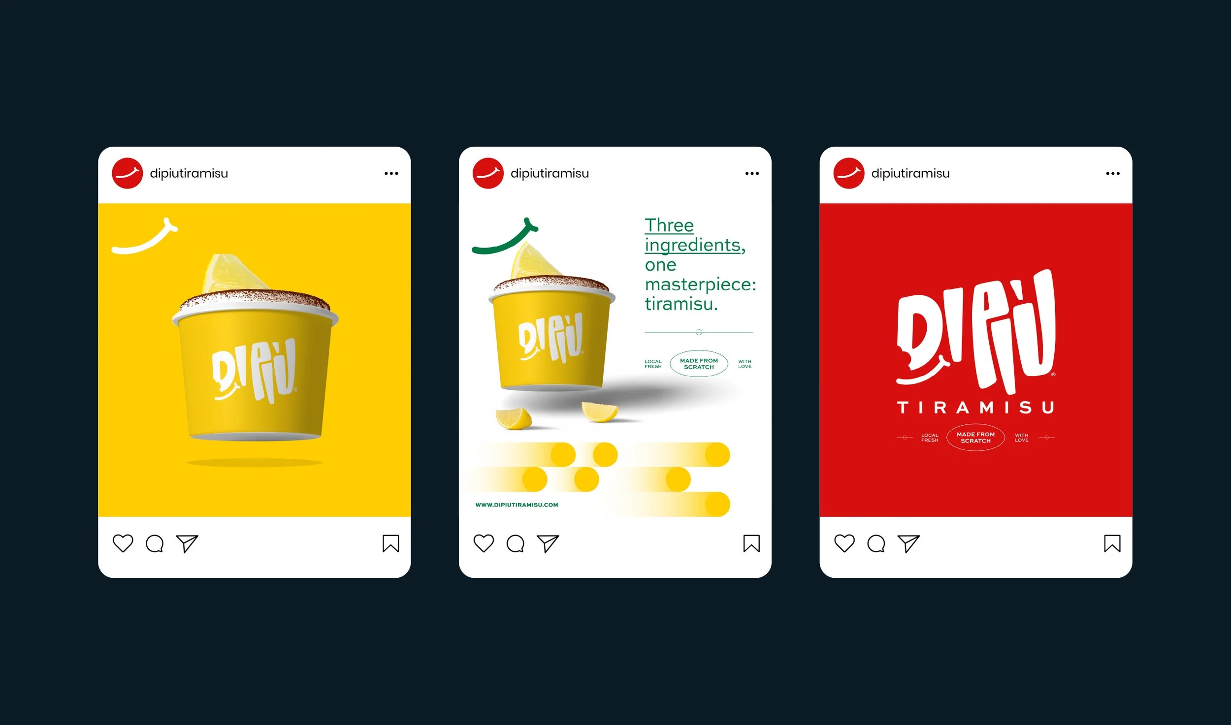
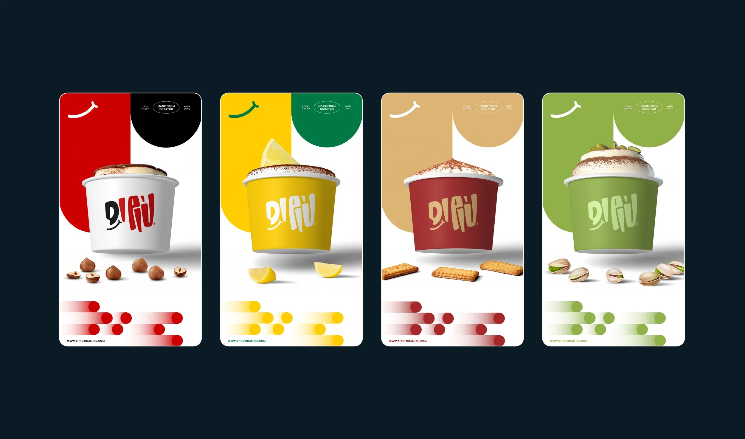
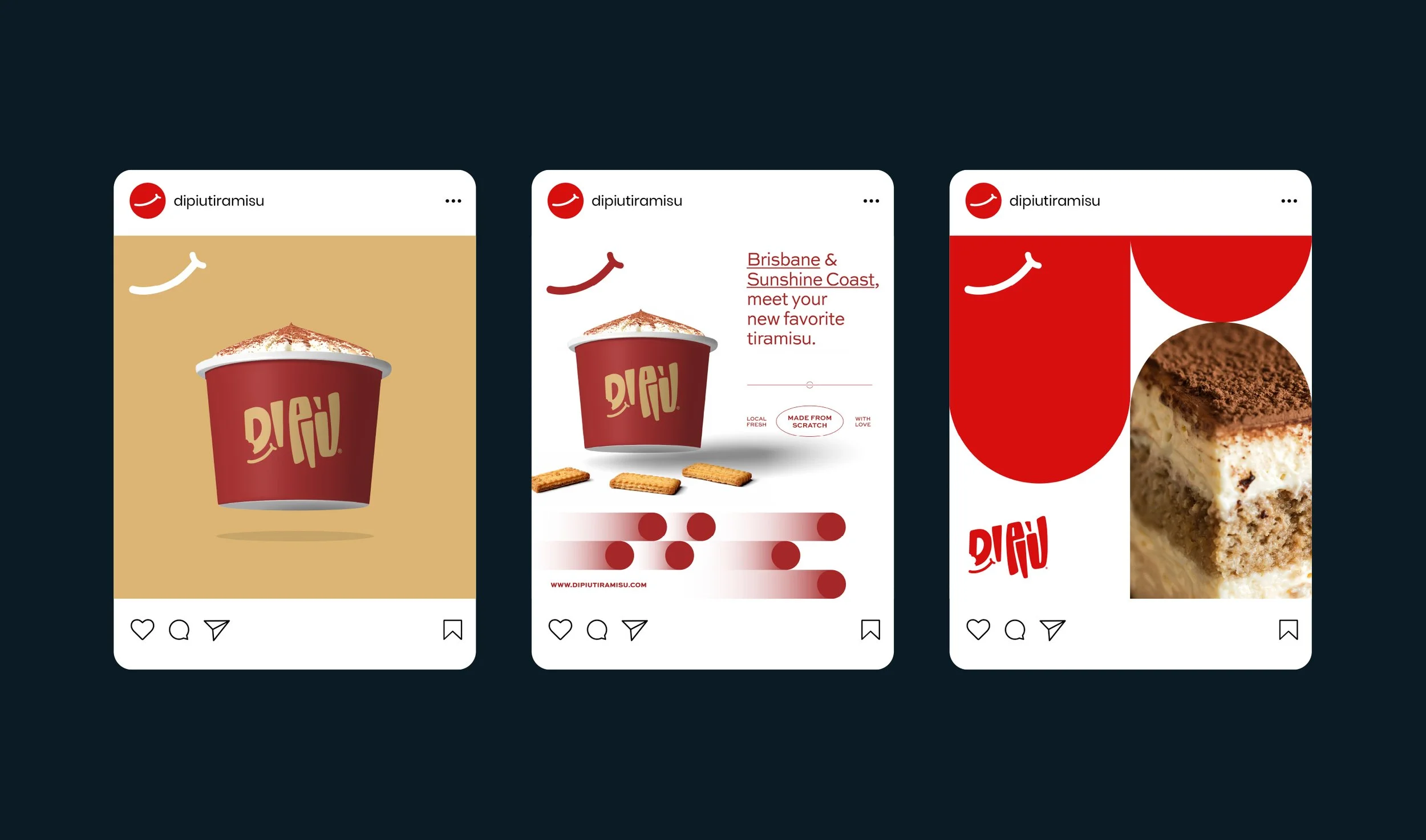
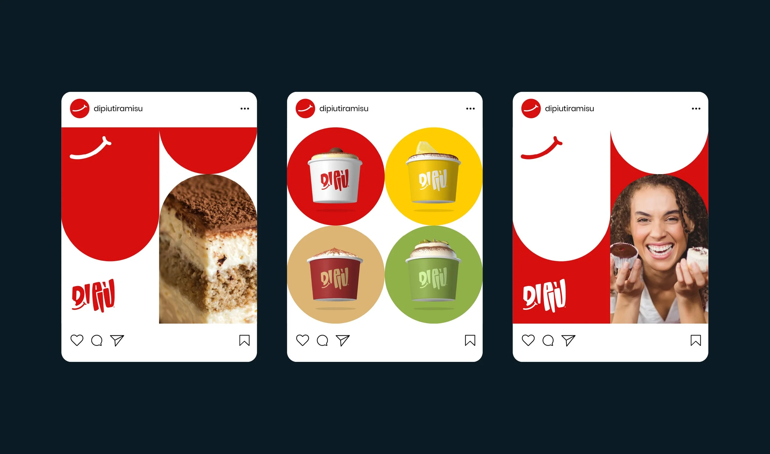
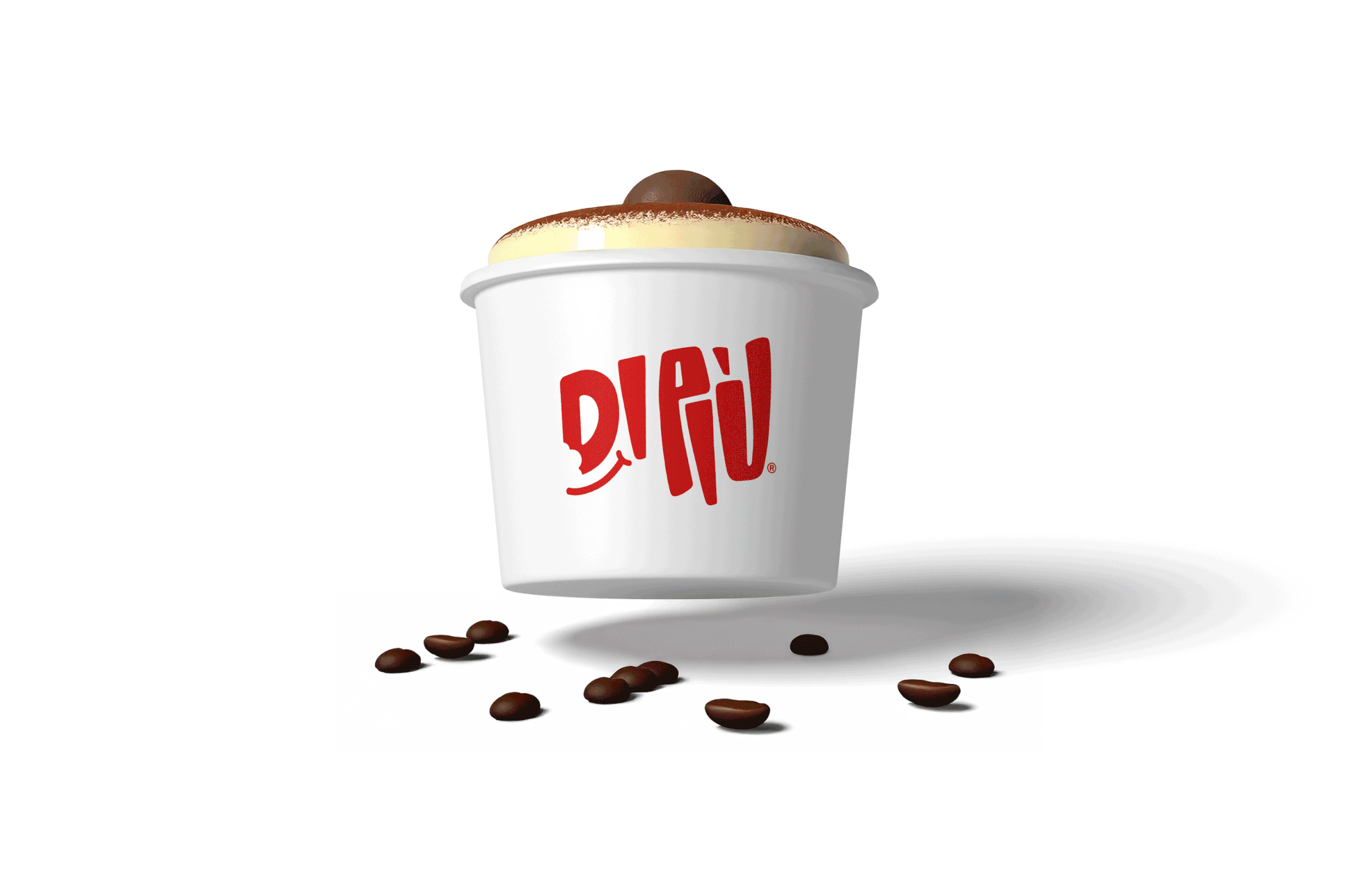
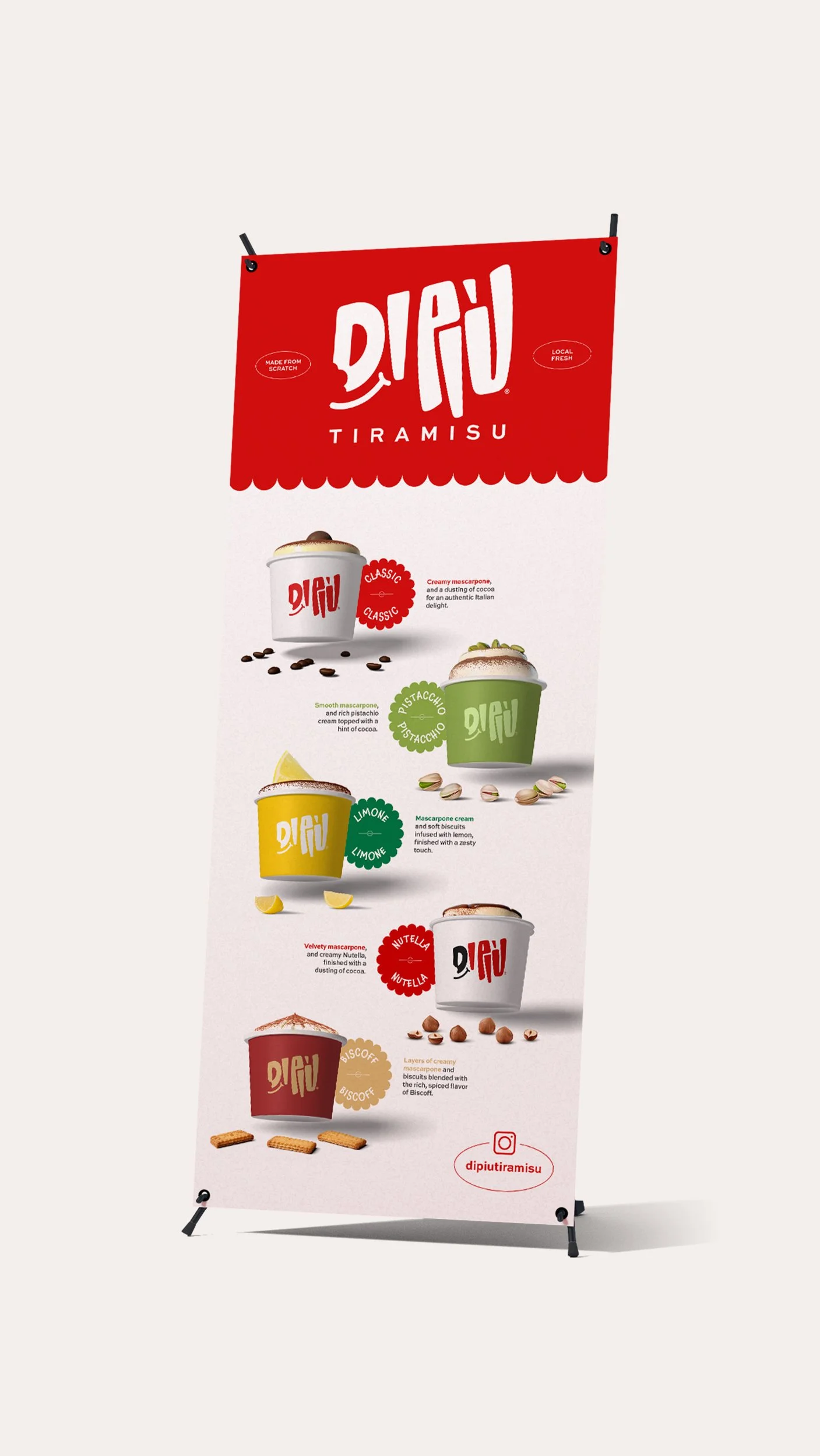
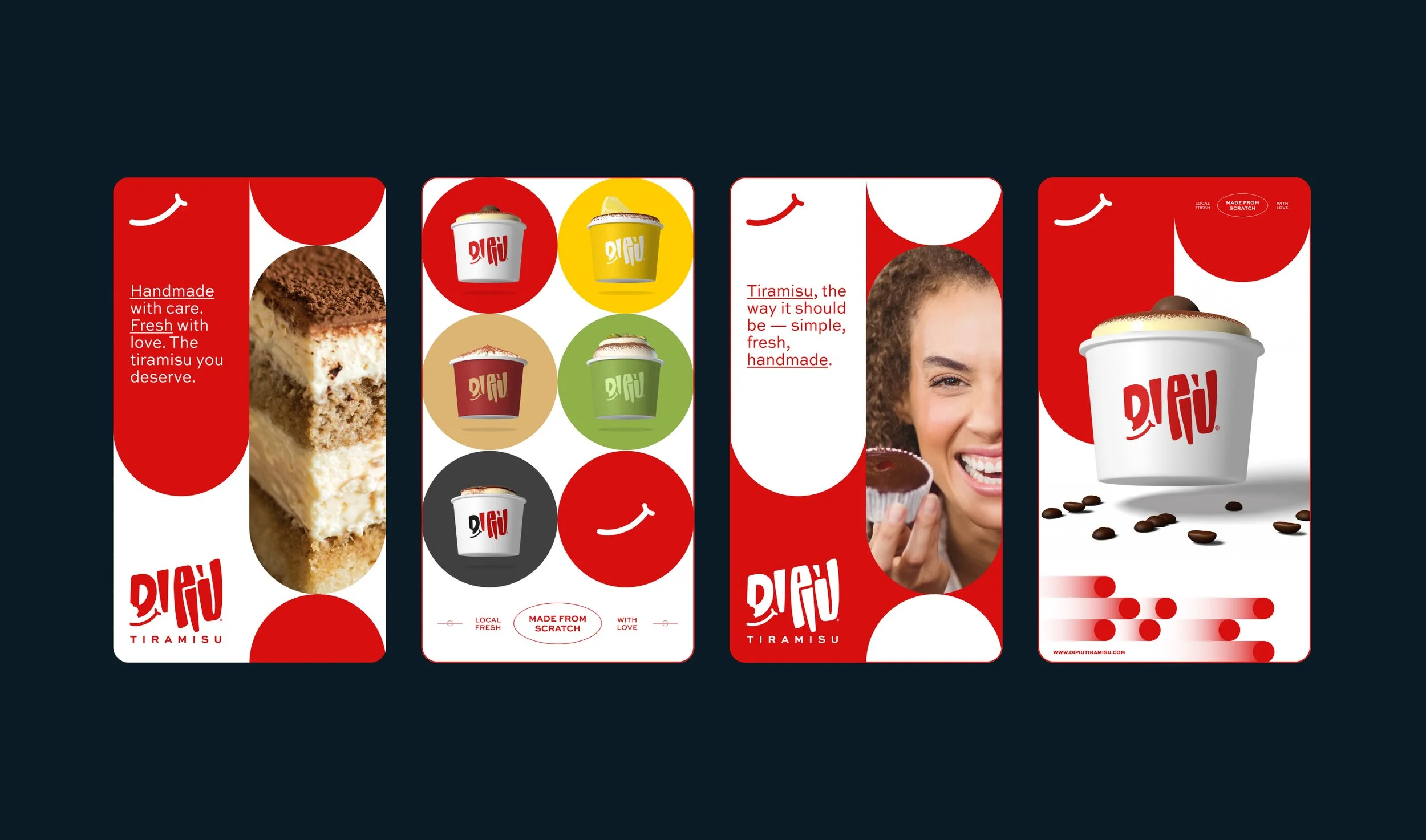
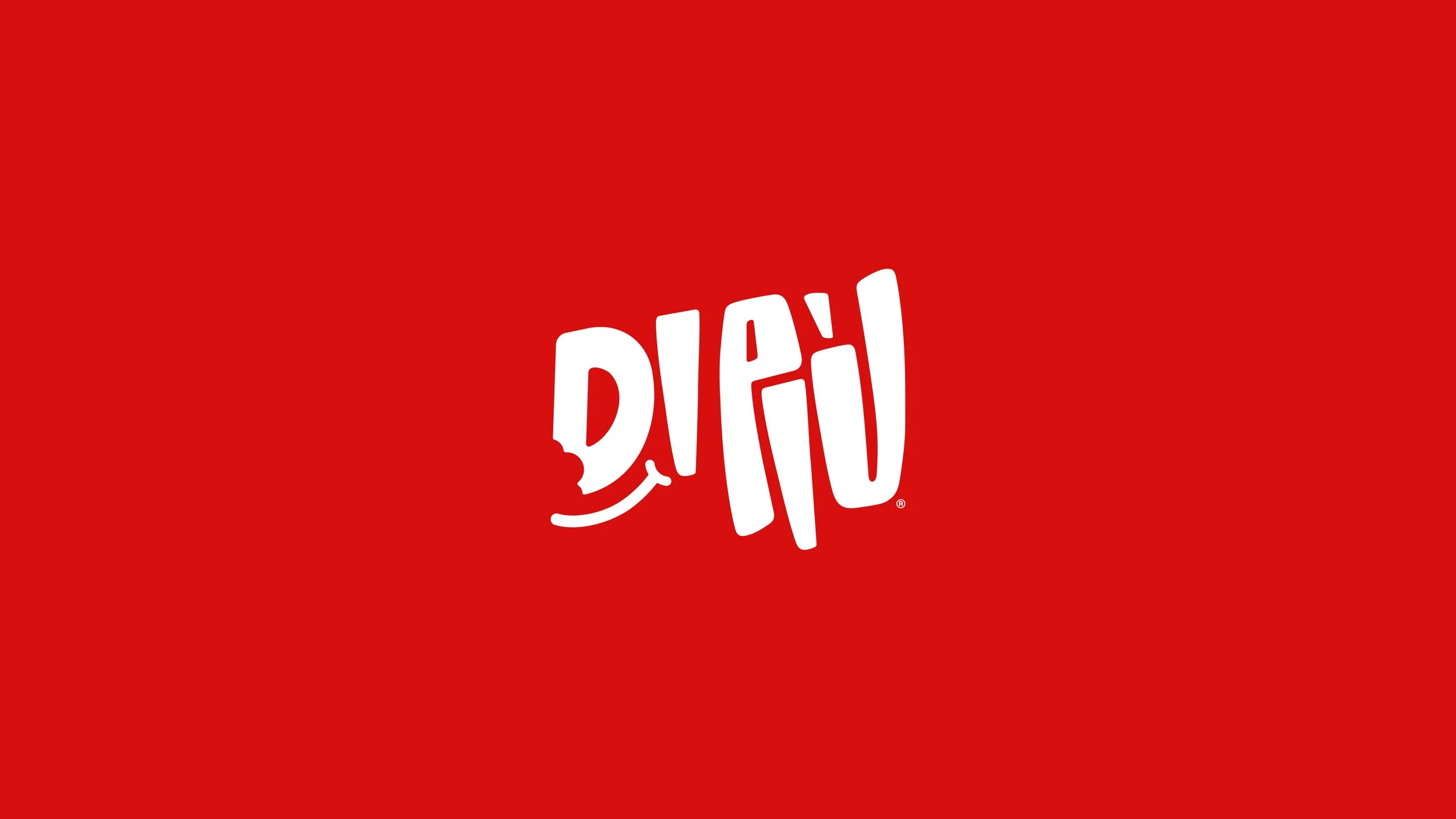
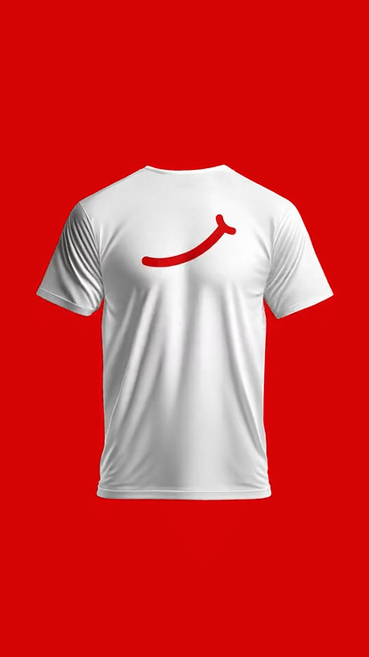
DI PIÙ’s branding captures that warmth, heritage, and joy through a fully custom, hand-crafted typeface designed exclusively for the brand. The playful bite and smile integrated into the logo reflect the simple happiness of tasting a lovingly made Italian classic. The visual identity feels fresh, human, and heartfelt — just like Lilibeth’s tiramisù.
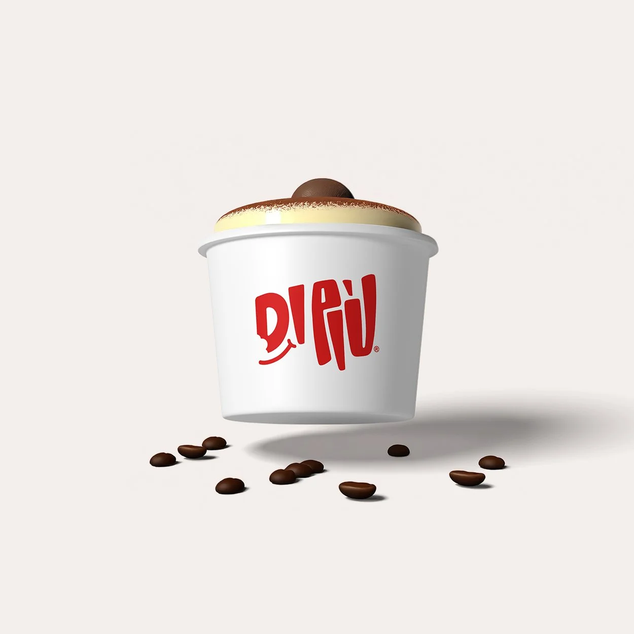
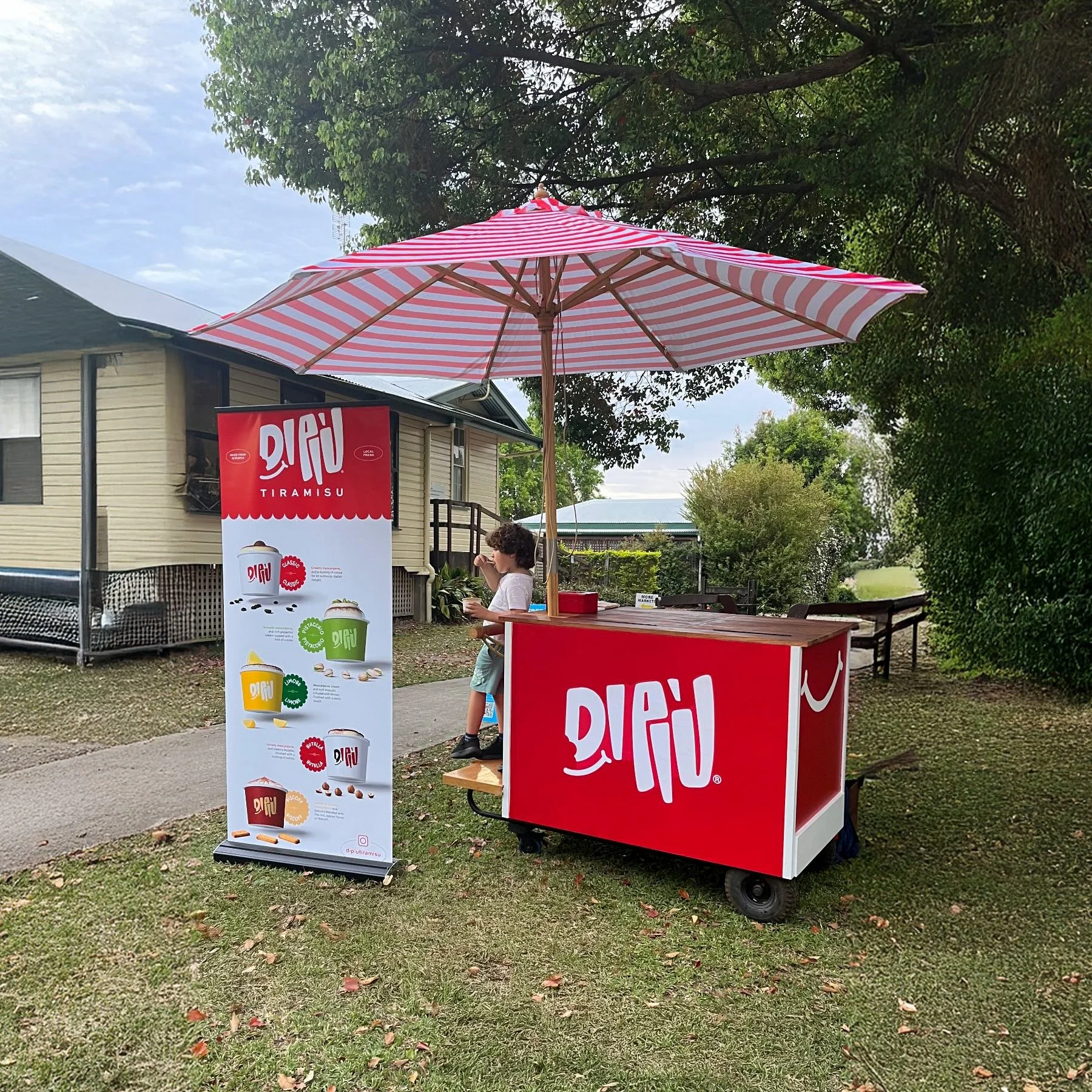
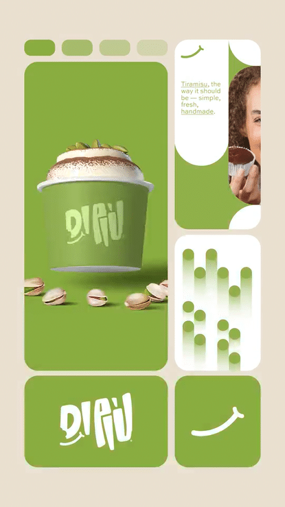
A fresh take on Italy’s sweetest classic. Three ingredients, one masterpiece: tiramisù. The best tiramisù in Brisbane & Sunshine Coast, Australia. The tiramisù you deserve ;)
Agency: Chance Design®
Client: DI PIÙ®
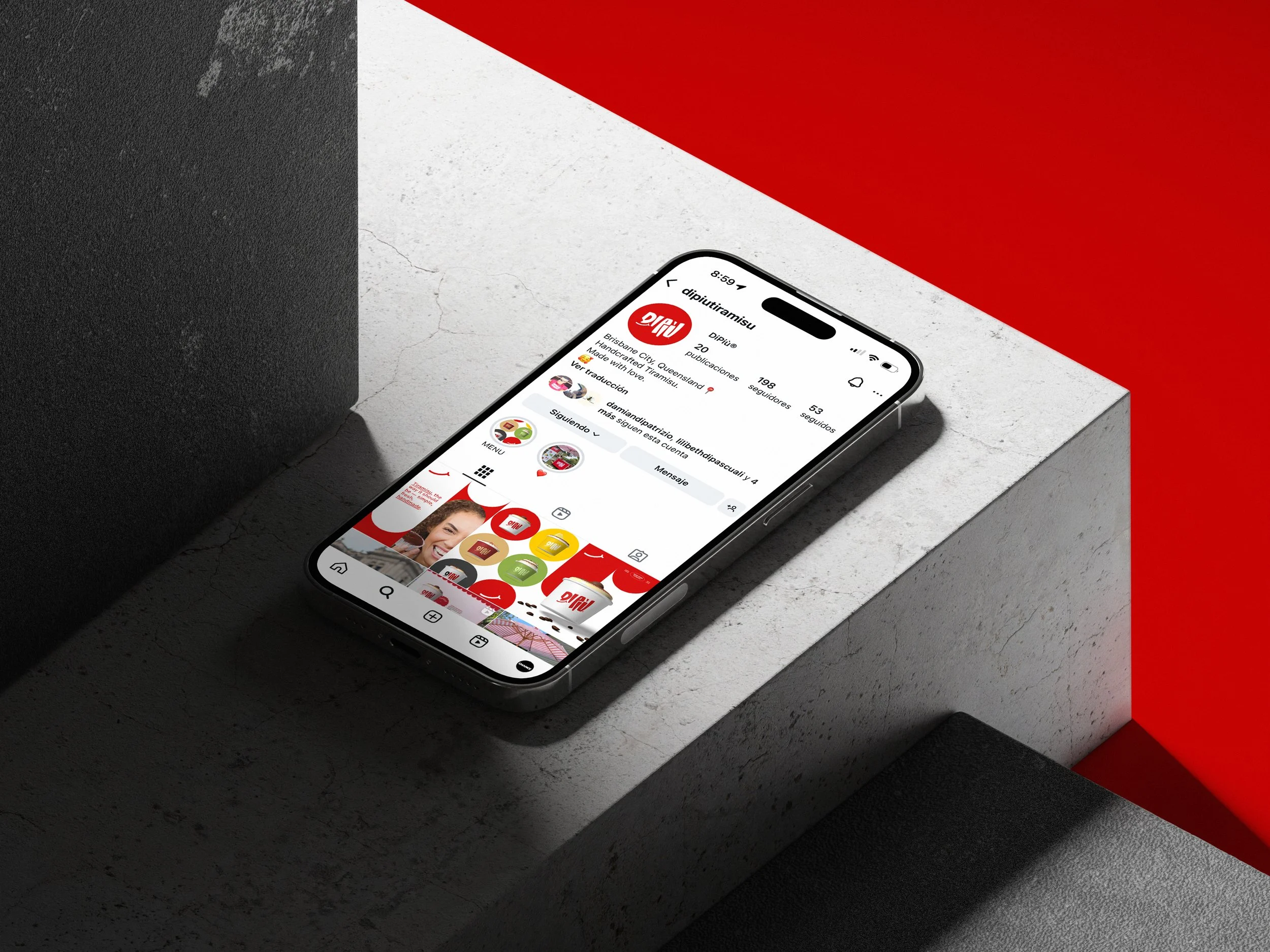
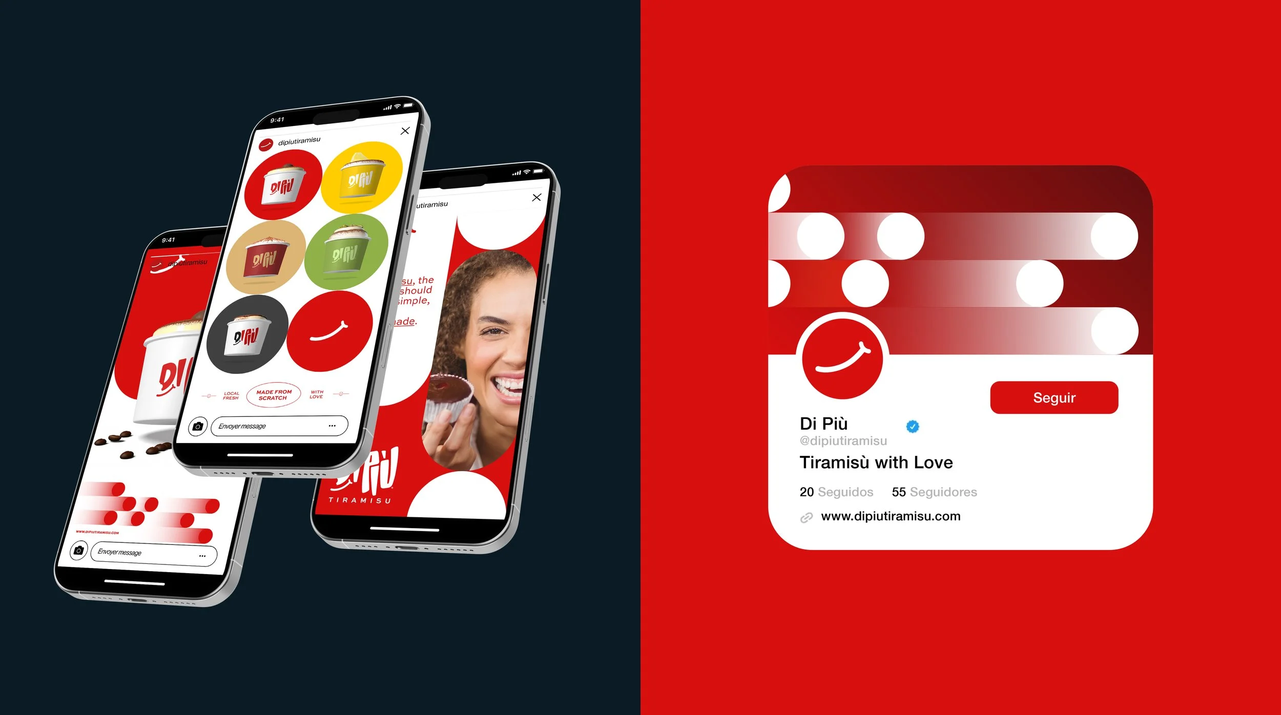
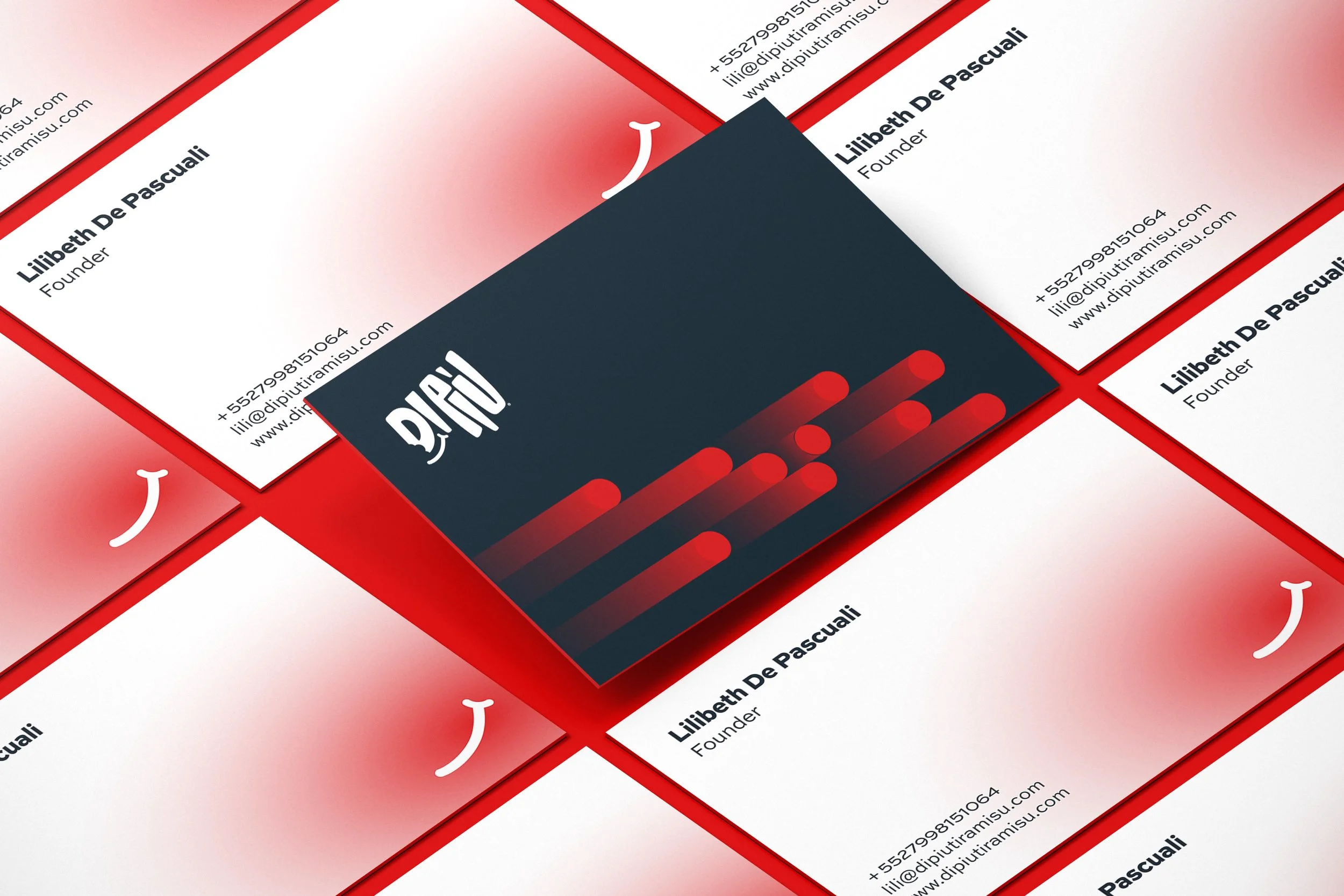
Services: Logo Design, Branding, Art Direction, Graphic Design, Social Media Design. here