FLO
-
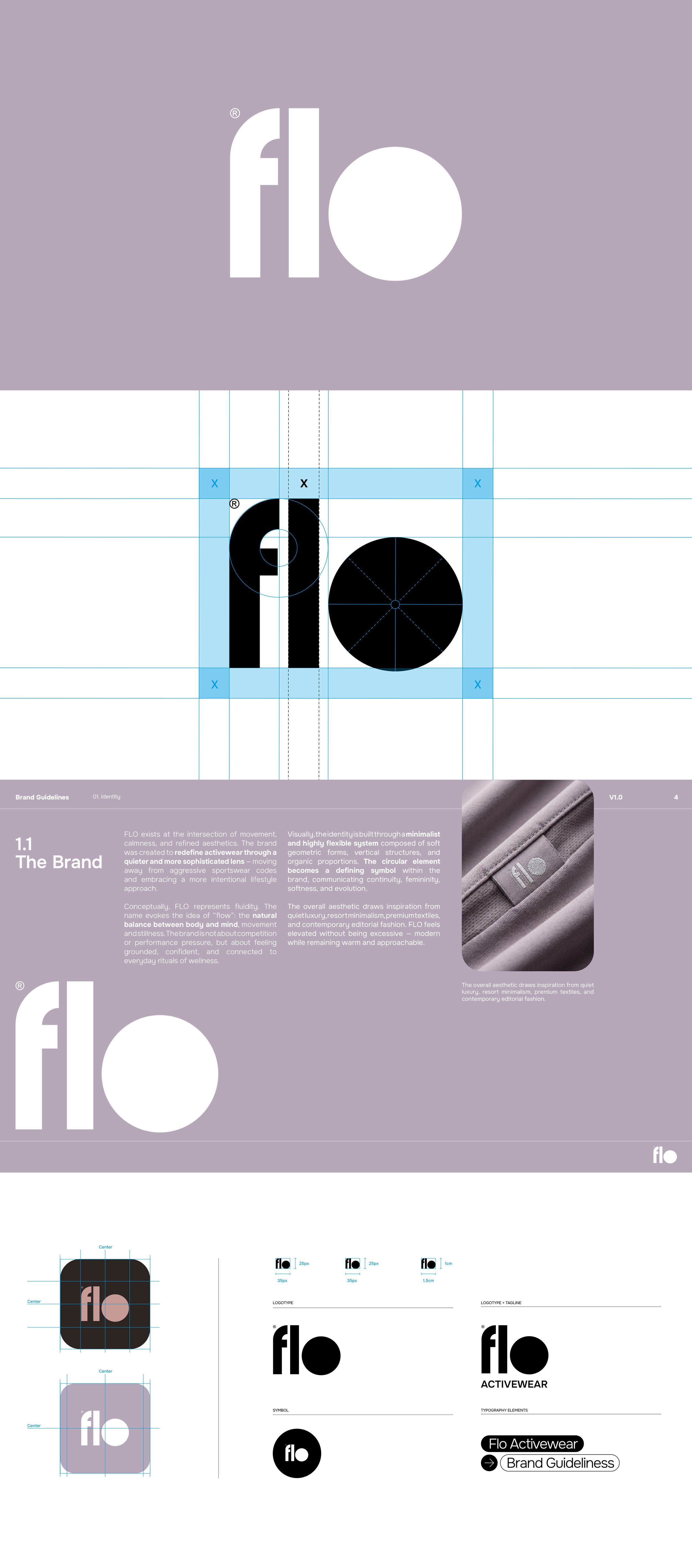
The brand was created to redefine activewear through a quieter and more sophisticated lens — moving away from aggressive sportswear codes and embracing a more intentional lifestyle approach.
Conceptually, FLO represents fluidity. The name evokes the idea of “flow”: the natural balance between body and mind, movement and stillness. The brand is not about competition or performance pressure, but about feeling grounded, confident, and connected to everyday wellness rituals.
Studio: Chance Design
Services: Branding, Logo Design, Graphic Design, Art Direction.
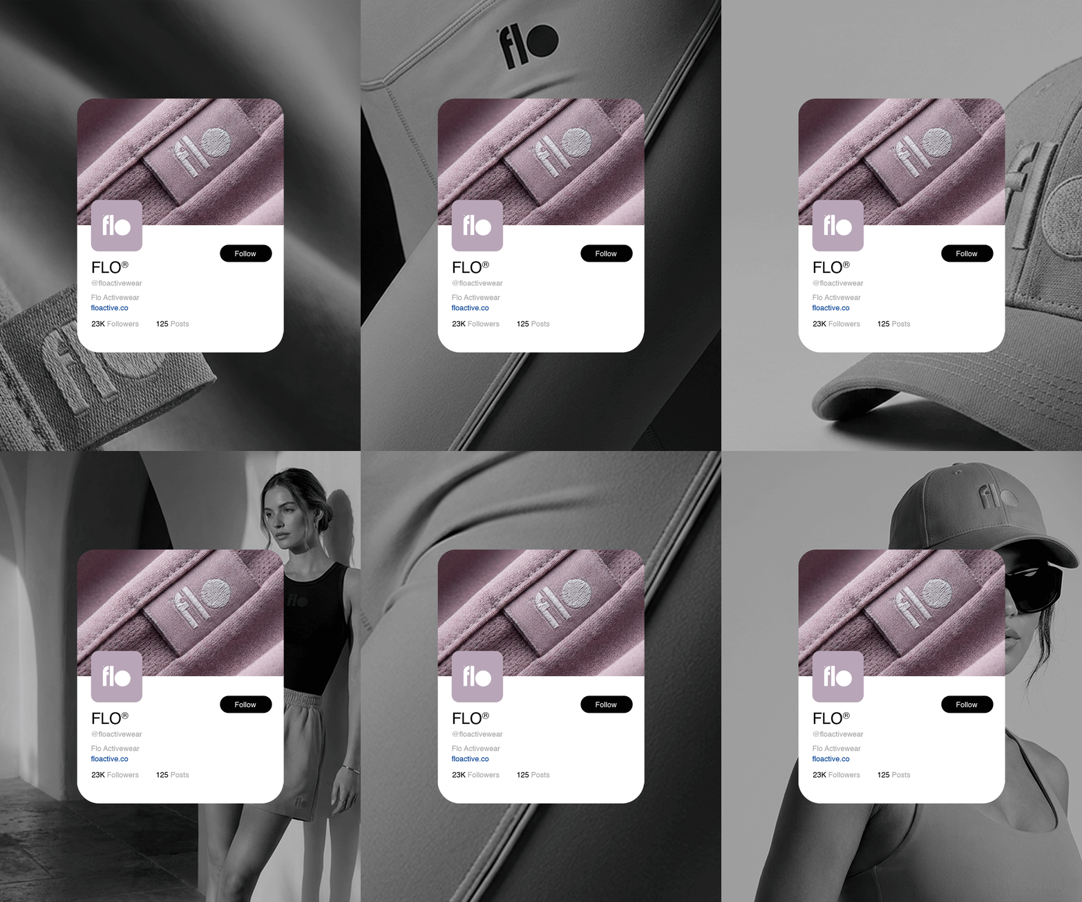
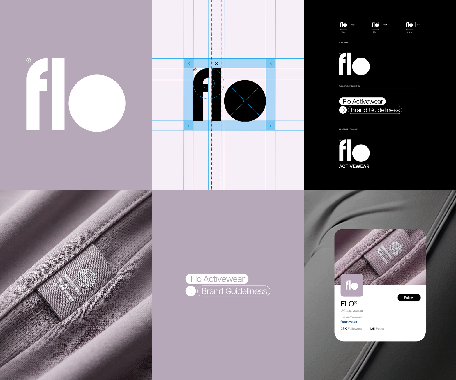
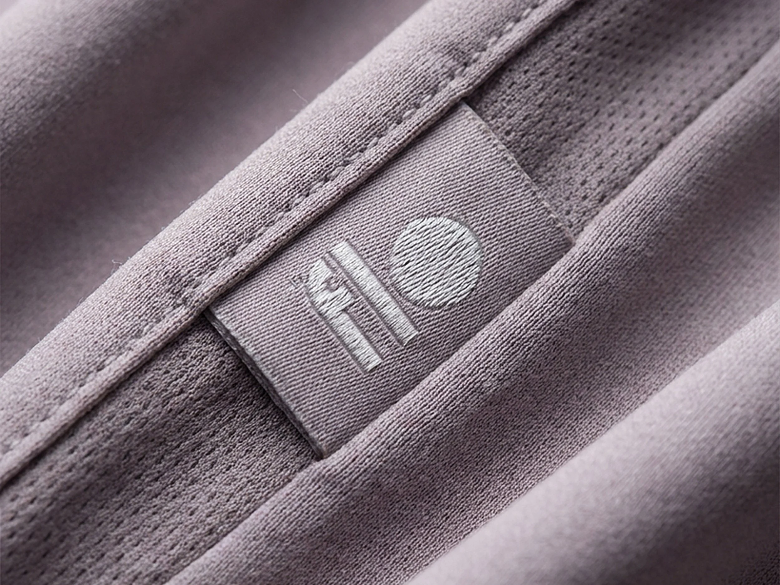
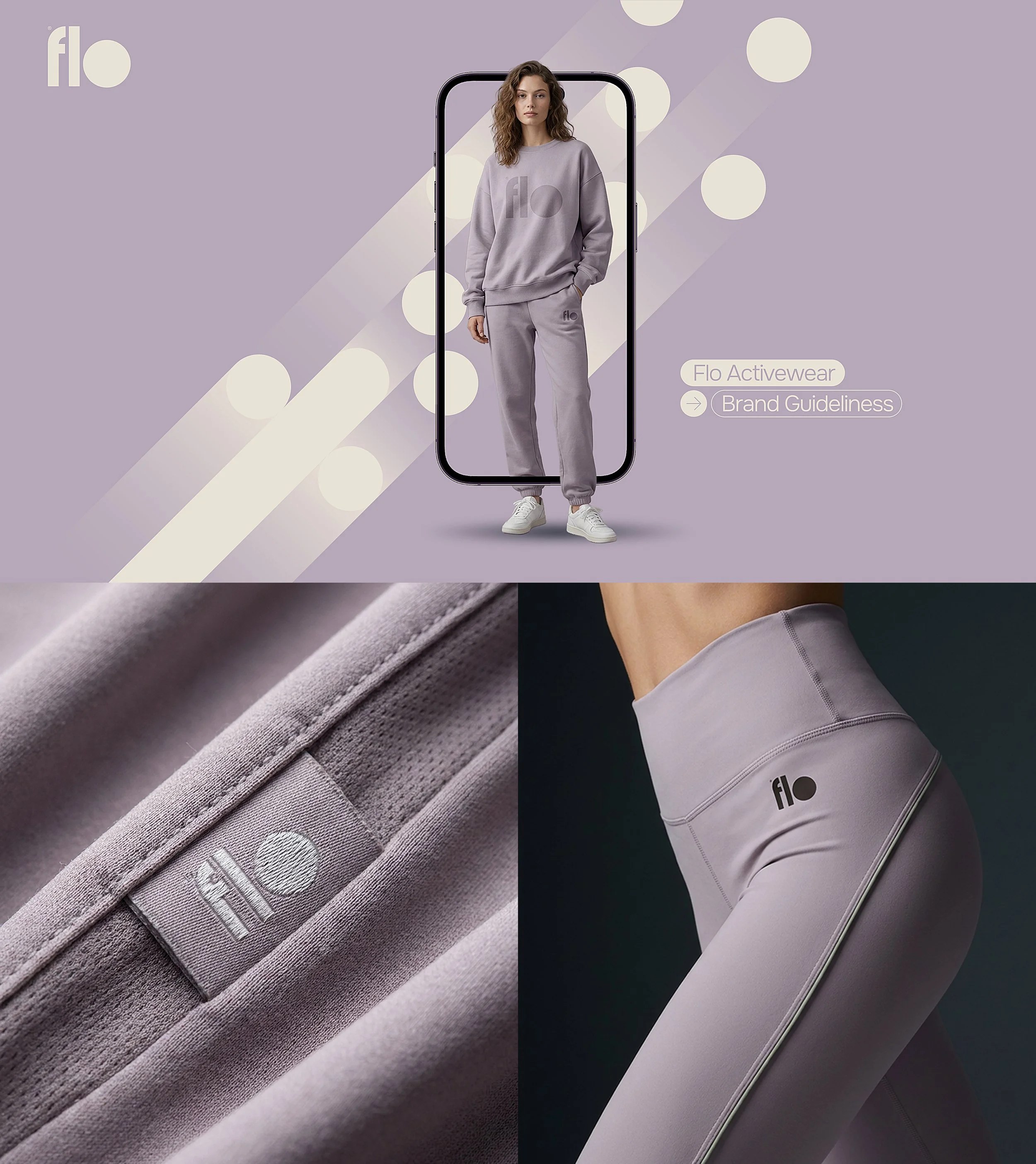
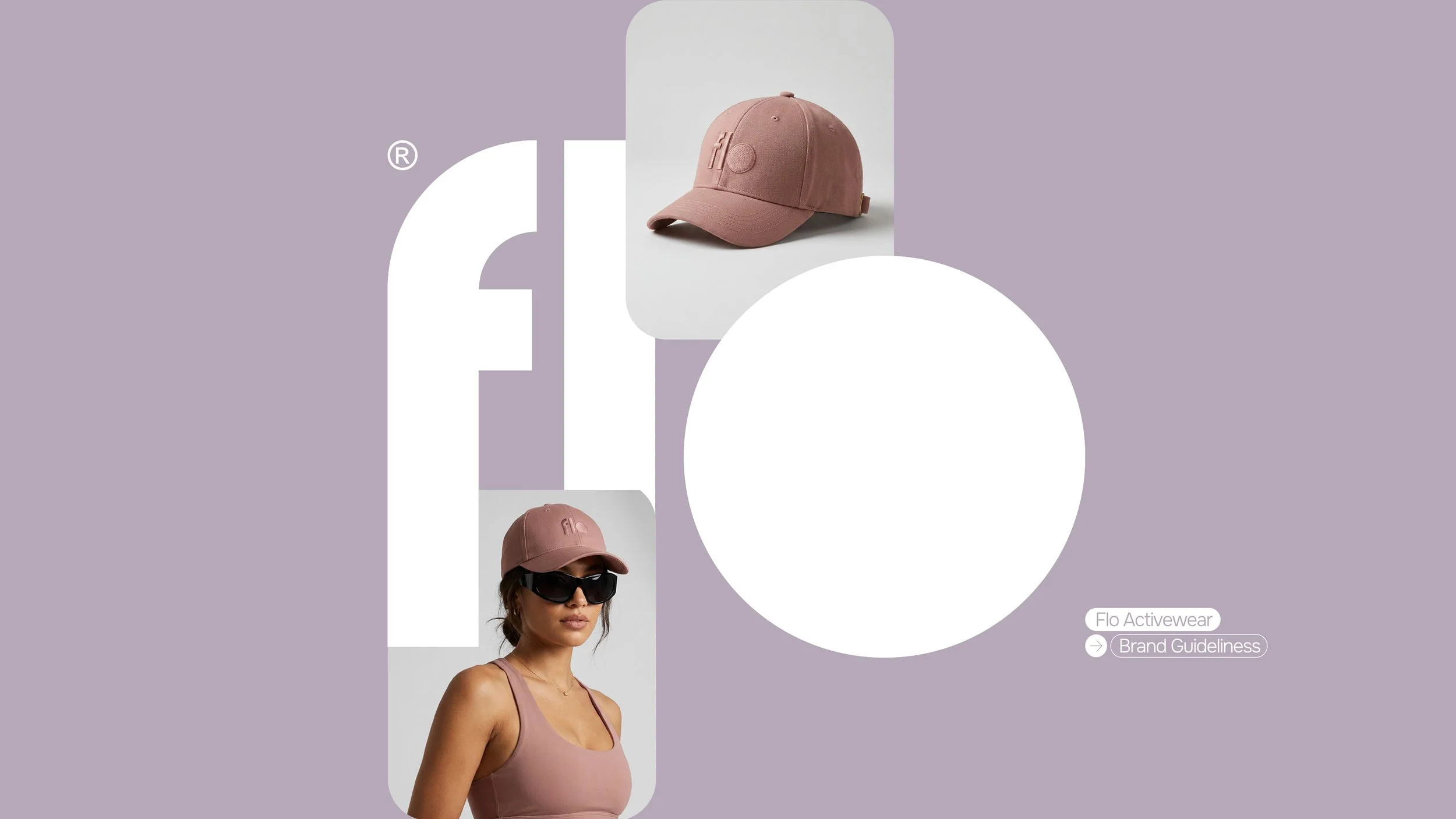
Visually, the identity is built through a minimalist and highly flexible system composed of soft geometric forms, vertical structures, and organic proportions. The circular element becomes a defining symbol within the brand, communicating continuity, femininity, softness, and evolution.
The overall aesthetic draws inspiration from quiet luxury, resort minimalism, premium textiles, and contemporary editorial fashion. FLO feels elevated without being excessive — modern while remaining warm and approachable.
Visual Language
-
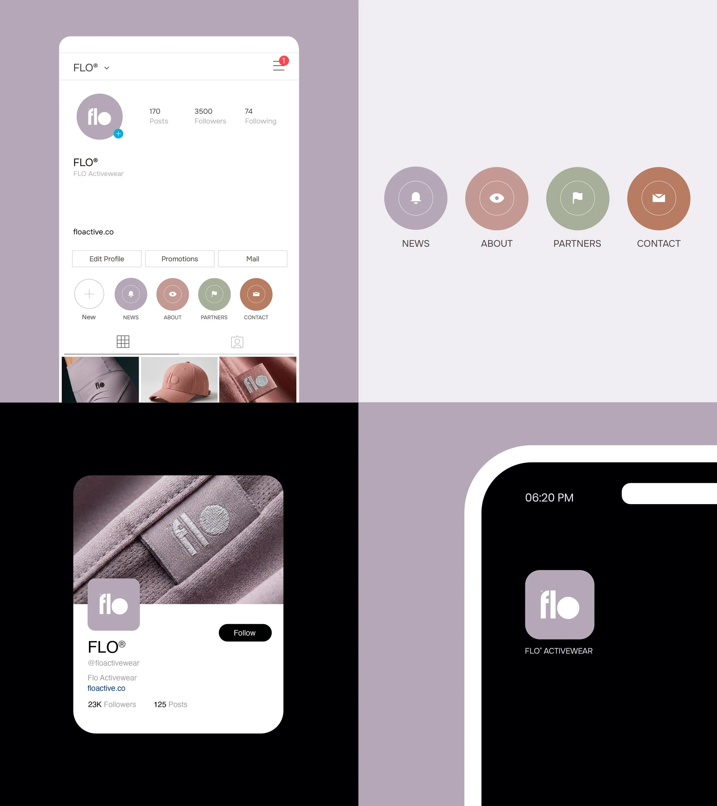
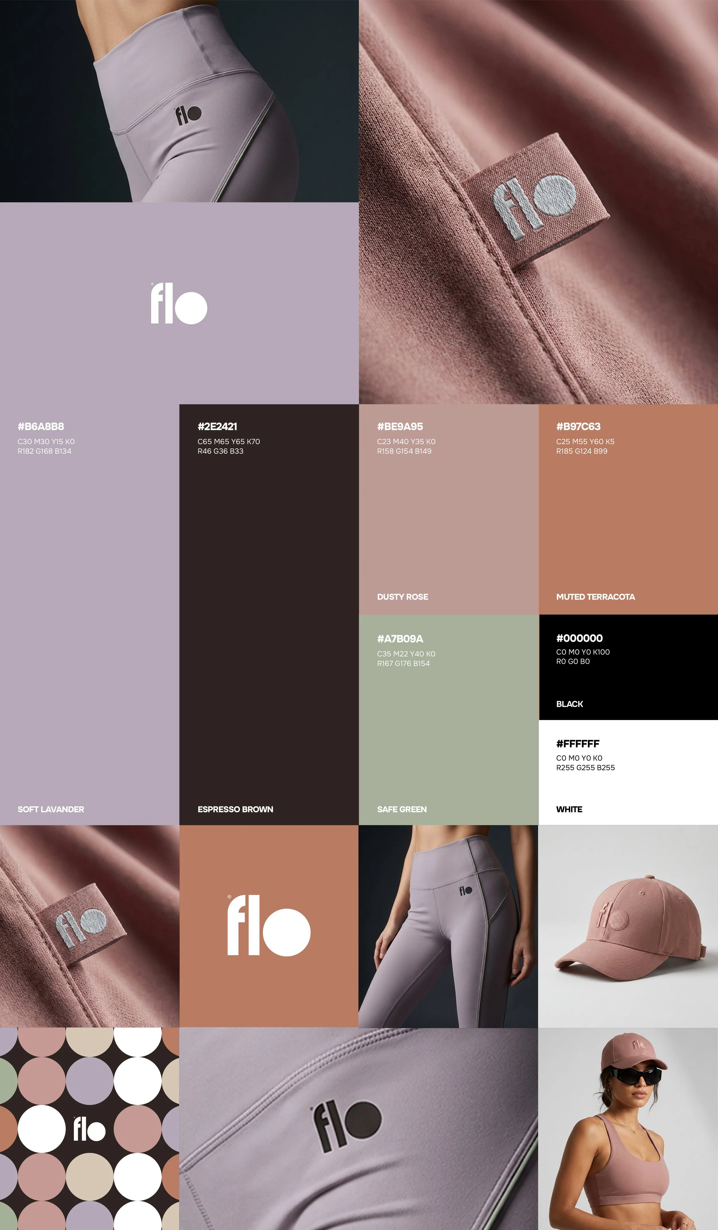
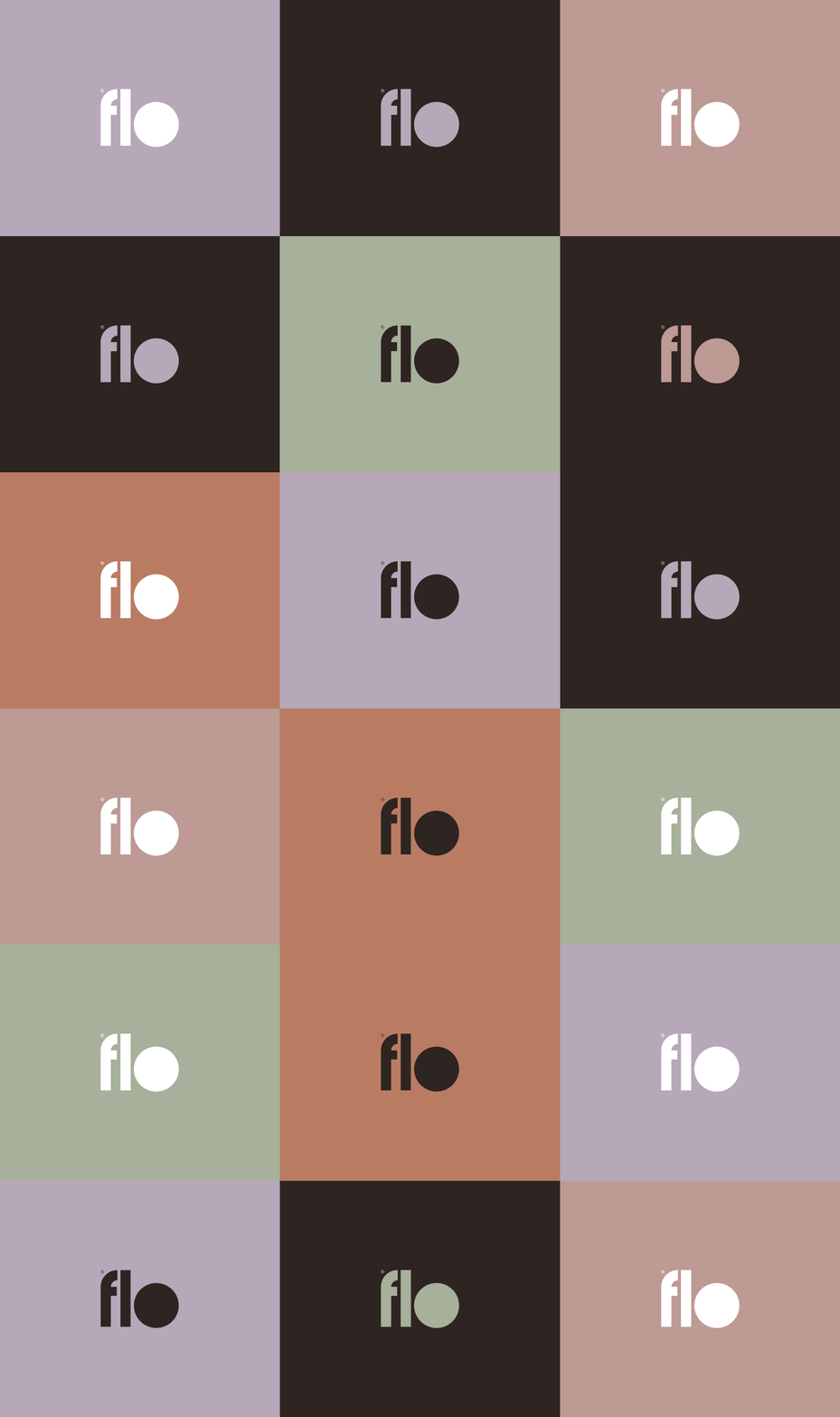
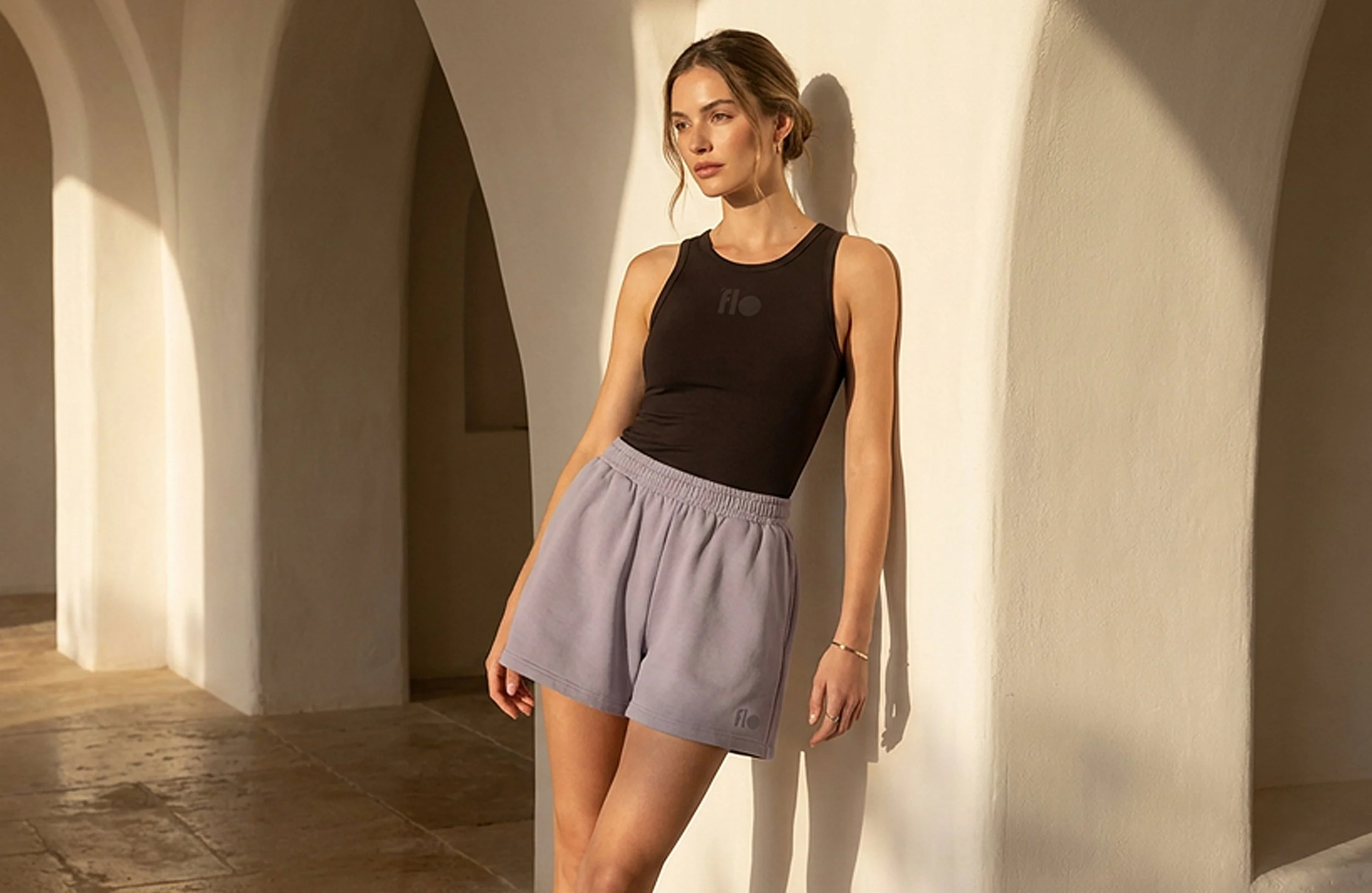
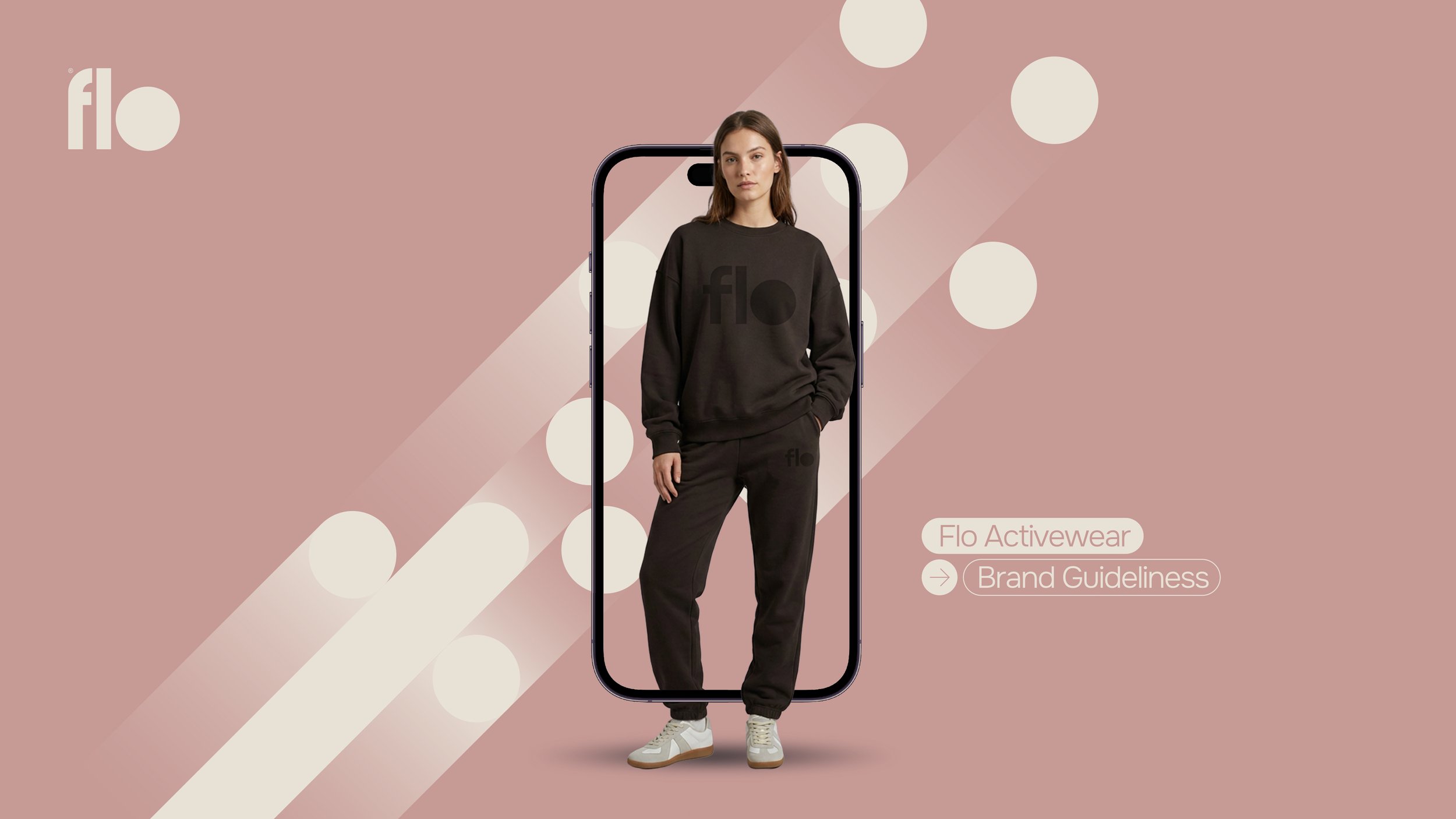
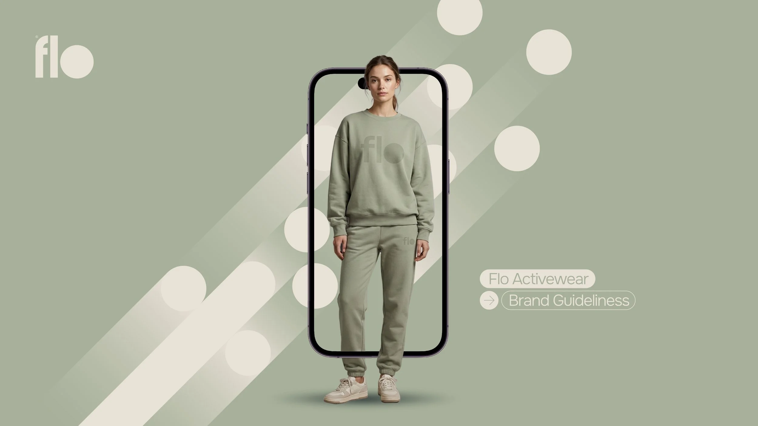
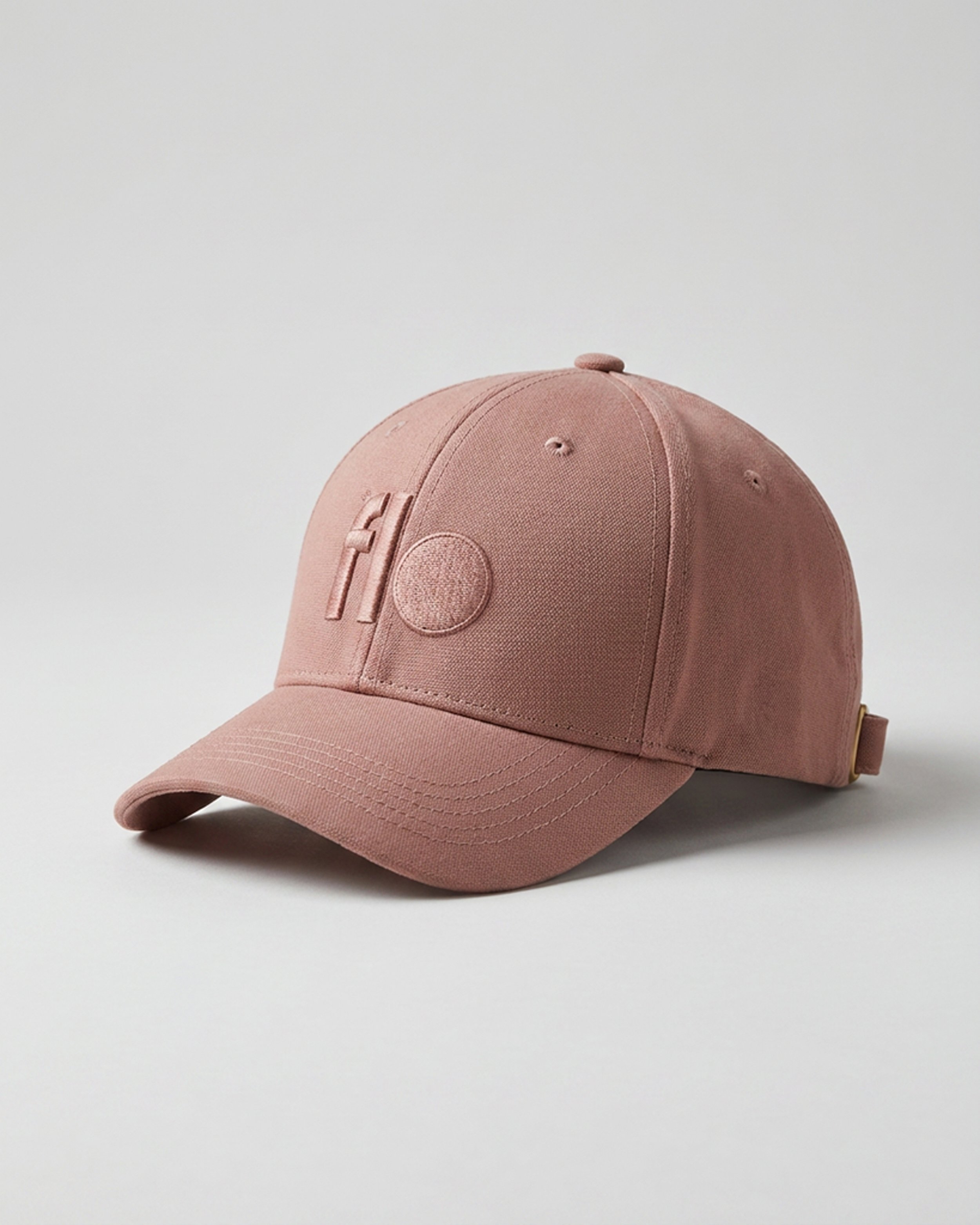
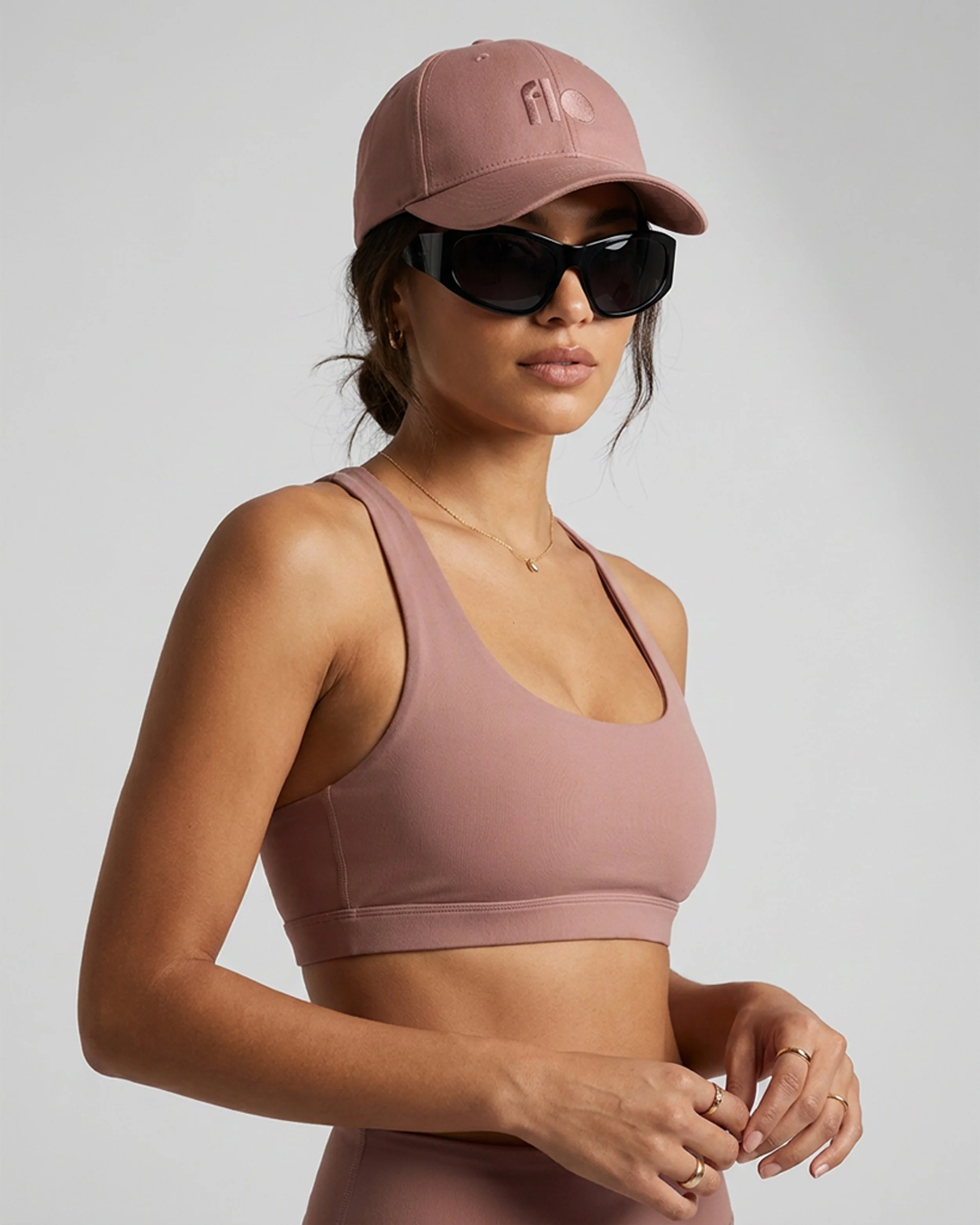
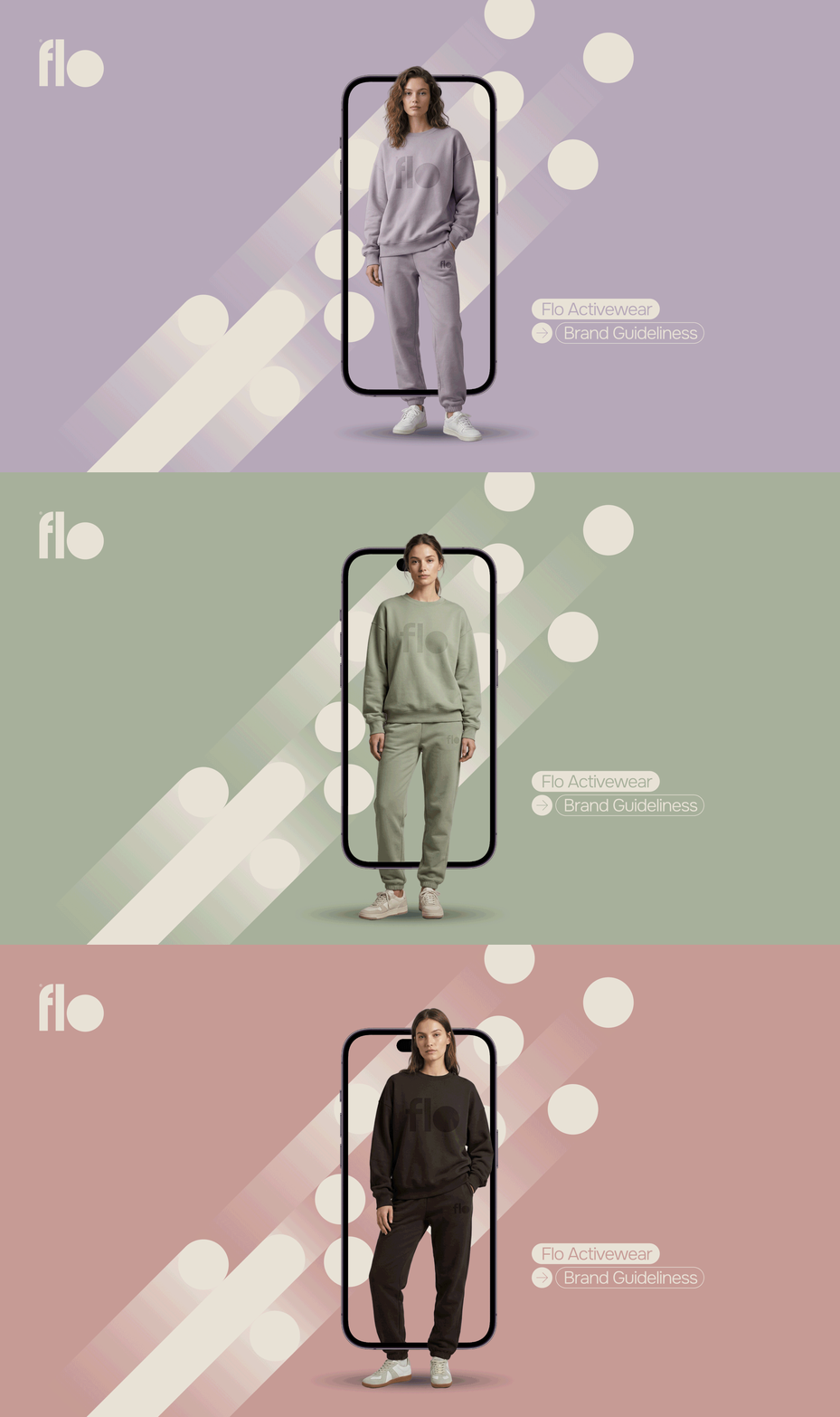
Its primary applications appear on soft, neutral, or muted backgrounds, ensuring strong visual impact while maintaining harmony with the overall brand identity.
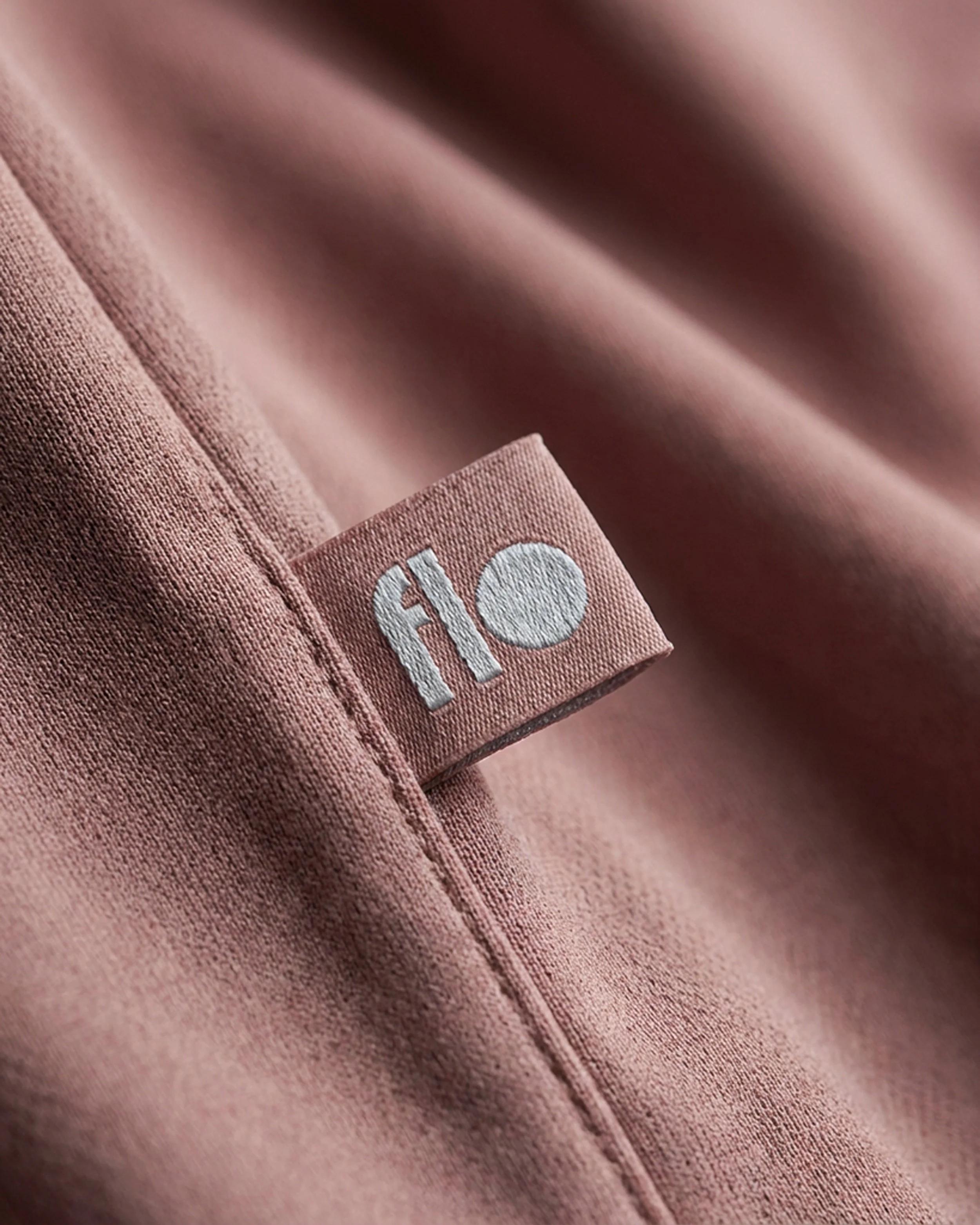
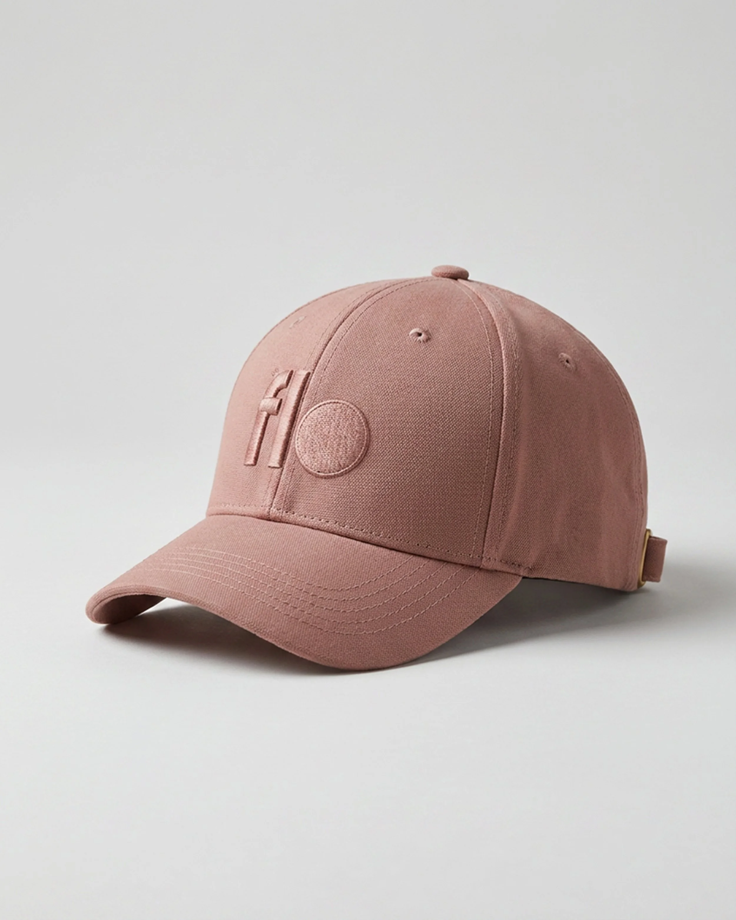
The logo can also be applied in high-contrast variations within the same color system, preserving clarity, legibility, and visual presence across multiple contexts. This flexibility allows the identity to remain consistent without compromising the functionality of the graphic system.
Dynamic Circles
-
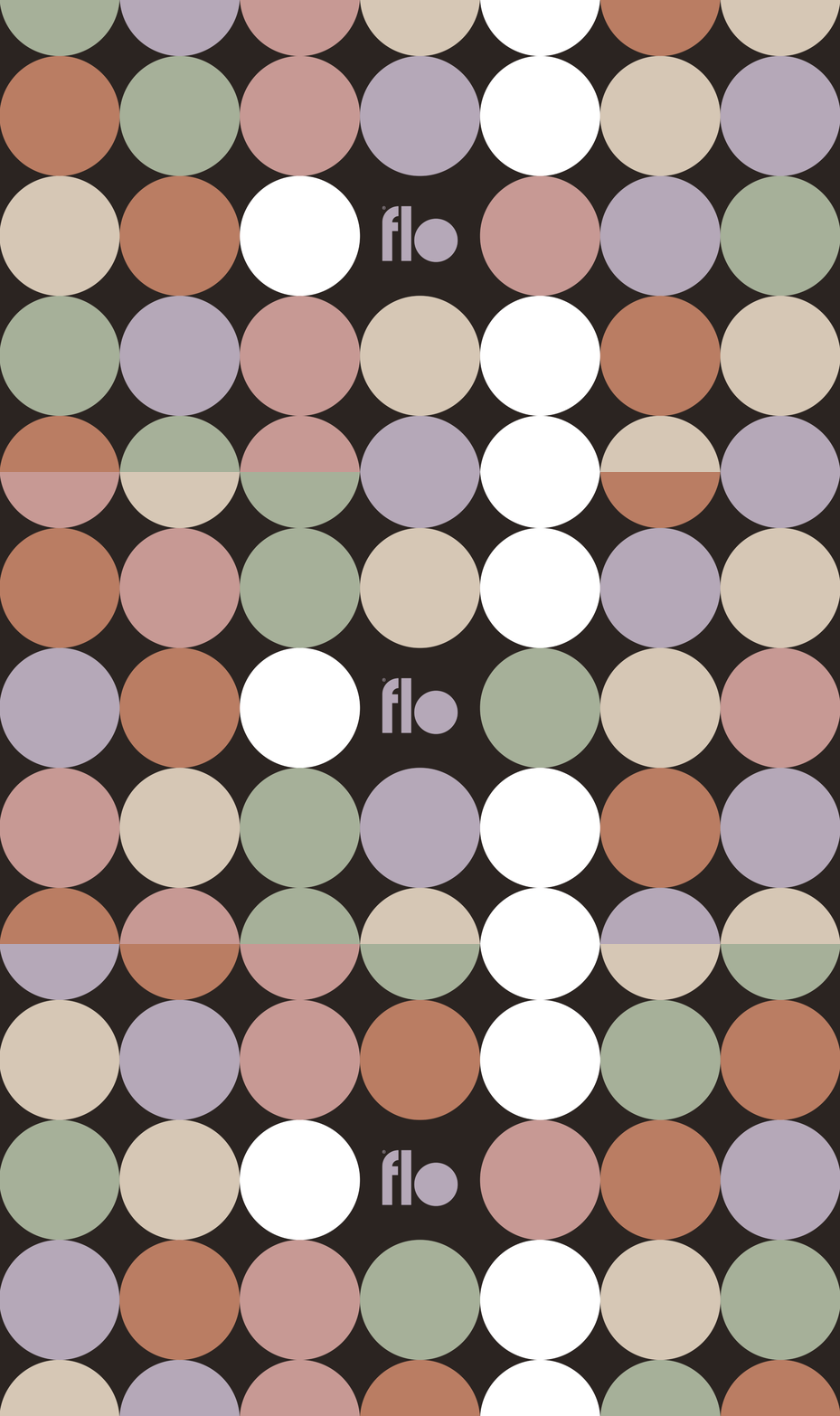
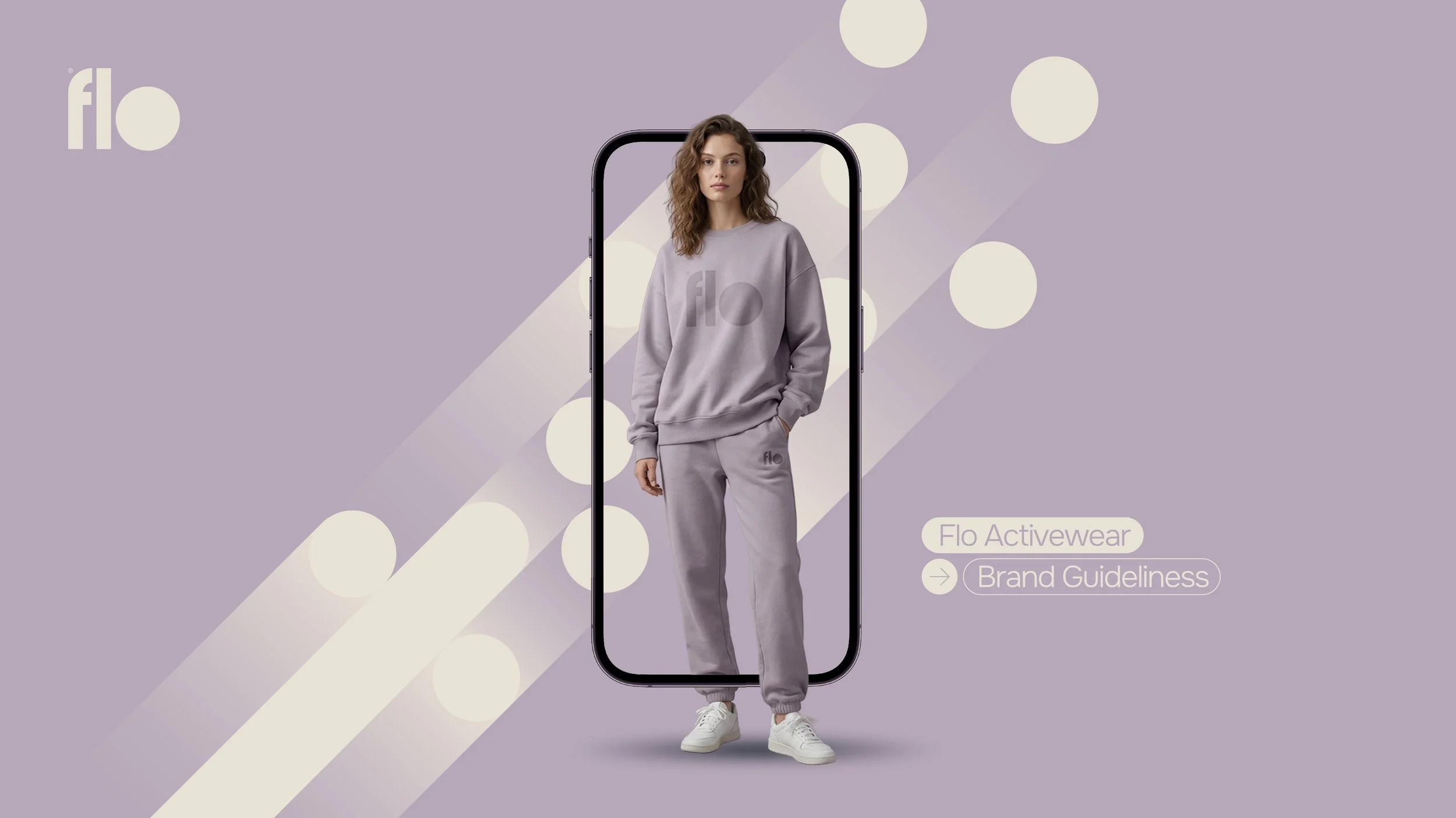
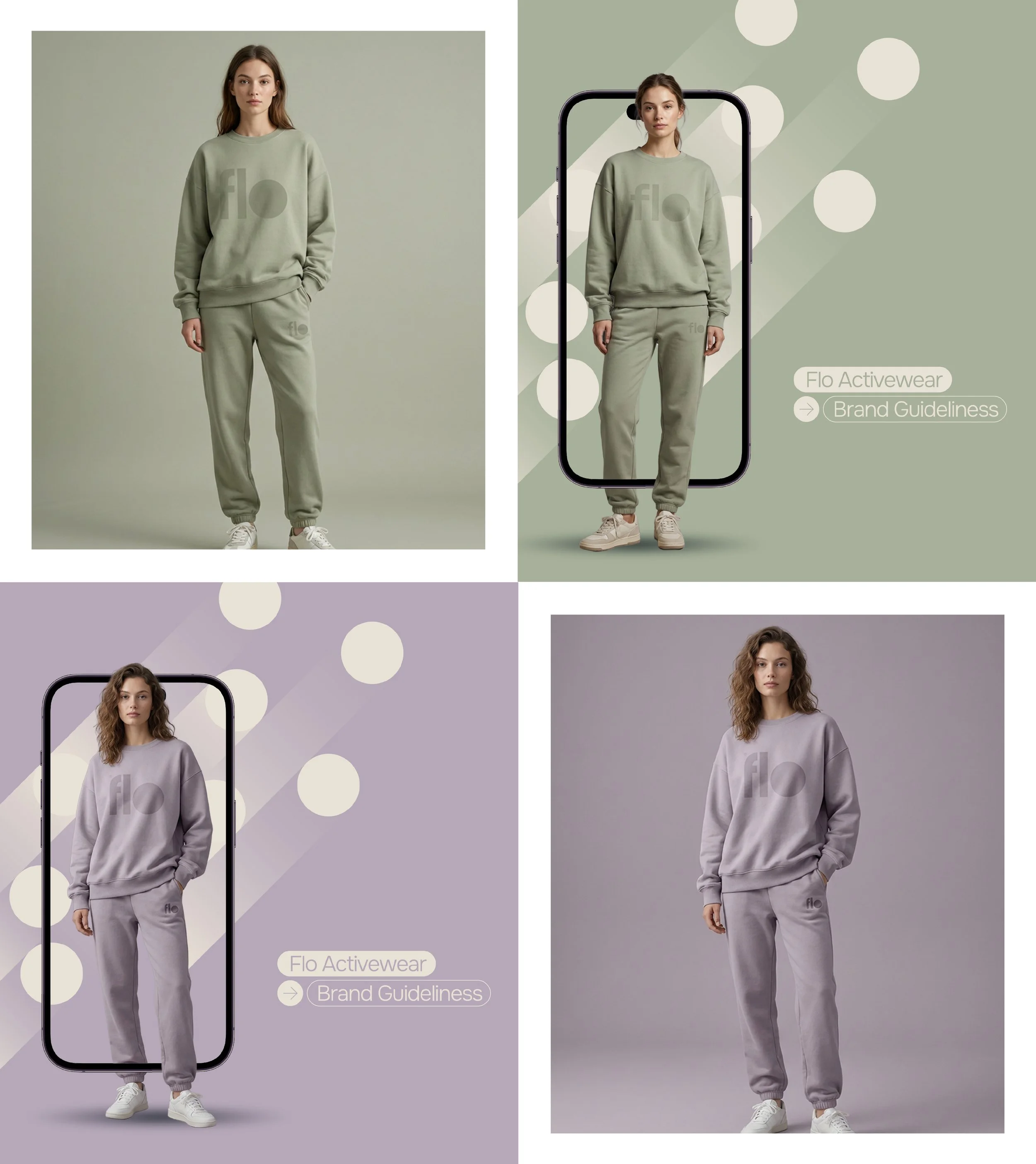
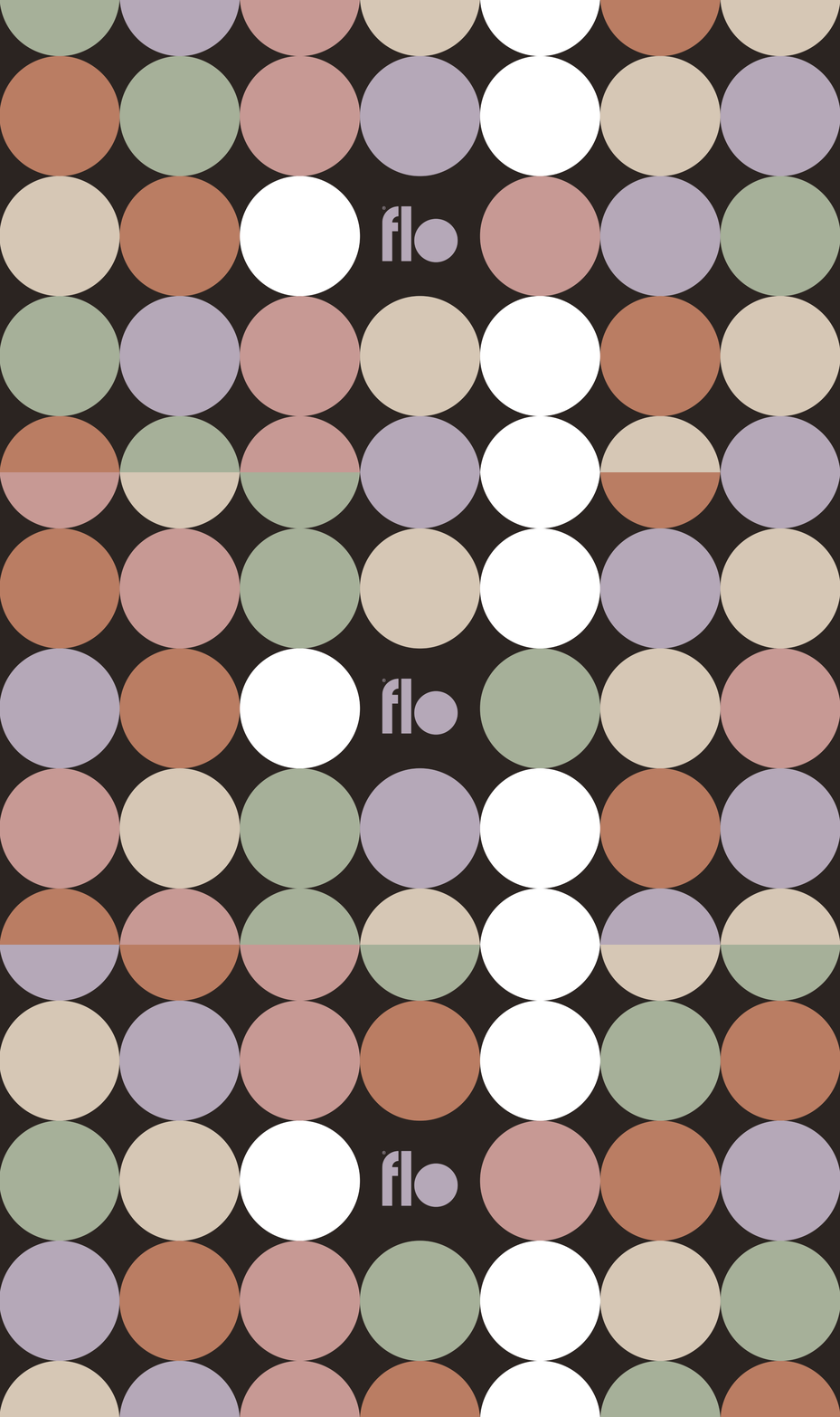
They introduce rhythm, movement, and hierarchy while maintaining a clean and balanced aesthetic.
These shapes are intentionally minimal, controlled, and refined, avoiding unnecessary complexity. Through framing devices, subtle overlays, and compositional guides, the circular forms help organize information while consistently and recognizably reinforcing the brand identity.
The dynamic circles are closely connected to the visual language of the logo itself, reflecting the sense of flow, continuity, and connection that defines FLO. Throughout the identity system and packaging applications, they become a distinctive and central graphic resource.
FLO exists at the intersection of movement, calmness, and refined aesthetics. The brand was created to redefine activewear through a quieter and more sophisticated lens — moving away from aggressive sportswear codes and embracing a more intentional lifestyle approach.
Conceptually, FLO represents fluidity. The name evokes the idea of “flow”: the natural balance between body and mind, movement and stillness. The brand is not about competition or performance pressure, but about feeling grounded, confident, and connected to everyday wellness rituals.