
-
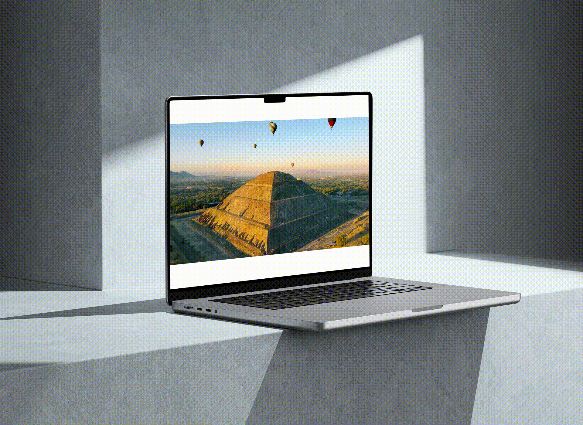
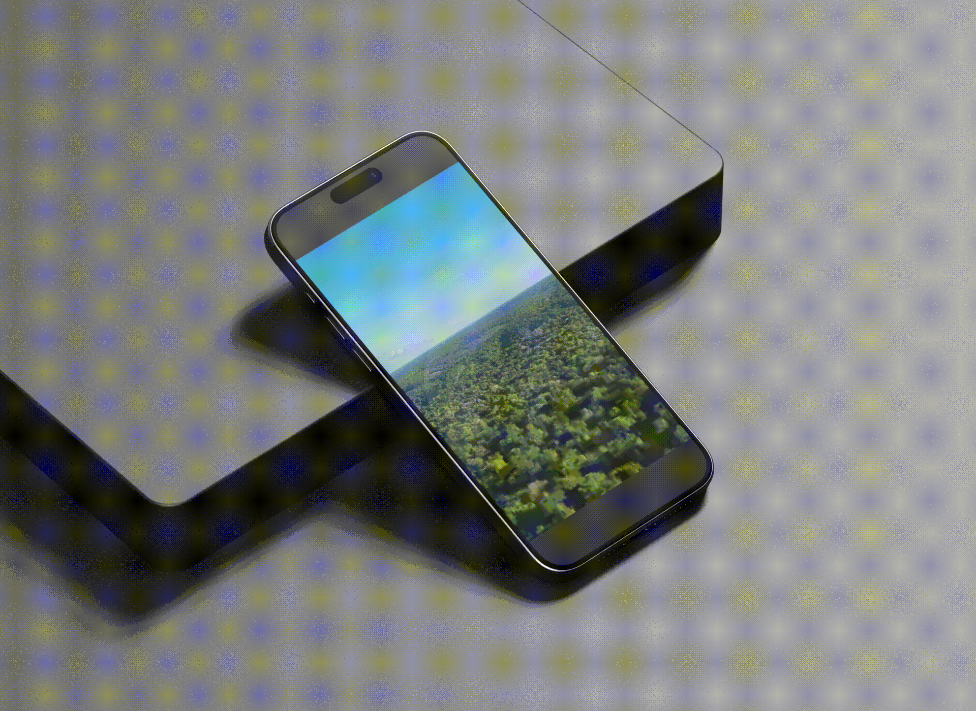
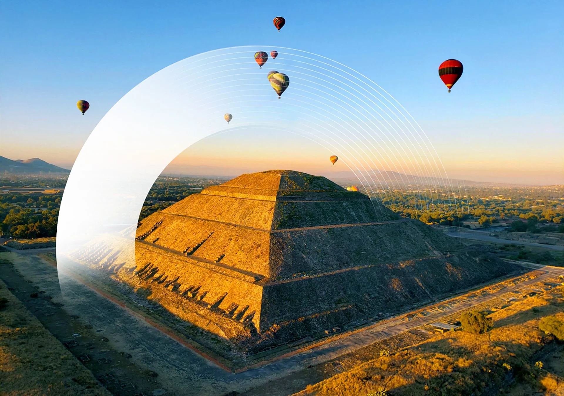
The websites for Mexico and Brazil were designed as a cohesive digital system that expresses a global brand through local nuance. The core visual language is built around the circle—a universal form that represents globality, continuity, and connection.
Conceptually, the circle reflects Saison International’s role as a connector between markets, people, and opportunities. Visually, it becomes a structural device: framing imagery, guiding navigation, creating rhythm, and reinforcing hierarchy. It is not decorative — it is functional.
The art direction balances clarity and dynamism. Clean layouts, confident typography, and regionally attuned color palettes create distinction between Mexico and Brazil while preserving brand unity. Circular overlays and layered compositions introduce movement and depth without compromising professionalism.
From a UX/UI perspective, the experience is streamlined and intuitive. The interface prioritizes readability, clear information architecture, and smooth transitions. Circular elements subtly anchor attention, supporting a fluid, scroll-based journey across devices.
Visit Website: Saison Mexico
Visit Website: Saison BrazilAgency: Chance Design
Client: Saison International
Services: Branding, Art Direction, Graphic Design, Motion Graphics, Website Design, UX/UI, Digital Concept
Saison International


Brand System Development
-
As a global company expanding into Mexico, Brazil, and upcoming markets across the Americas, the creation of a unified brand system was essential. The manual establishes visual, verbal, and structural standards to ensure consistency, scalability, and strategic cohesion across all present and future markets.
The result is a scalable ecosystem that balances global consistency with regional identity — structured, contemporary, and built for expansion.