BUSY Group
-
For more than four decades, The BUSY Group has helped thousands of Australians through education, apprenticeships, employment and community initiatives.
As the organisation continued to grow, so did its complexity. New business units, independent programs and expanding services had gradually created an ecosystem where every brand communicated differently, making the organisation feel fragmented despite belonging to the same institution.
Rather than creating a new logo, this project became a complete strategic redesign of the entire visual ecosystem.
The challenge wasn't to reinvent BUSY.
It was to redesign forty years of growth into one coherent identity system.
Agency: Chance Design
Client: The BUSY Group®
Services: Branding, Art Direction, Logo Design, Graphic Design, Motion Graphics, Social Media.

The Challenge
-
The previous identity had evolved organically over decades.
Different business units had developed their own logos, proportions, naming conventions and visual languages, making it increasingly difficult to understand how each service related to the organisation as a whole
The objective became much larger than a visual refresh.
We needed to create an identity capable of supporting dozens of present and future brands while preserving the recognition and trust already built by BUSY.
A New Geometry
Every proportion became intentional.
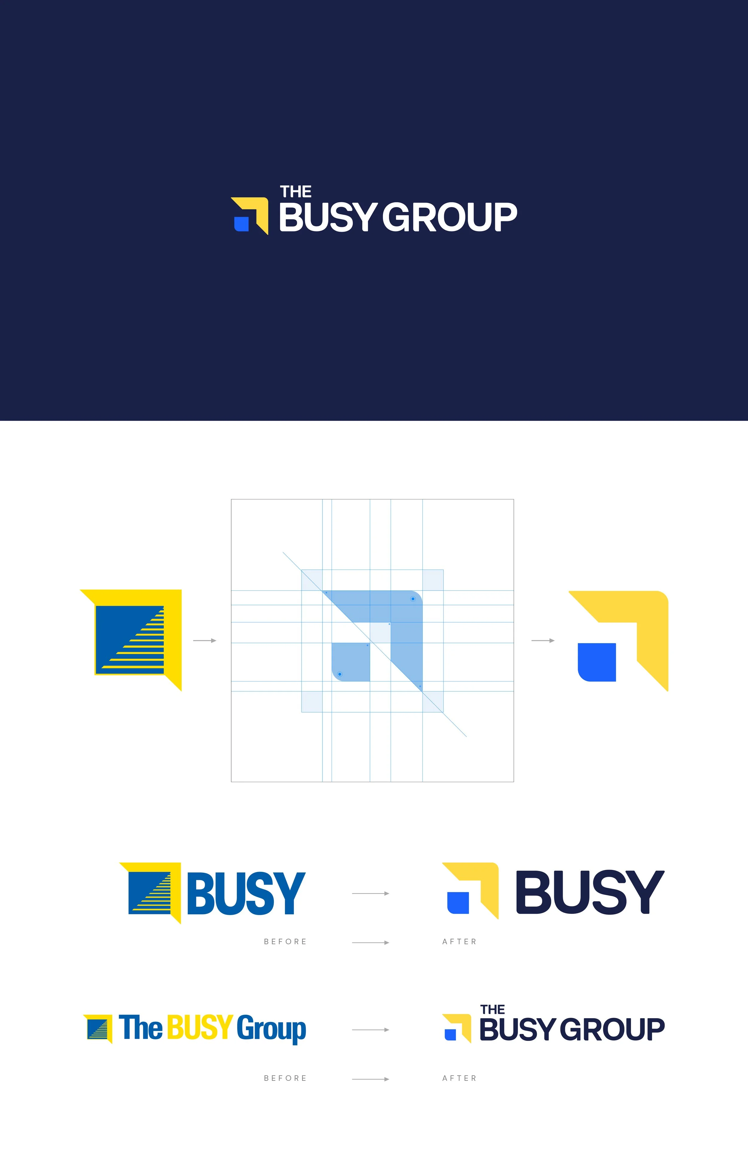
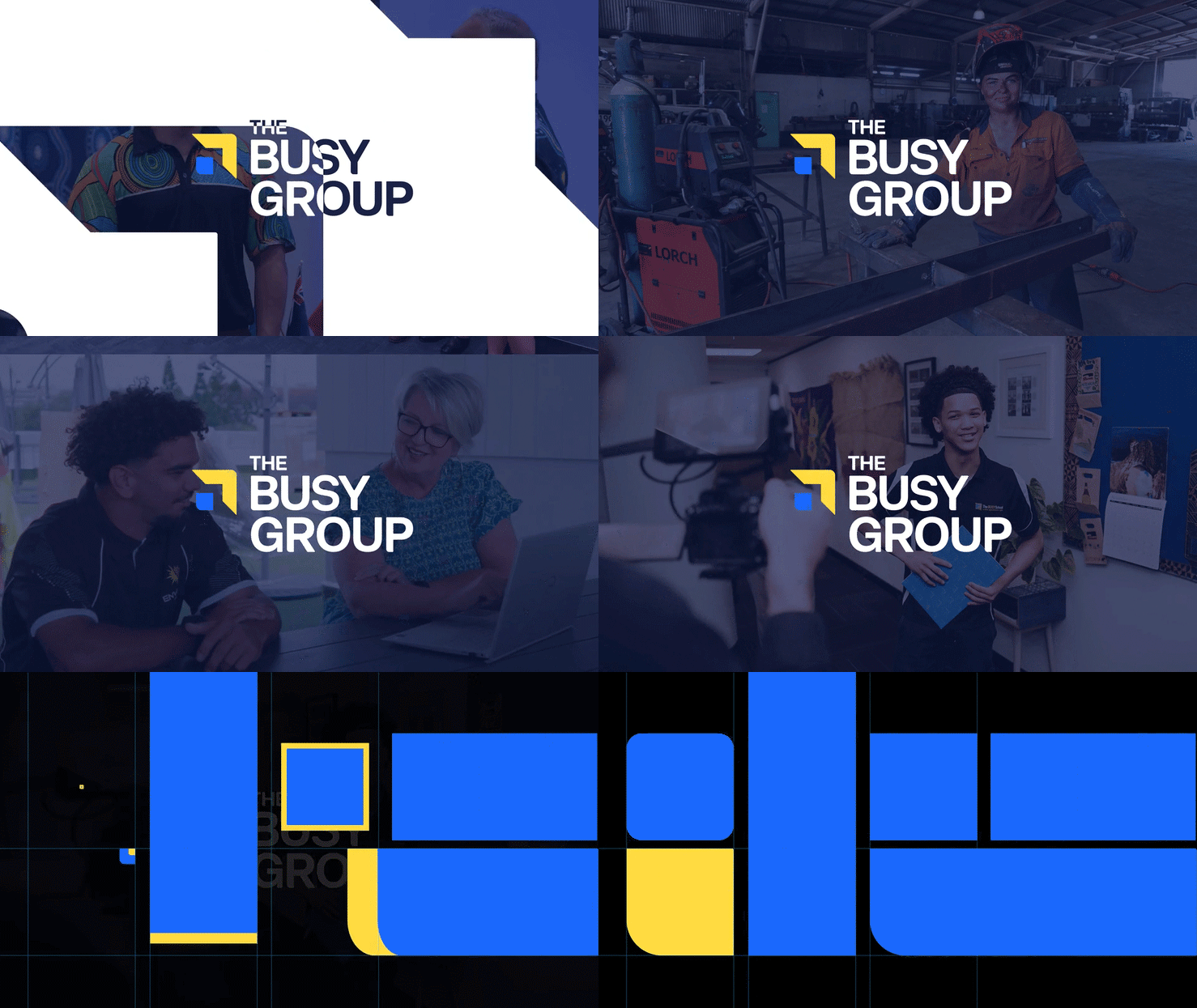
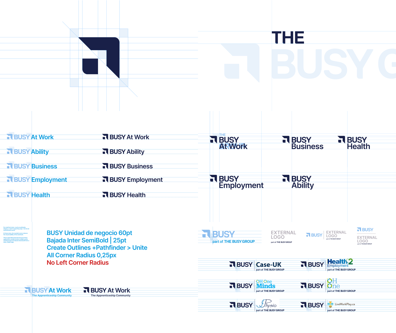
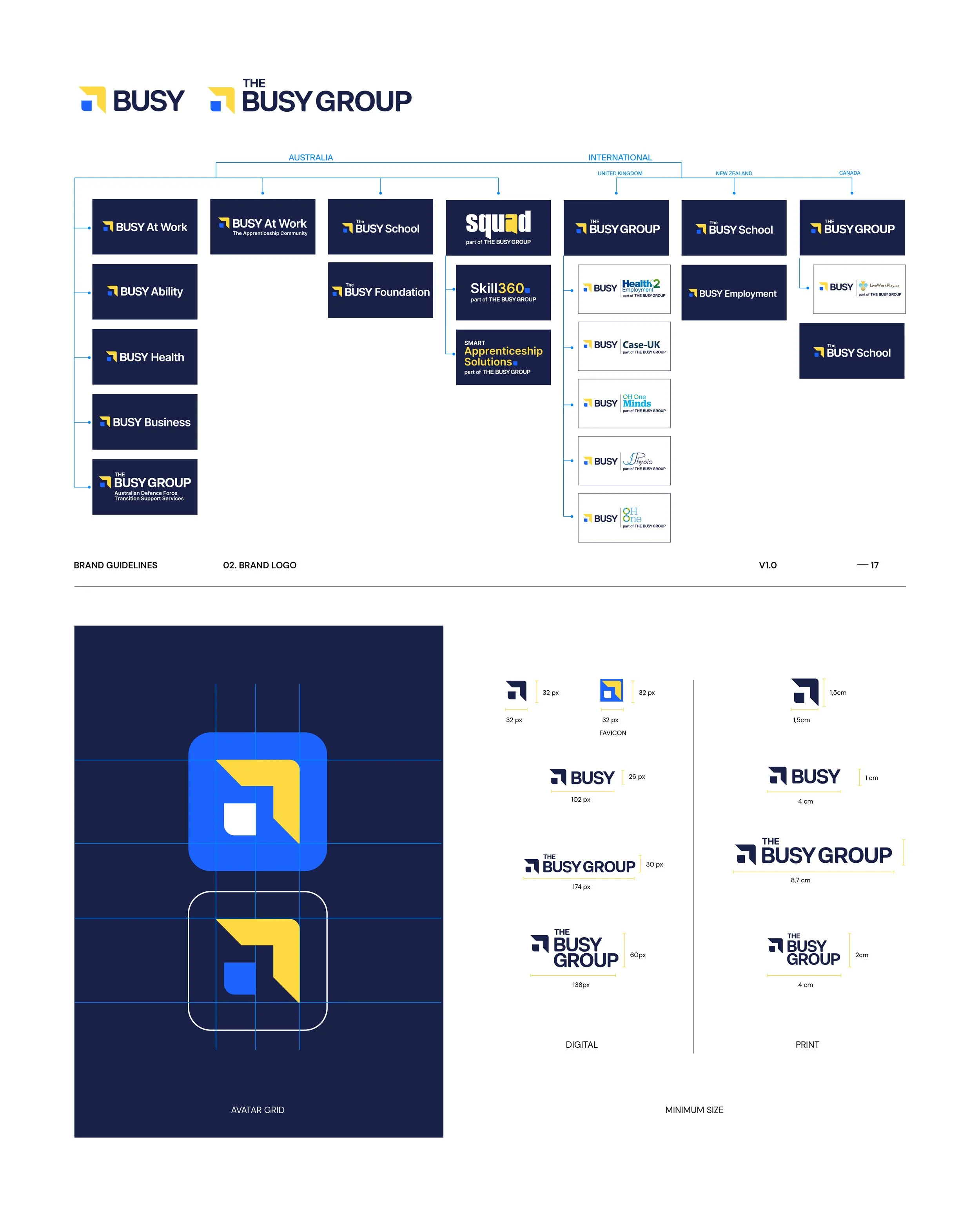
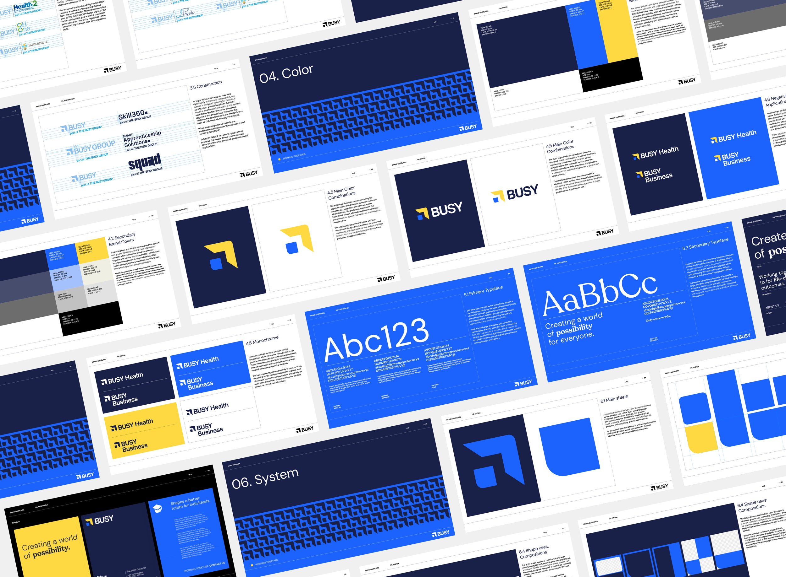
The entire identity was rebuilt using a geometric construction system.
Nothing was drawn intuitively.
Every angle, spacing, radius and alignment follows a precise set of rules that later informed not only the logo, but every graphic asset throughout the identity.
This geometric language became the foundation of the entire visual system.
Brand Architecture
Designing for growth.
Perhaps the most important part of the project wasn't the logo itself.
It was creating a flexible architecture capable of organising an organisation composed of multiple companies, programs and future initiatives.
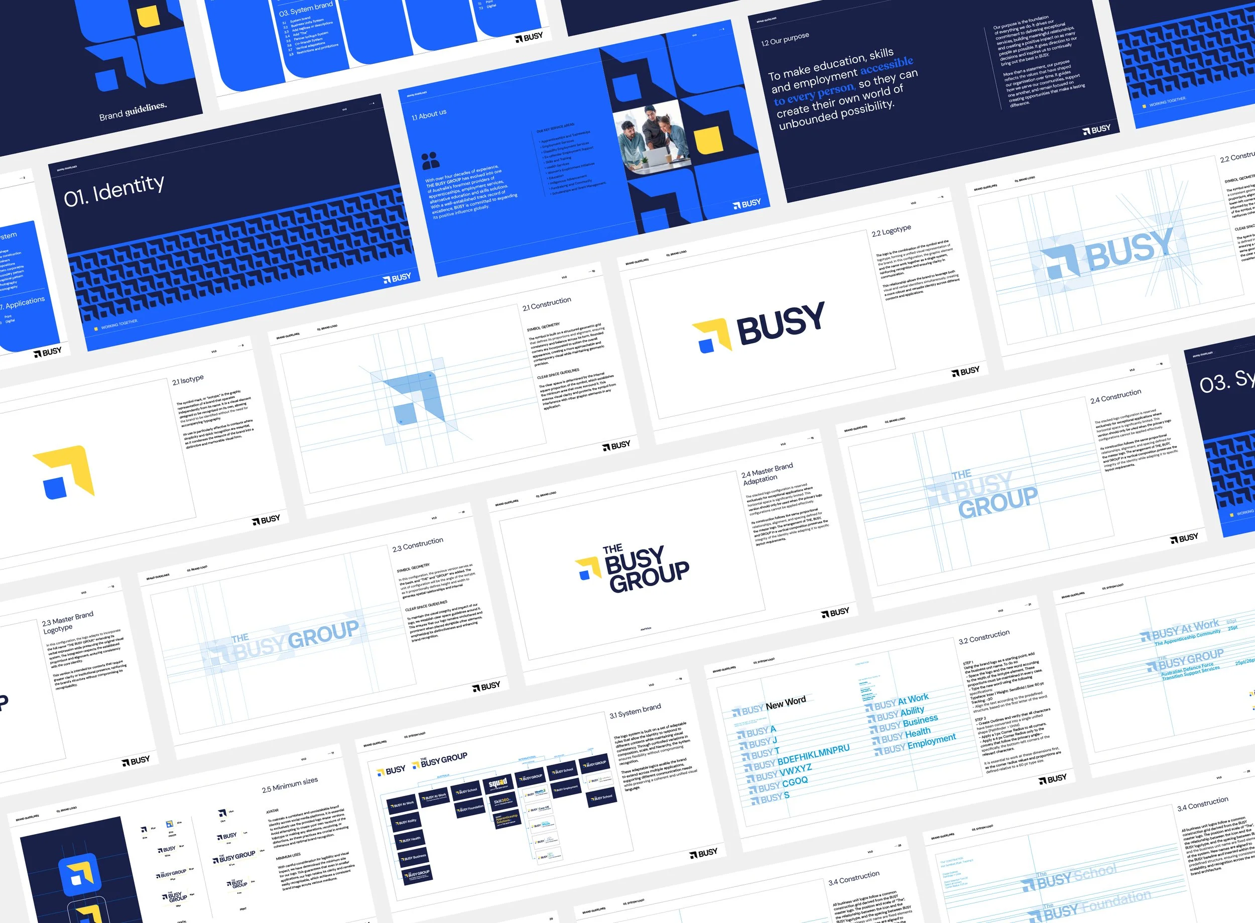
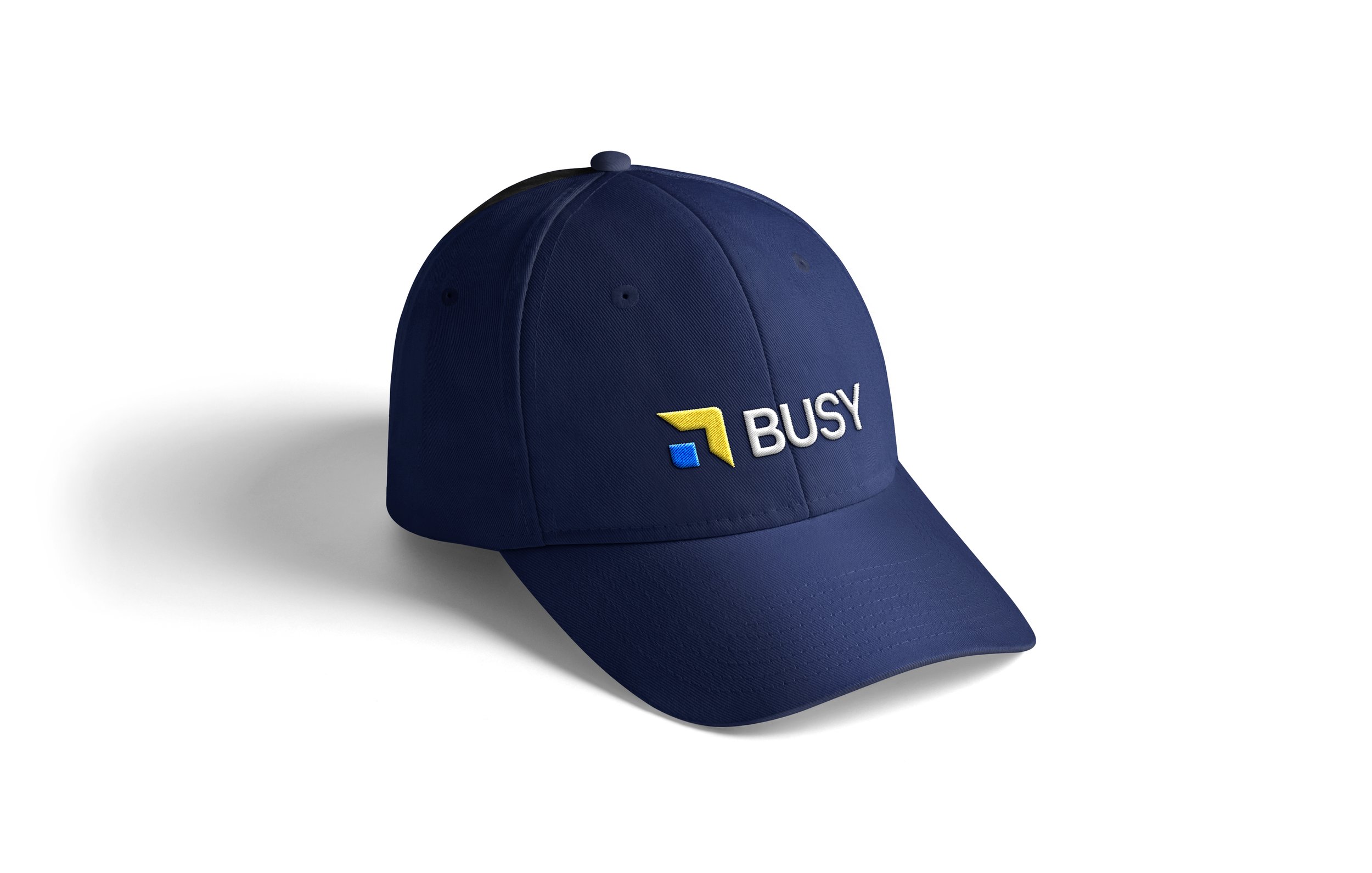
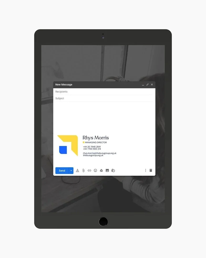
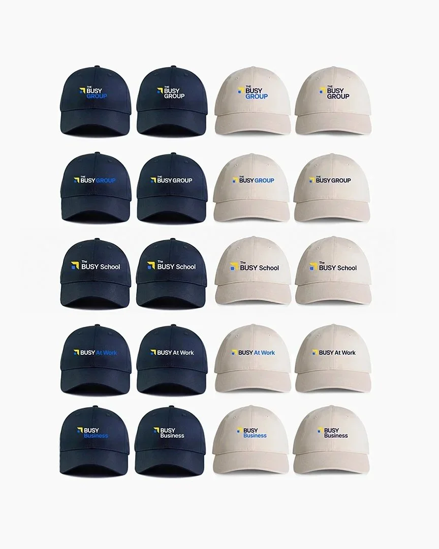
The new system establishes clear relationships between the Master Brand, Business Units, partner lockups, co-brands and future extensions, allowing every new initiative to feel immediately connected to the BUSY ecosystem.




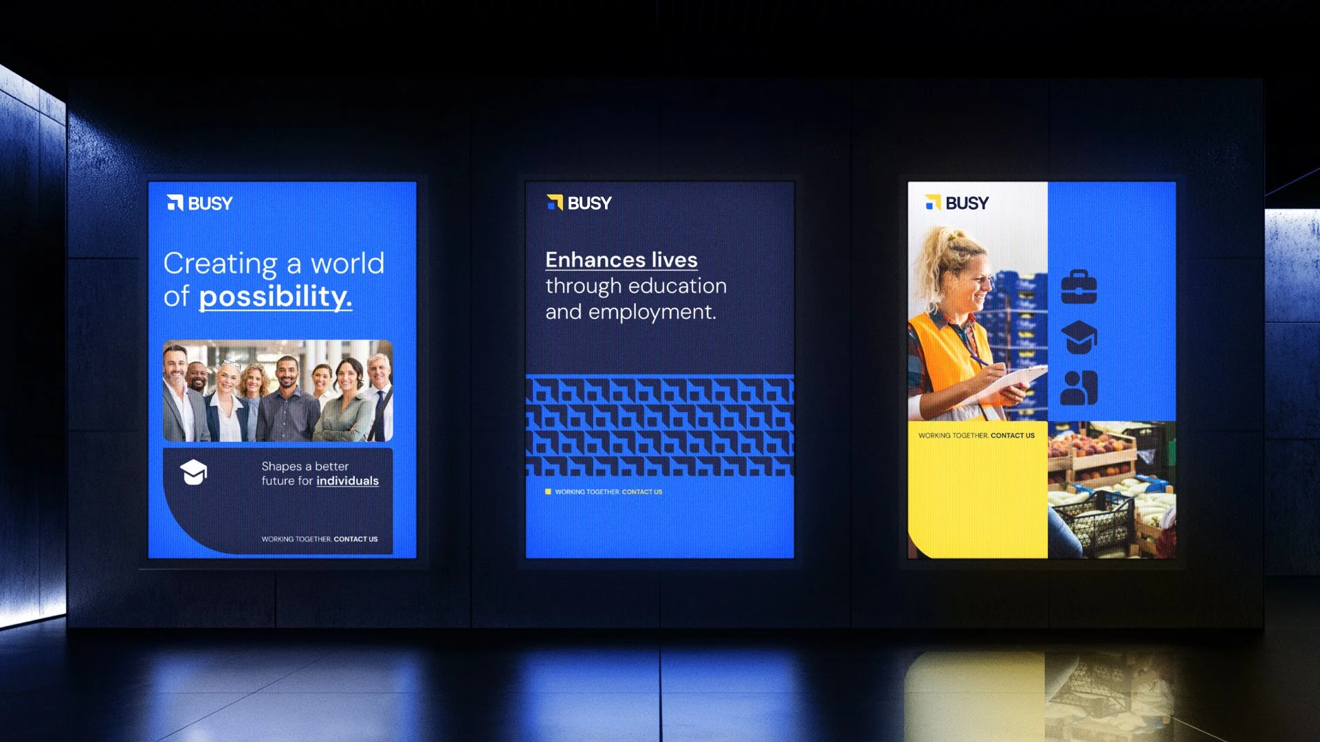

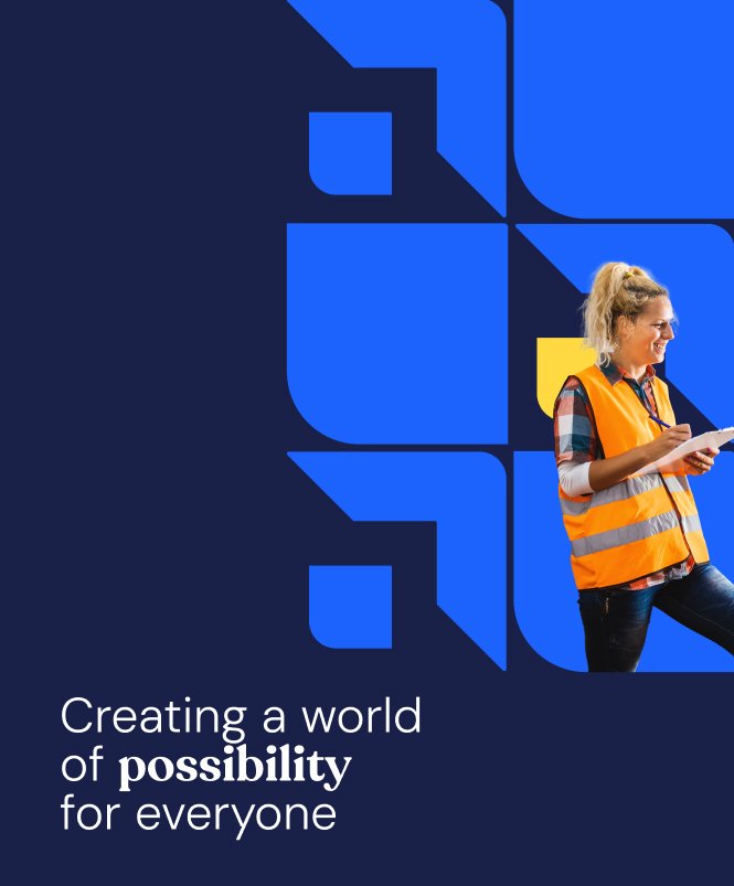
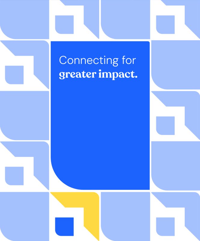
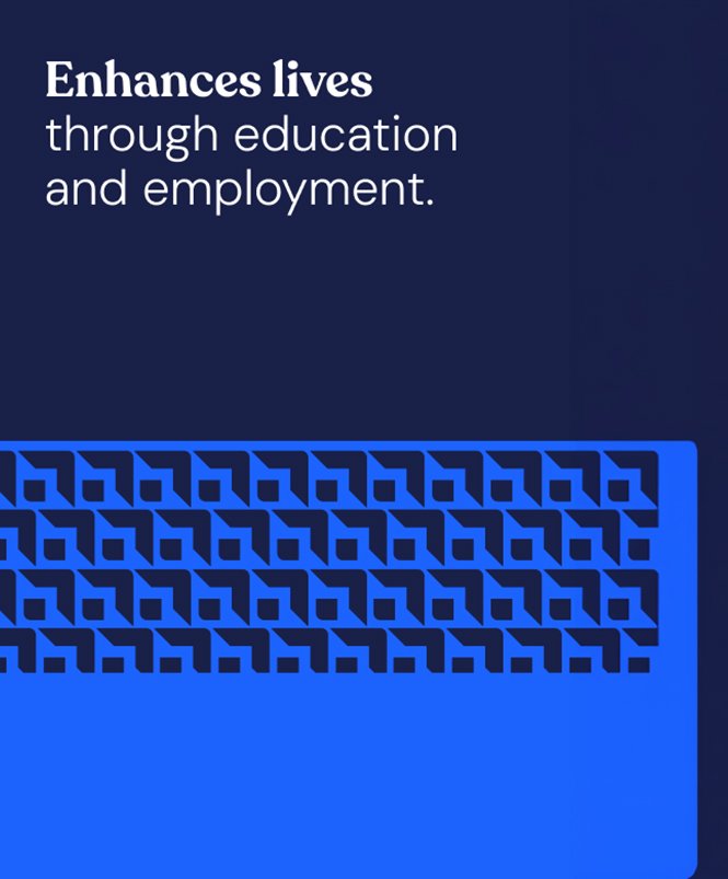
One System. Infinite Applications.
-
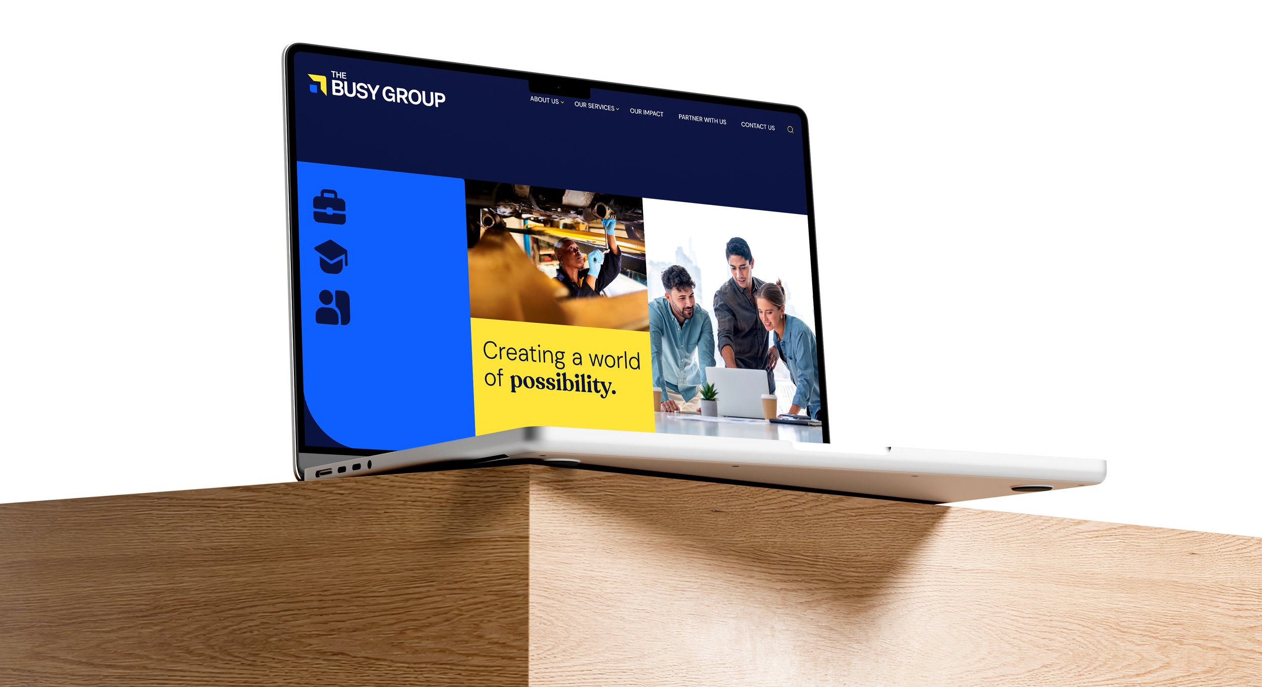
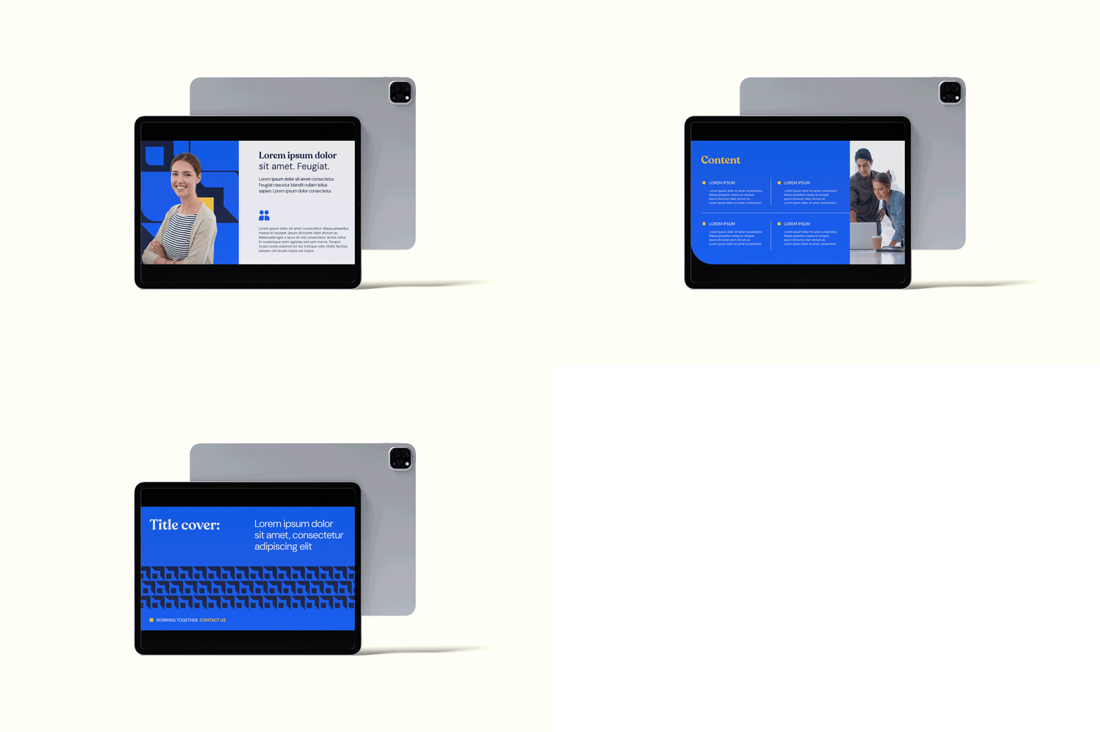
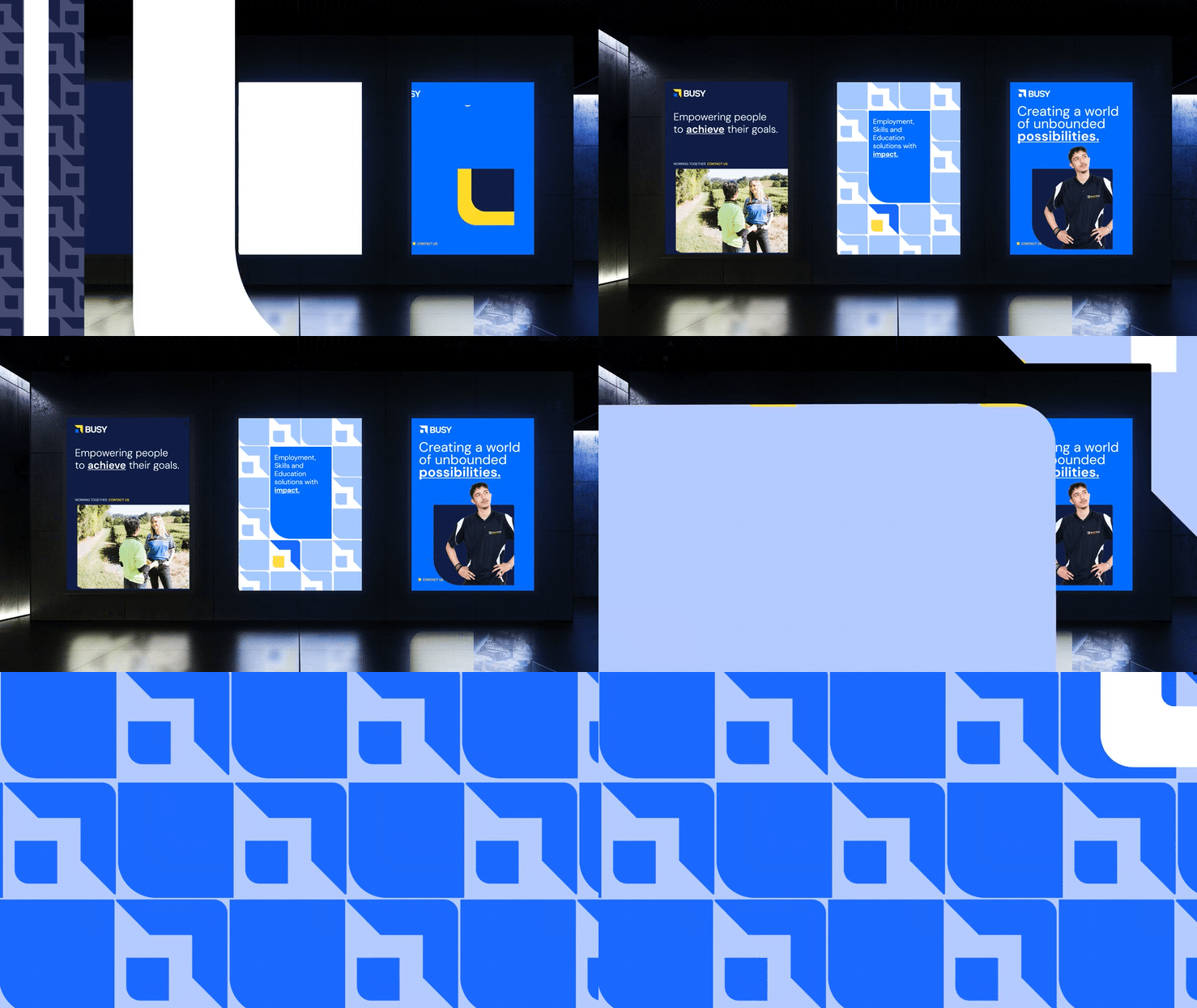
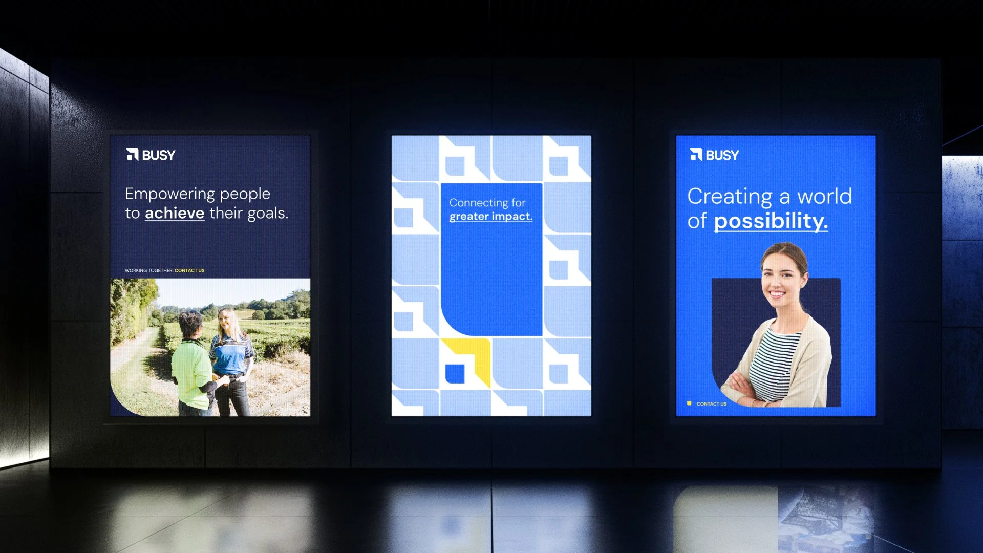
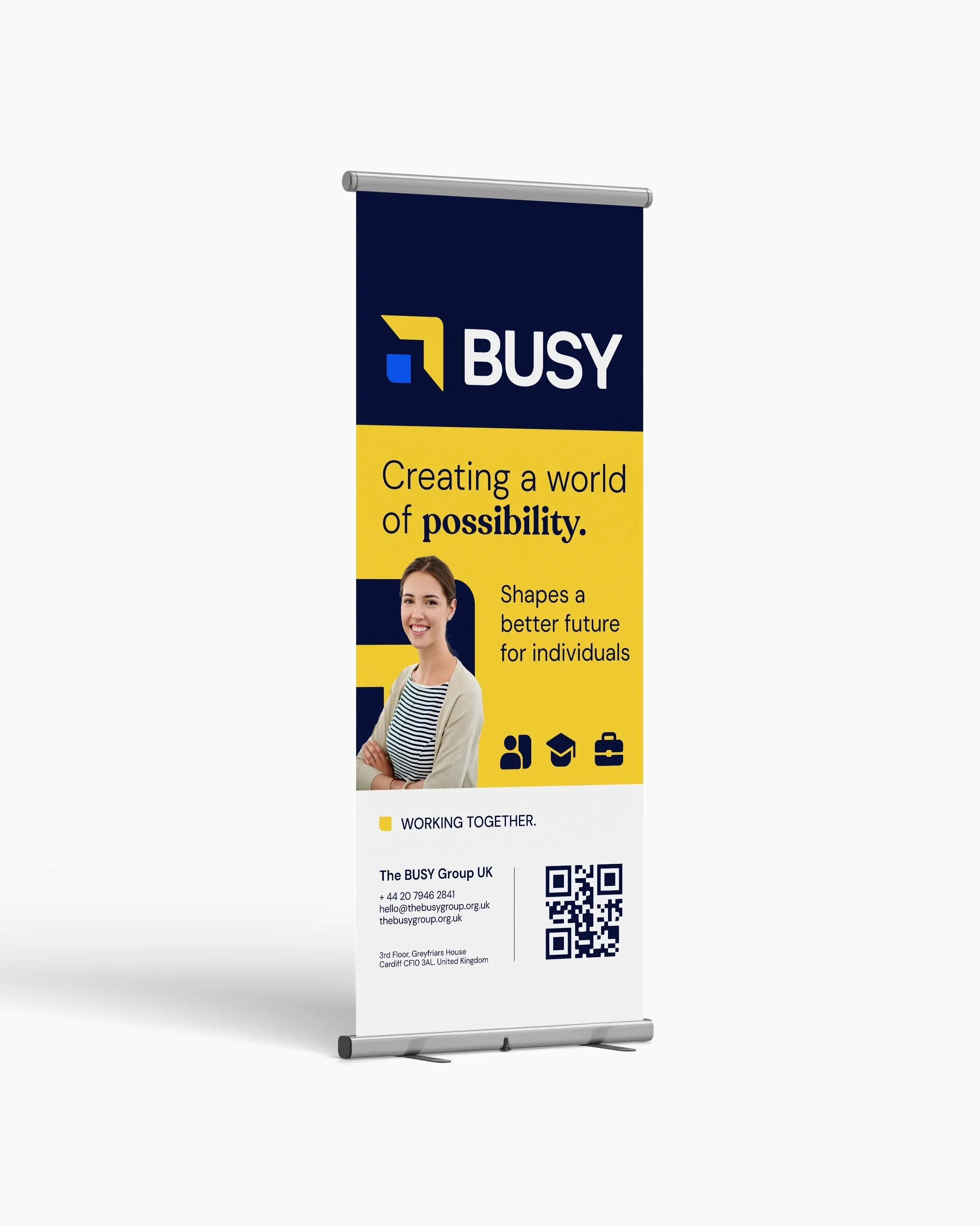
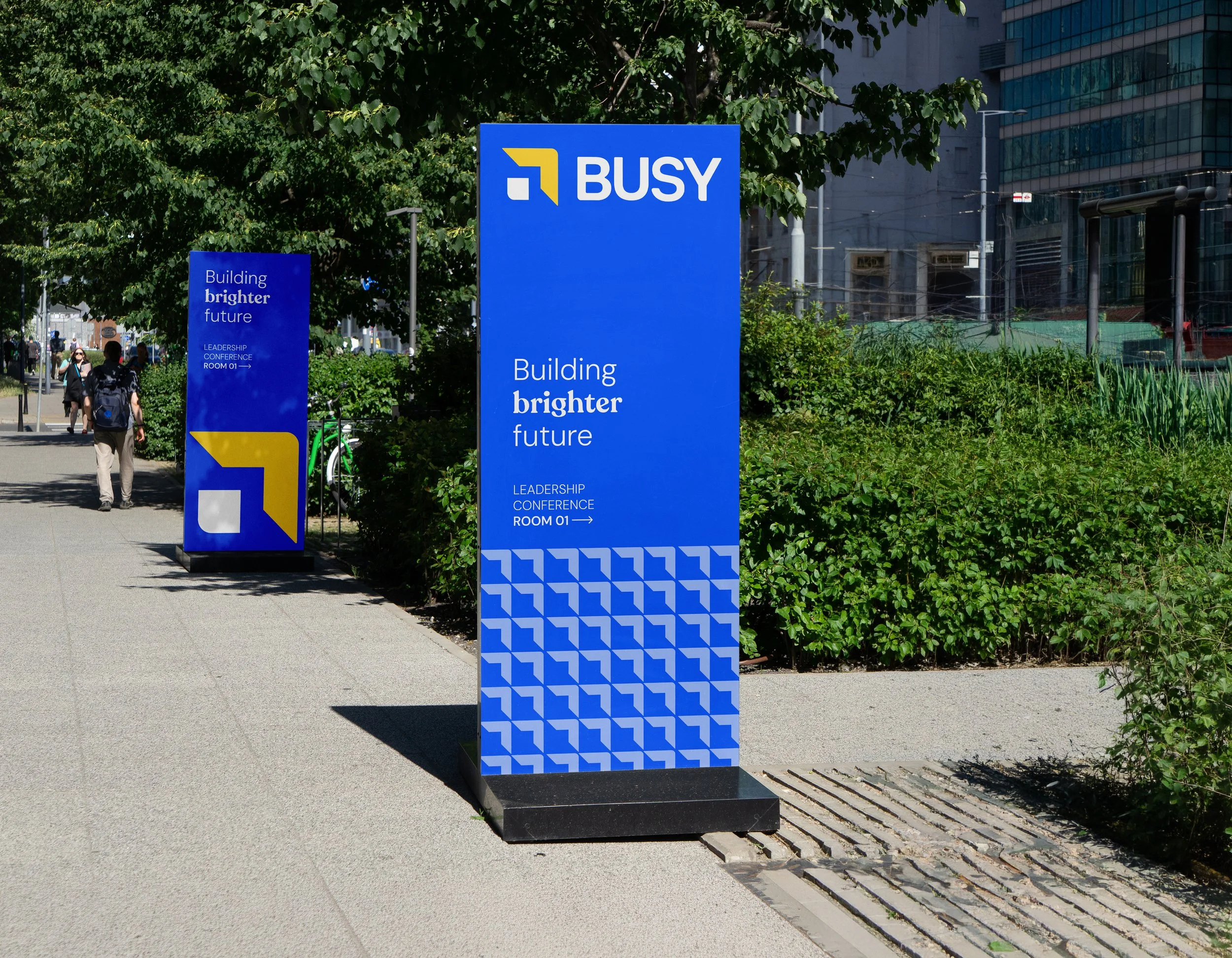
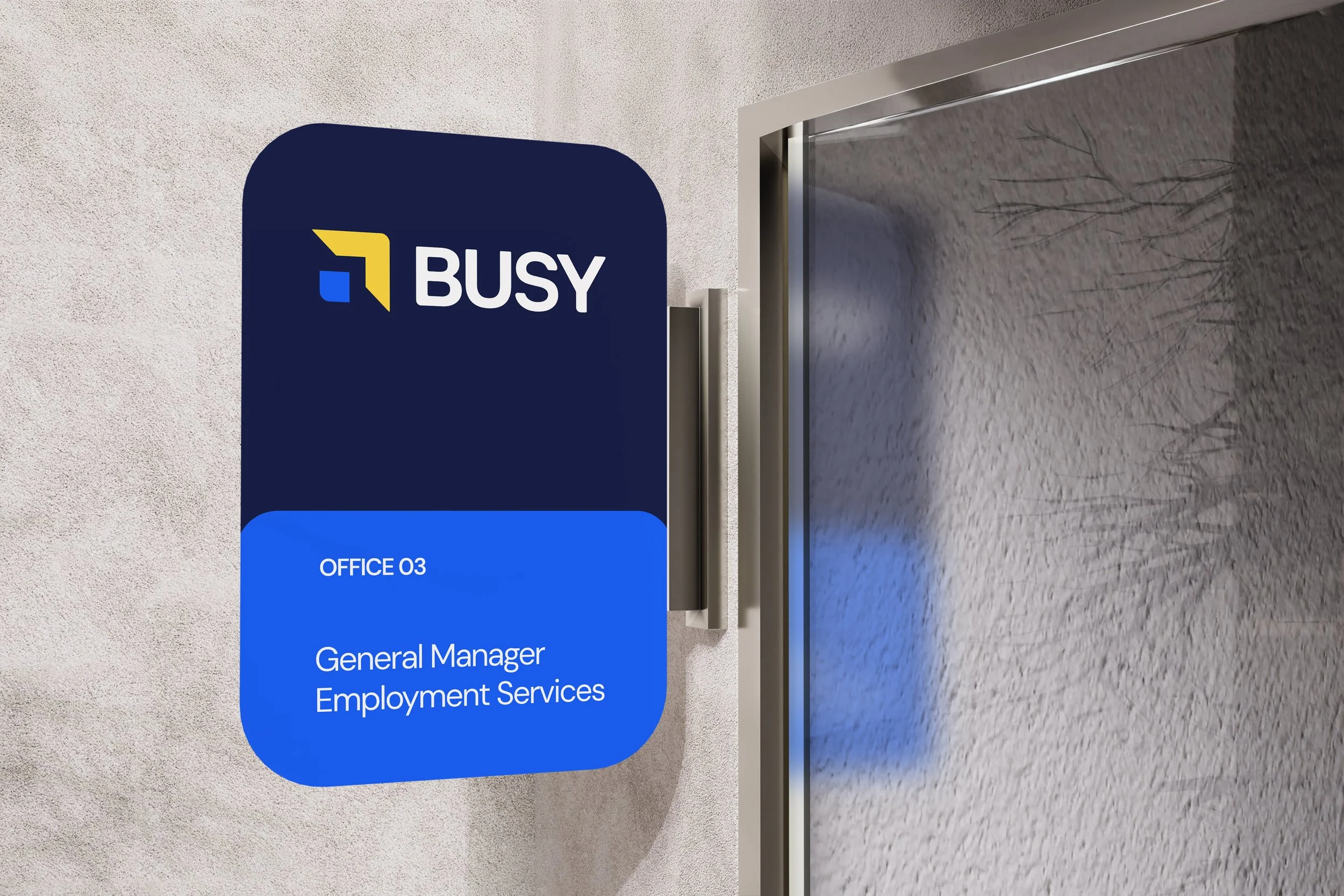
Rather than designing isolated assets, the objective was to build visual rules.
Patterns originate directly from the logo geometry.
Containers share the same construction principles.
Iconography follows identical corner radii.
Graphic compositions rely on the same modular logic.
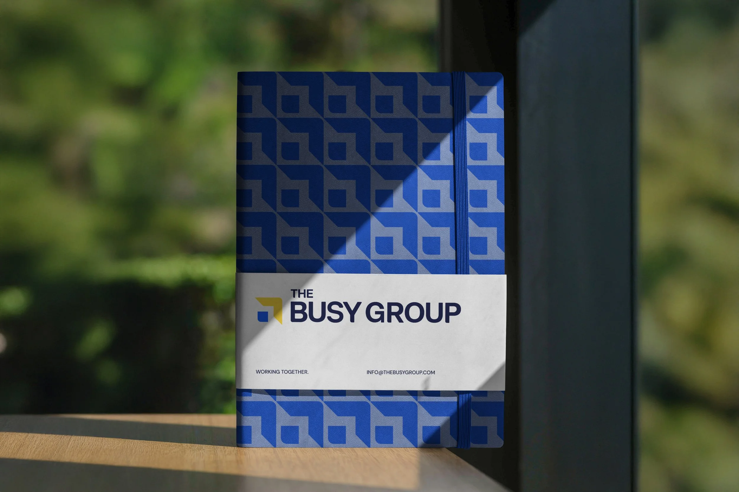
Every element belongs to the same visual language, creating consistency without becoming repetitive.
Brand Strategy
-
Replacing a highly recognised identity wasn't the right solution.
Instead, the project focused on identifying what people already recognised and strengthening those assets.
The result is an identity that feels familiar at first glance, while introducing a completely new level of clarity, consistency and scalability.
Every design decision was made to increase recognition rather than replace it.
Logo Redesign
-
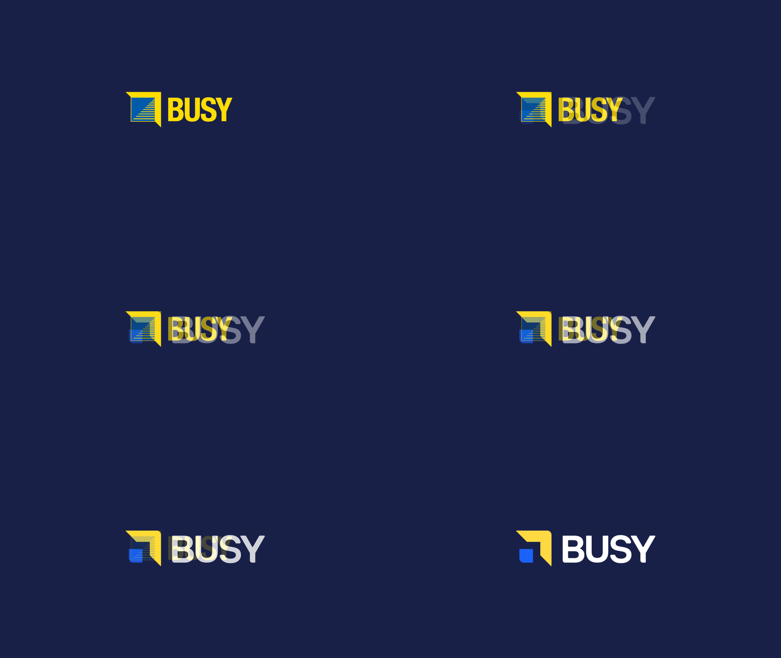
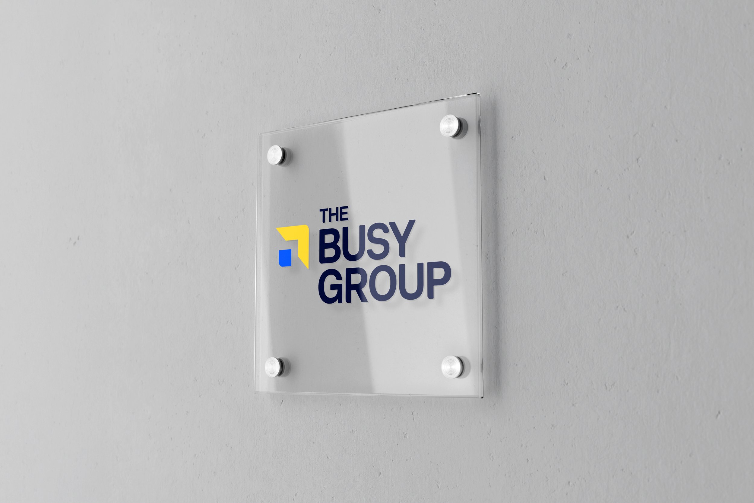
The previous logo contained multiple visual details that made it difficult to reproduce consistently across modern digital environments.
The redesign reduced the mark to its essential geometry while preserving its recognisable silhouette.
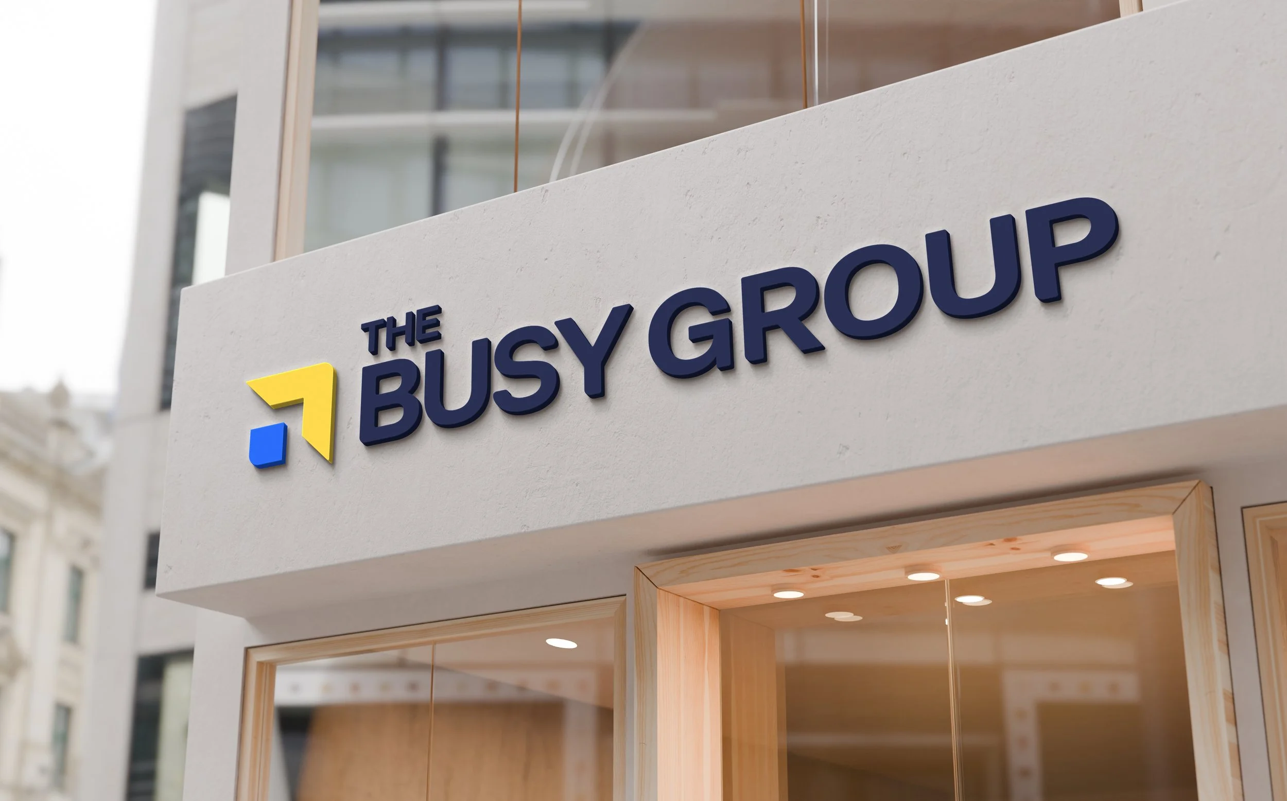
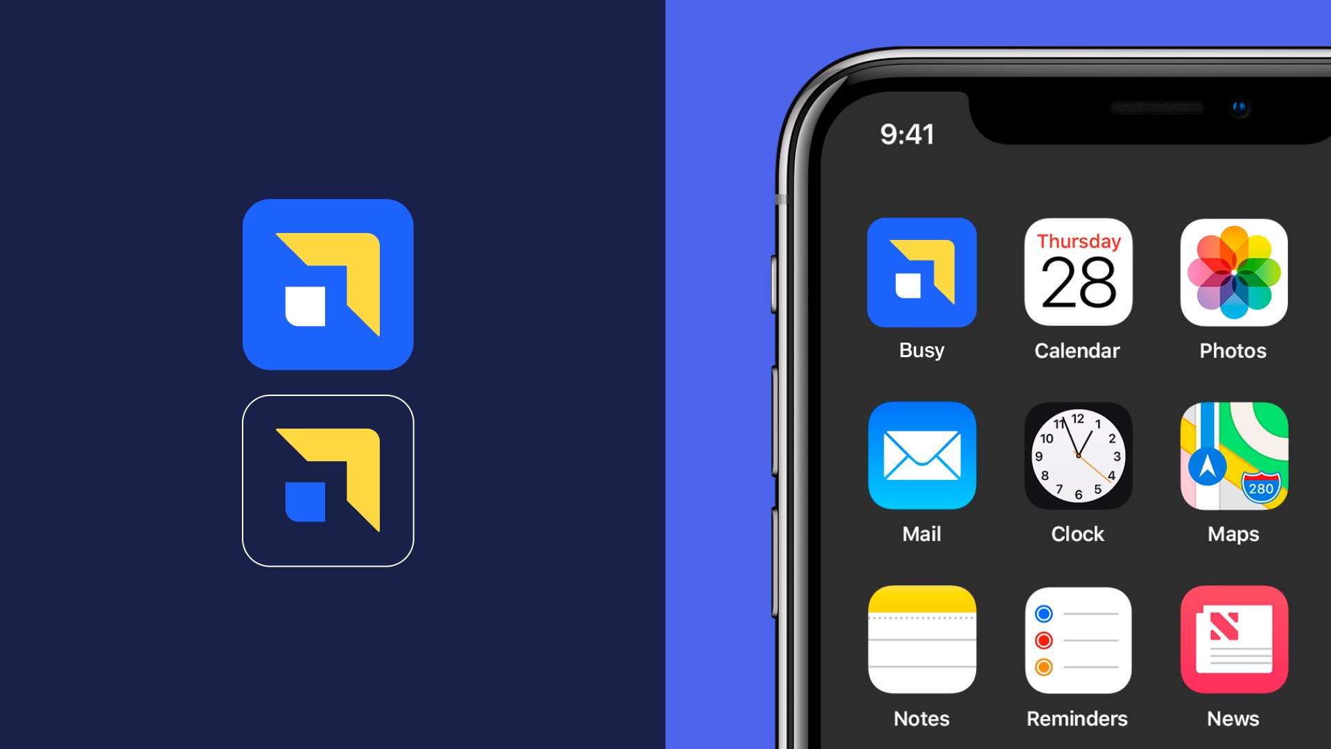
Rounded corners, refined proportions and a stronger geometric construction transformed the symbol into a contemporary mark capable of working from a favicon to large-scale environmental graphics without losing character.Designing the next forty years.
Great rebrands don't erase history.
They organise it.
The BUSY Group now has a unified visual language capable of supporting one of Australia's largest education and employment organisations while giving every business unit the freedom to communicate with consistency, confidence and purpose.