TELLPAD
-
Brand Concept
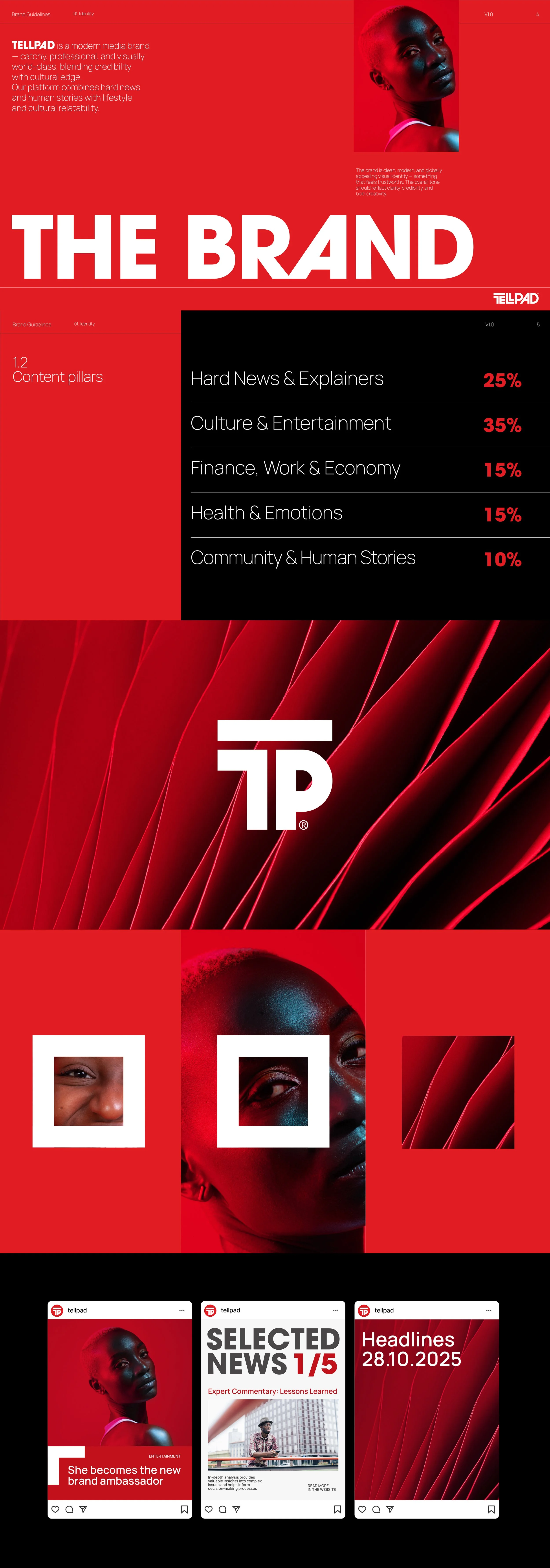
Tellpad is conceived as a contemporary African media platform built on clarity, immediacy, and authority. The brand identity needed to reflect not only the speed of modern journalism, but also its responsibility — to inform, connect, and empower communities across Nigeria and the African continent.
Conceptual Foundation
At its core, Tellpad stands for structured storytelling in a fast-moving world. The name itself merges “tell” (narrative, journalism, voice) and “pad” (platform, device, digital space), symbolizing a dynamic hub where information is created and consumed in real time.
The visual identity translates this idea into a bold, unmistakable system grounded in strength and simplicity.
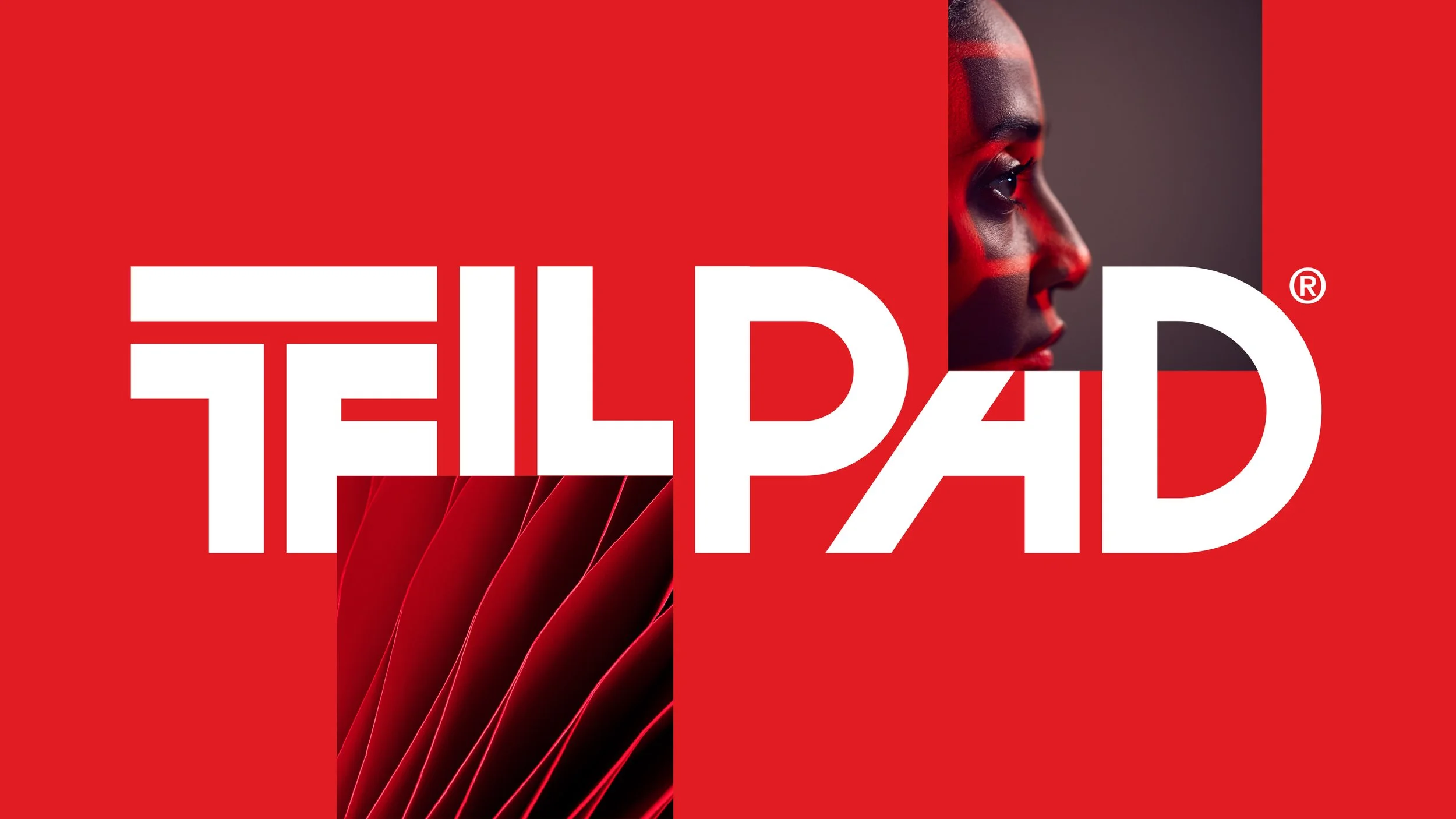
The custom logotype is built on geometric precision and horizontal alignment, emphasizing stability and trust — fundamental values for a news-driven brand.
The extended top bar integrated into the “T” functions as a visual anchor, subtly referencing a broadcast banner or headline strip. It represents the idea of information being delivered clearly and directly.The Symbol
The monogram “TP” distills the brand to its most essential form.
The symbol is designed as a compact, digital-ready mark — optimized for apps, social media, and live content environments. The horizontal bar remains a defining element, reinforcing the concept of a headline or breaking news ticker.
Its bold construction ensures legibility at small sizes while maintaining a strong visual presence in dynamic contexts.
Process & Intent
The design process focused on reduction and structural clarity. Multiple explorations were tested around typography weight, proportion, and modularity to ensure the identity would function seamlessly across broadcast graphics, mobile interfaces, and social platforms.
The final system is intentionally bold and minimal — a mark that feels contemporary yet timeless, digital-first yet grounded in journalistic credibility.
Tellpad’s identity is not decorative; it is functional, assertive, and built for constant visibility in a fast-paced media landscape.
It reflects a platform that does not simply report the continent’s stories — it amplifies them.
Agency: Chance Design
Client: TellPad
Services: Branding, Logo Design, Graphic Design, Motion Graphics, Social Media.

Process & Intent
-
Multiple explorations were tested around typography weight, proportion, and modularity to ensure the identity would function seamlessly across broadcast graphics, mobile interfaces, and social platforms.
The final system is intentionally bold and minimal — a mark that feels contemporary yet timeless, digital-first yet grounded in journalistic credibility.
Tellpad’s identity is not decorative; it is functional, assertive, and built for constant visibility in a fast-paced media landscape.
It reflects a platform that does not simply report the continent’s stories — it amplifies them.


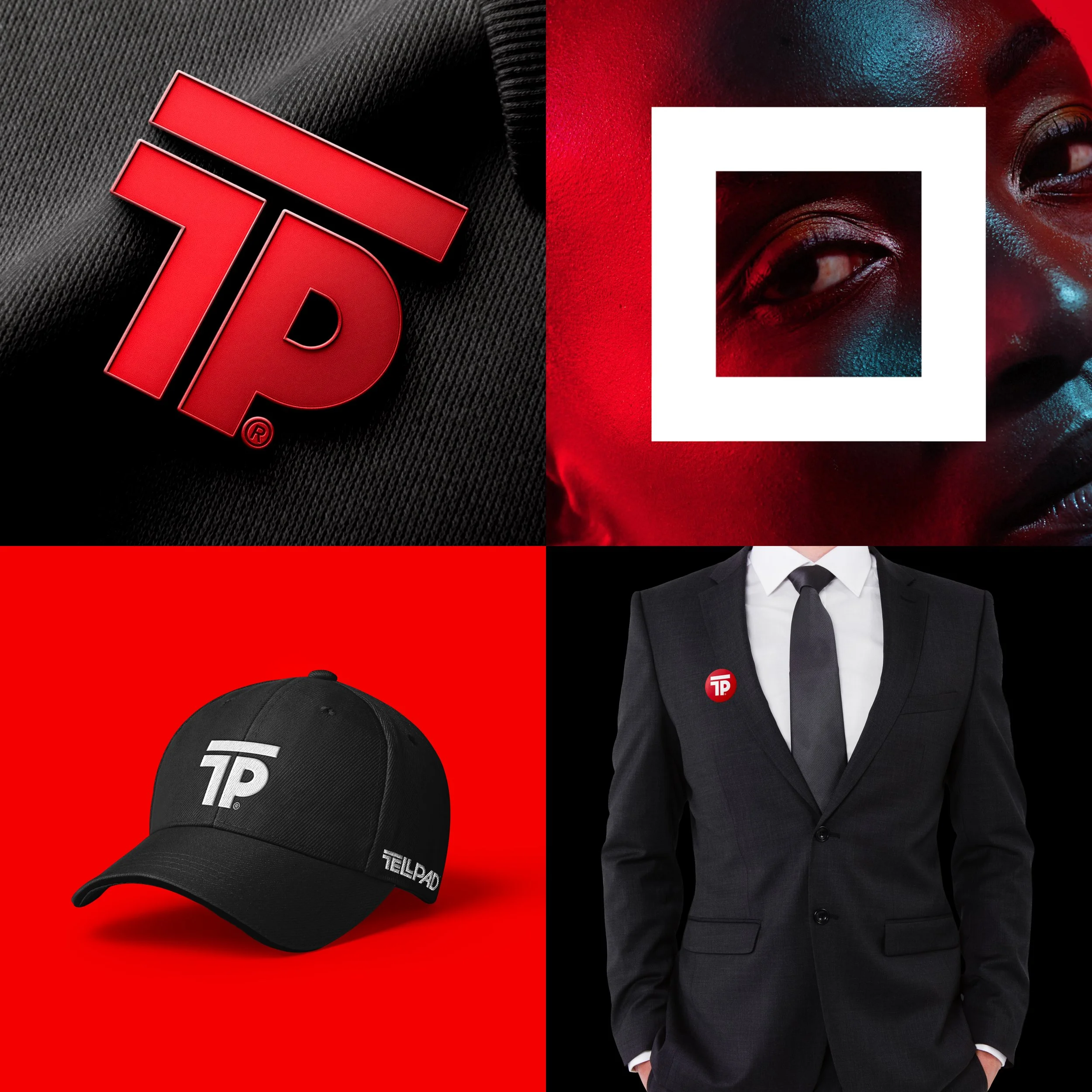
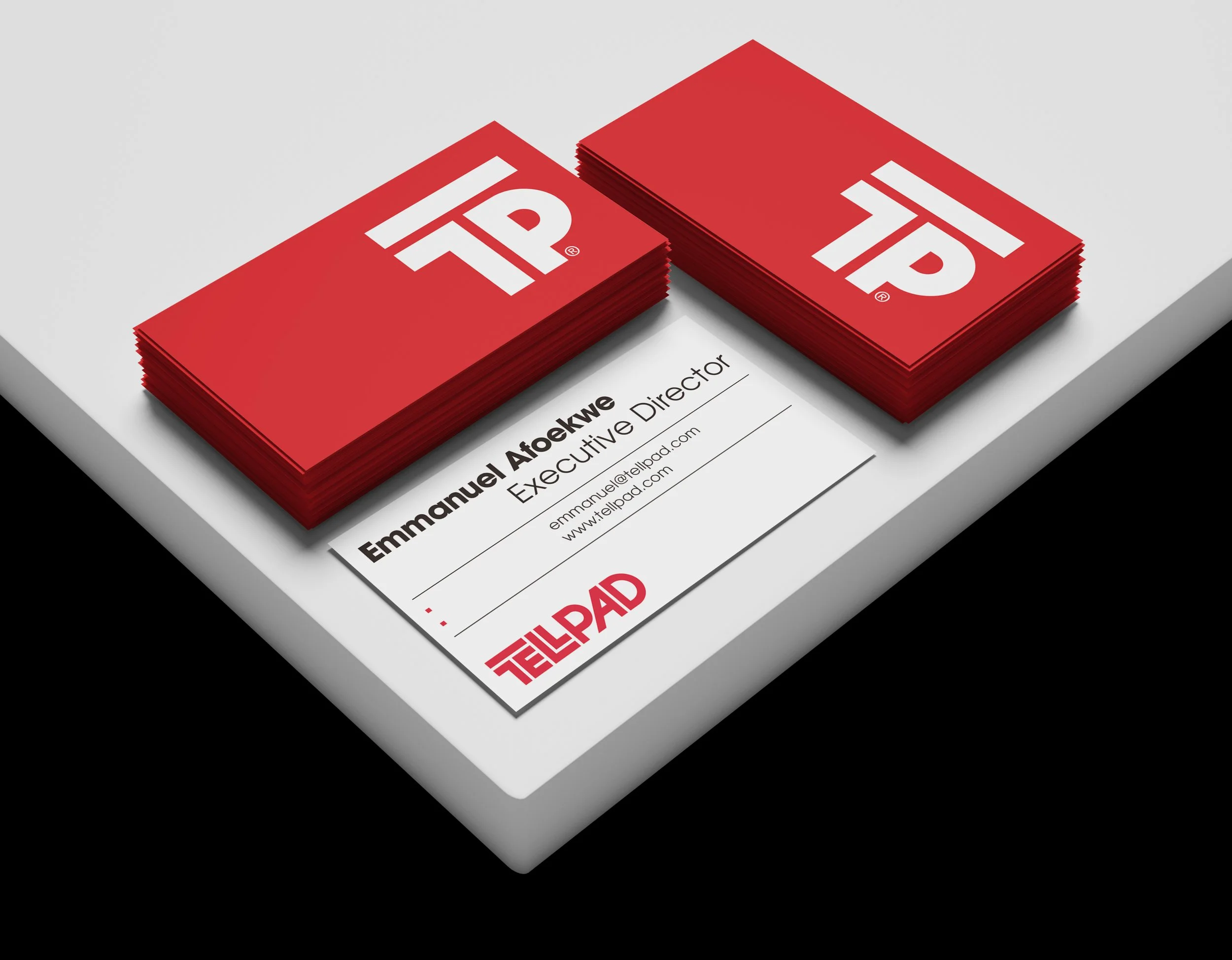
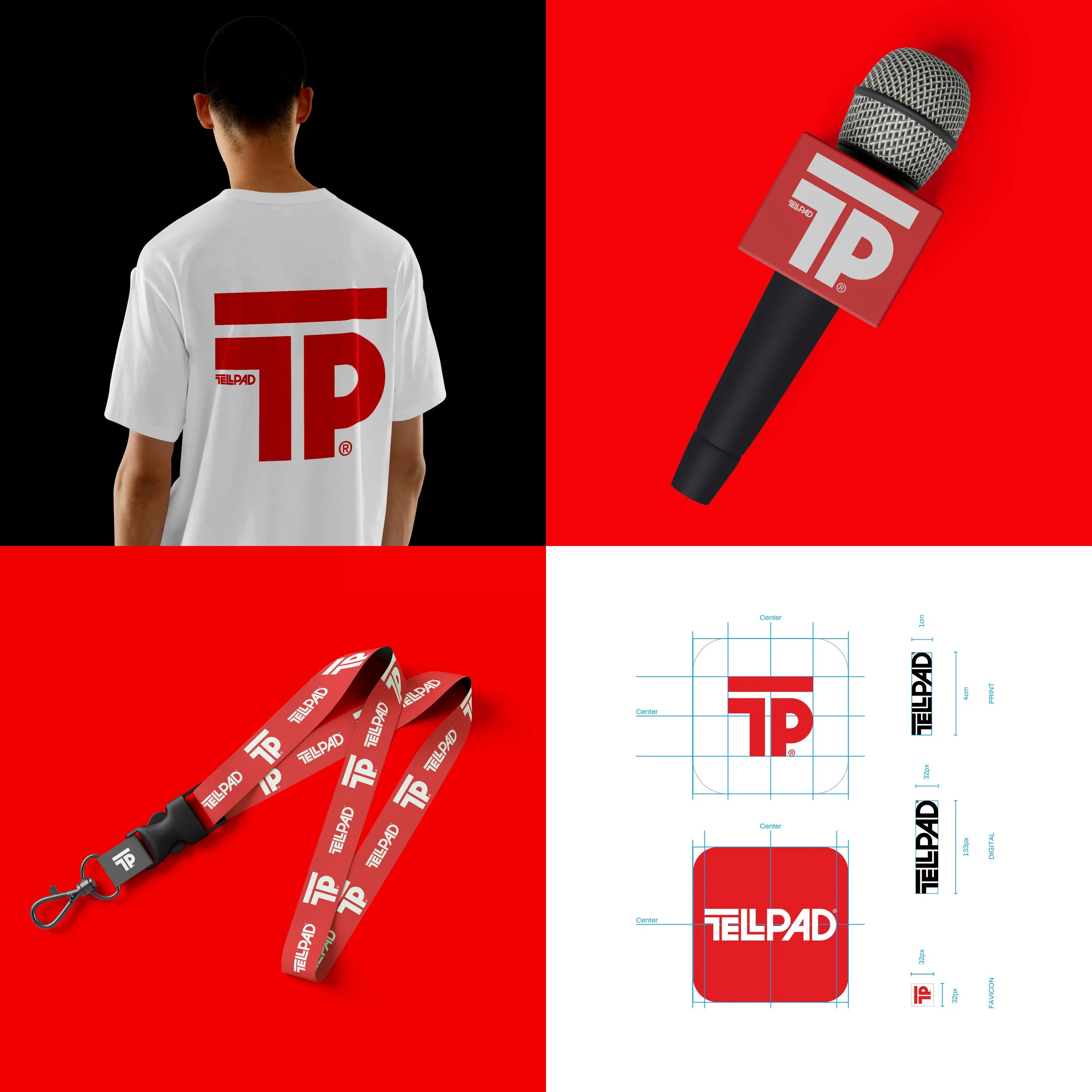
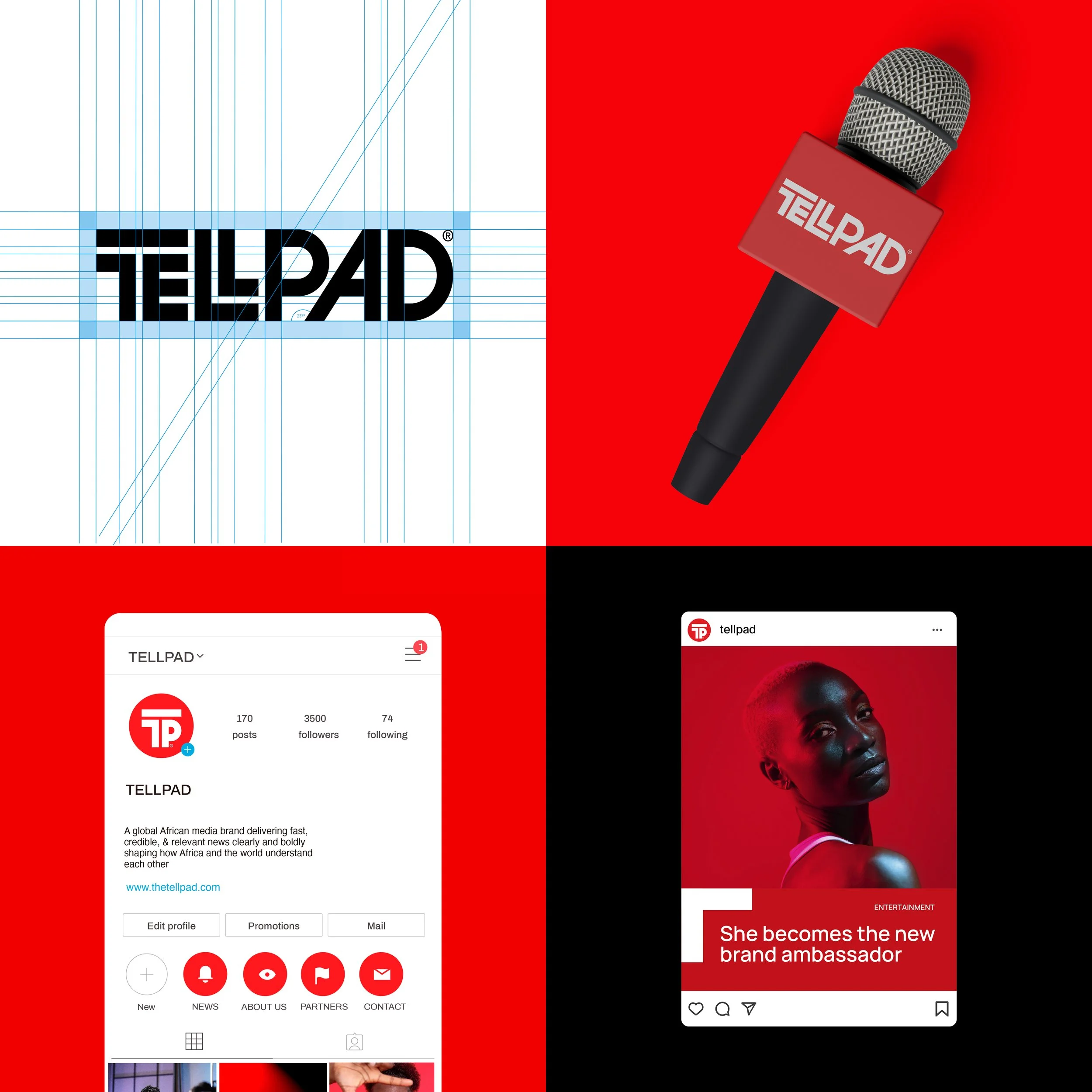
Color Strategy
-
Balanced with white and black, the palette achieves contrast, authority, and clarity. The gradient application introduces movement and depth, evoking live transmission and energy without compromising sophistication.