WELLIUM
-
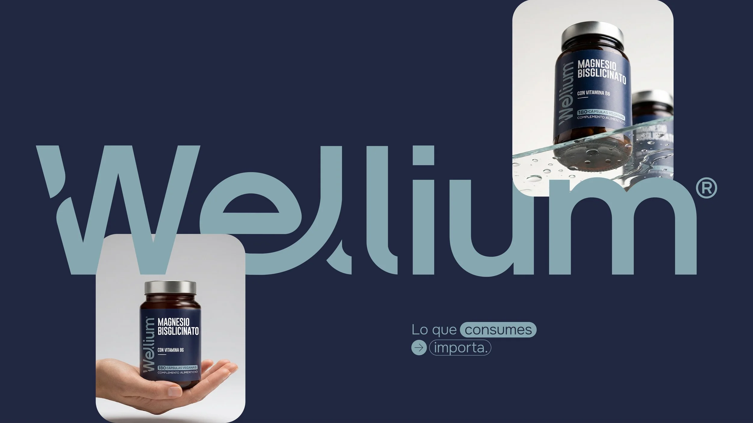
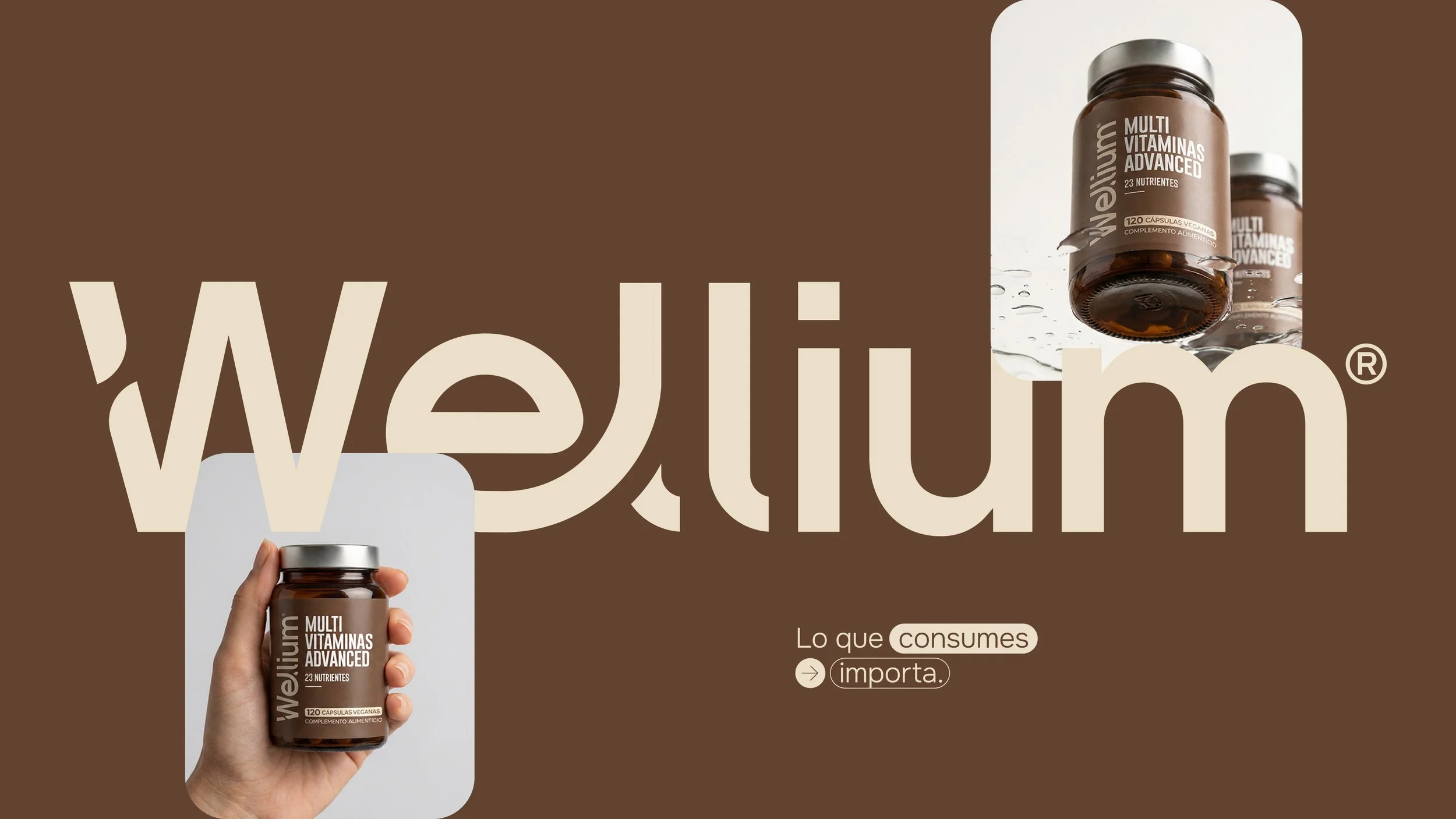
The supplement industry is often dominated by exaggerated claims, visual noise, and generic branding. Wellium was created to challenge that landscape through a quieter, more confident approach—one rooted in clarity, transparency and everyday wellbeing.
Rather than selling miracles, the brand focuses on building trust through thoughtful design, rigorous formulation, and a contemporary lifestyle perspective.
The objective was to develop a visual identity capable of positioning Wellium as a premium digital-first supplement brand.The system needed to balance scientific credibility with an approachable aesthetic, avoiding both overly clinical codes and the exaggerated language commonly found within the category.
Studio: Chance Design
Client: Fortalia Nutrition SLServices: Packaging, Branding, Logo Design, Graphic Design, Art Direction.
Brand Strategy
-
Trust — Clear communication and transparent product architecture.
Balance — Wellness understood as a sustainable daily practice.
Quality — Precision in formulation, materials and execution.
Contemporary — A modern lifestyle language that feels culturally relevant without relying on trends.
A Modular Identity
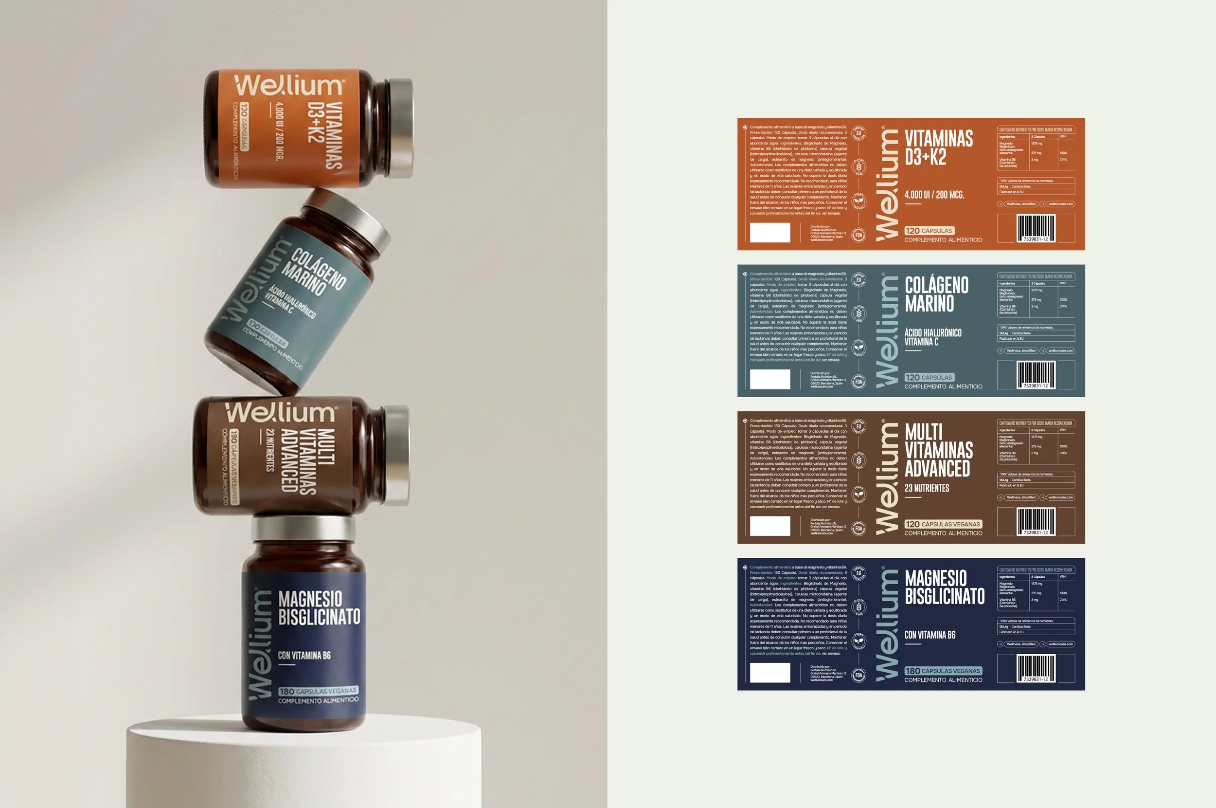
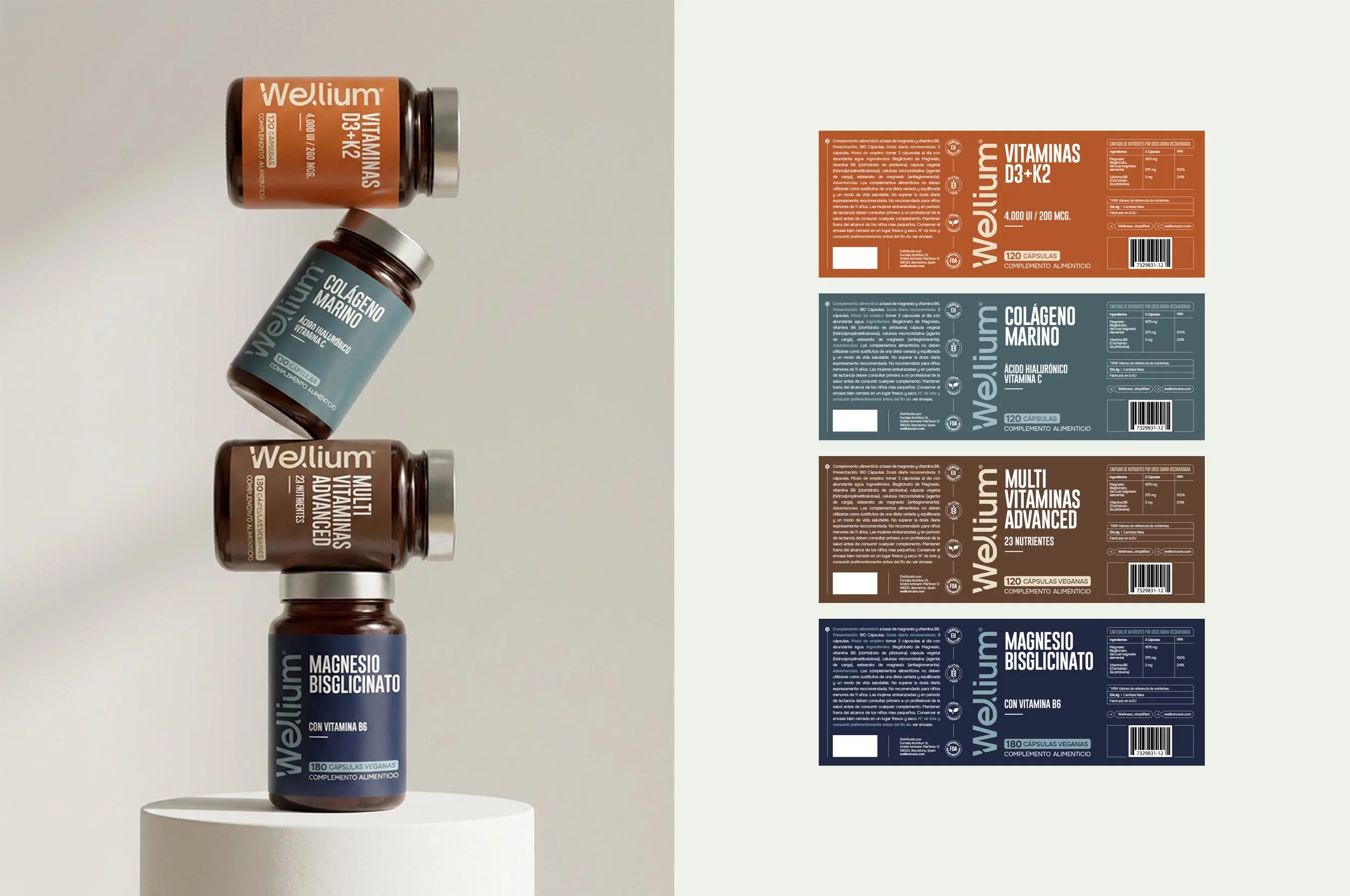
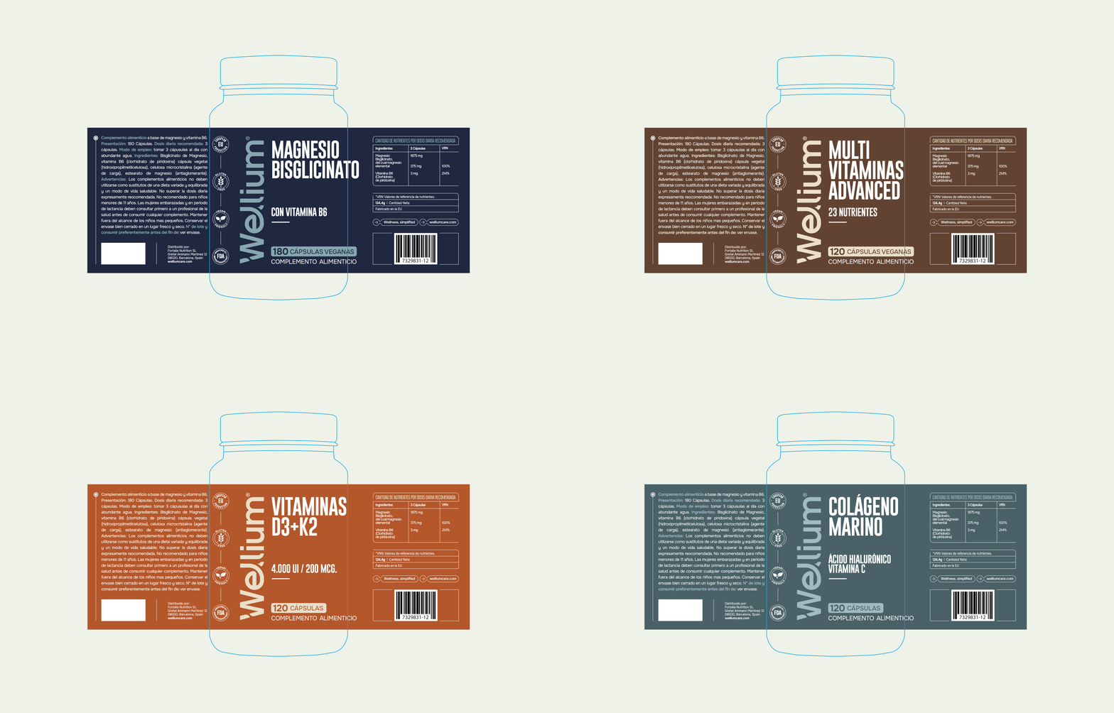
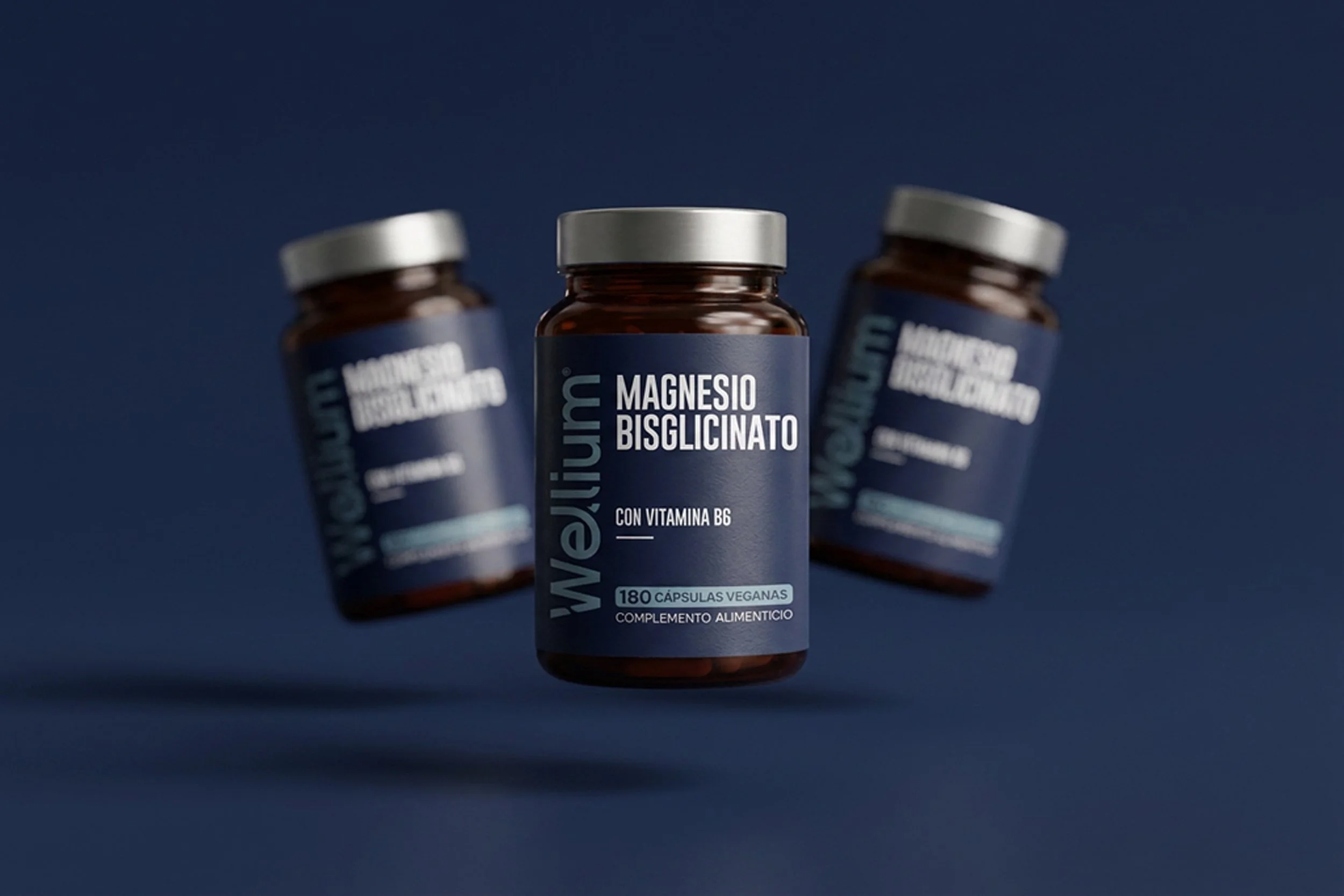
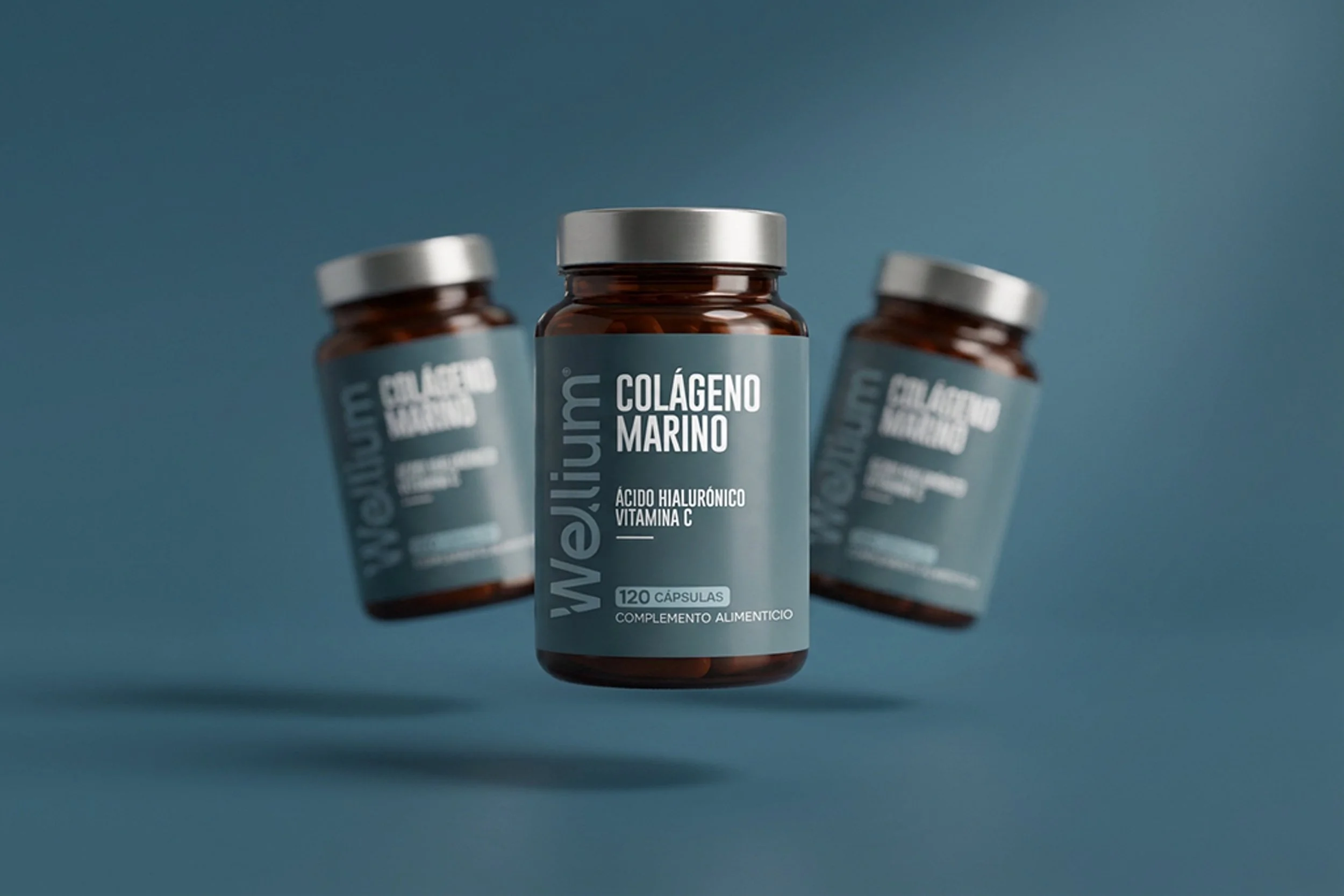
Instead of creating individual packaging for every SKU, the project focused on designing a scalable visual system.
Typography, hierarchy, spacing, and color become reusable components that allow the portfolio to expand while maintaining immediate brand recognition.


Color Architecture
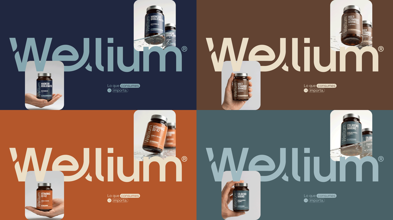
Color acts as a navigation system rather than decoration.
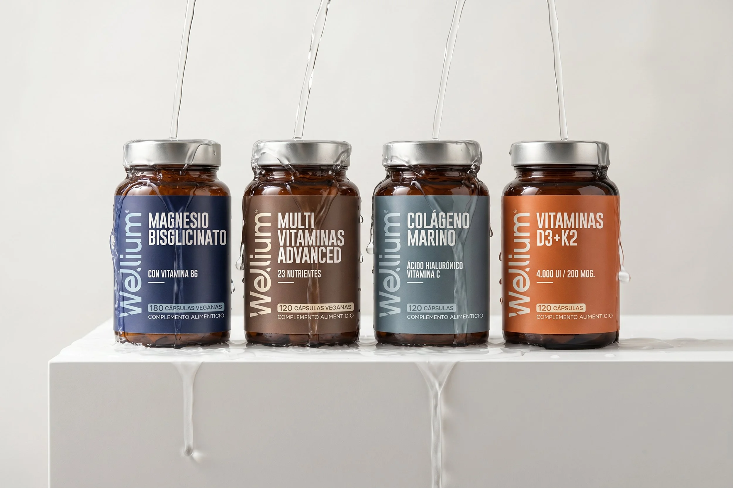
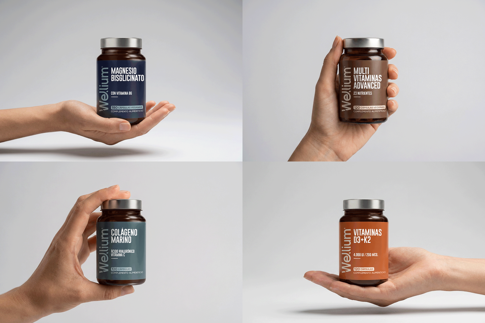
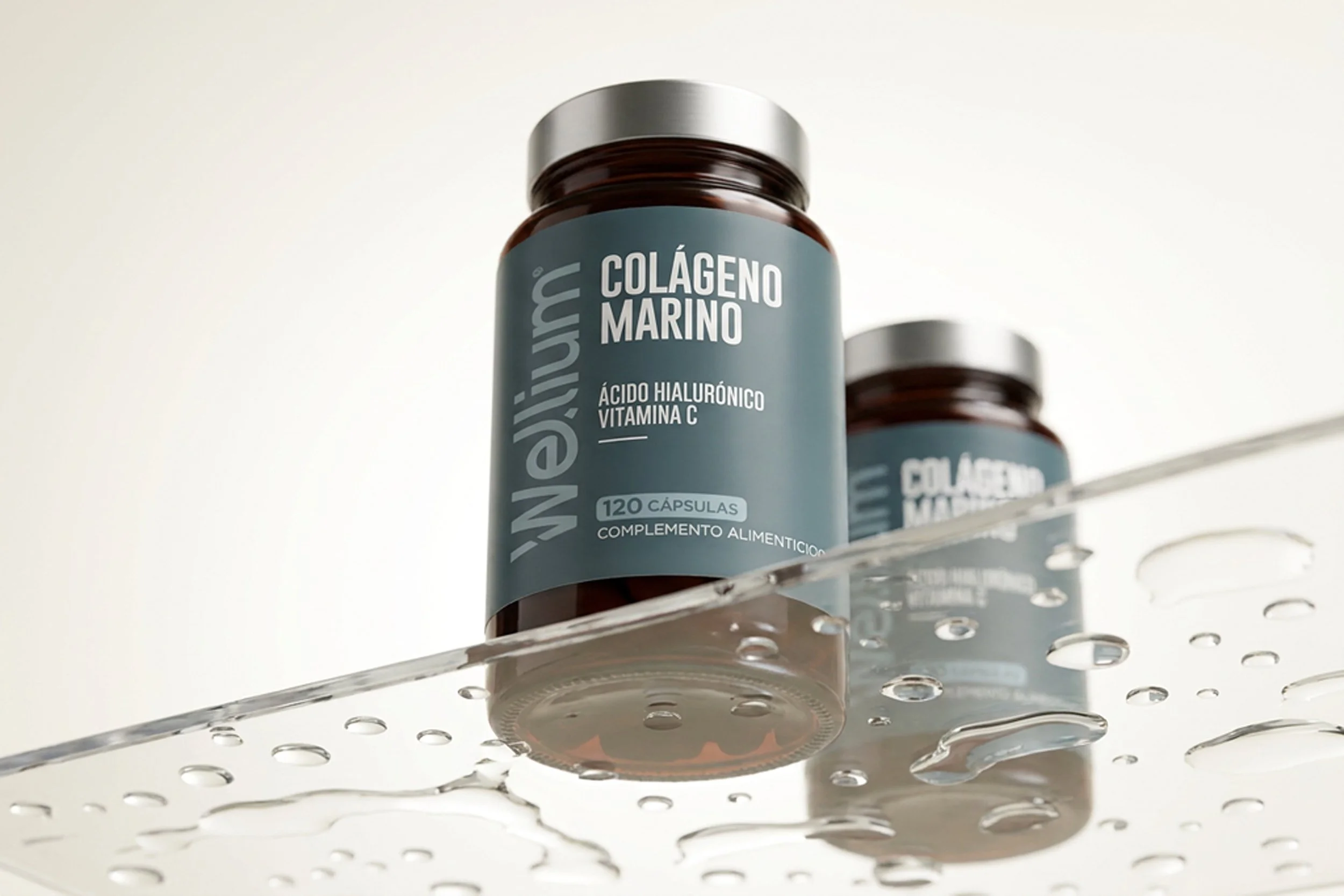
Each formulation receives its own distinctive accent color while preserving a consistent structural layout across the entire range. This creates instant recognition both on digital shelves and in physical retail environments.



Packaging Design
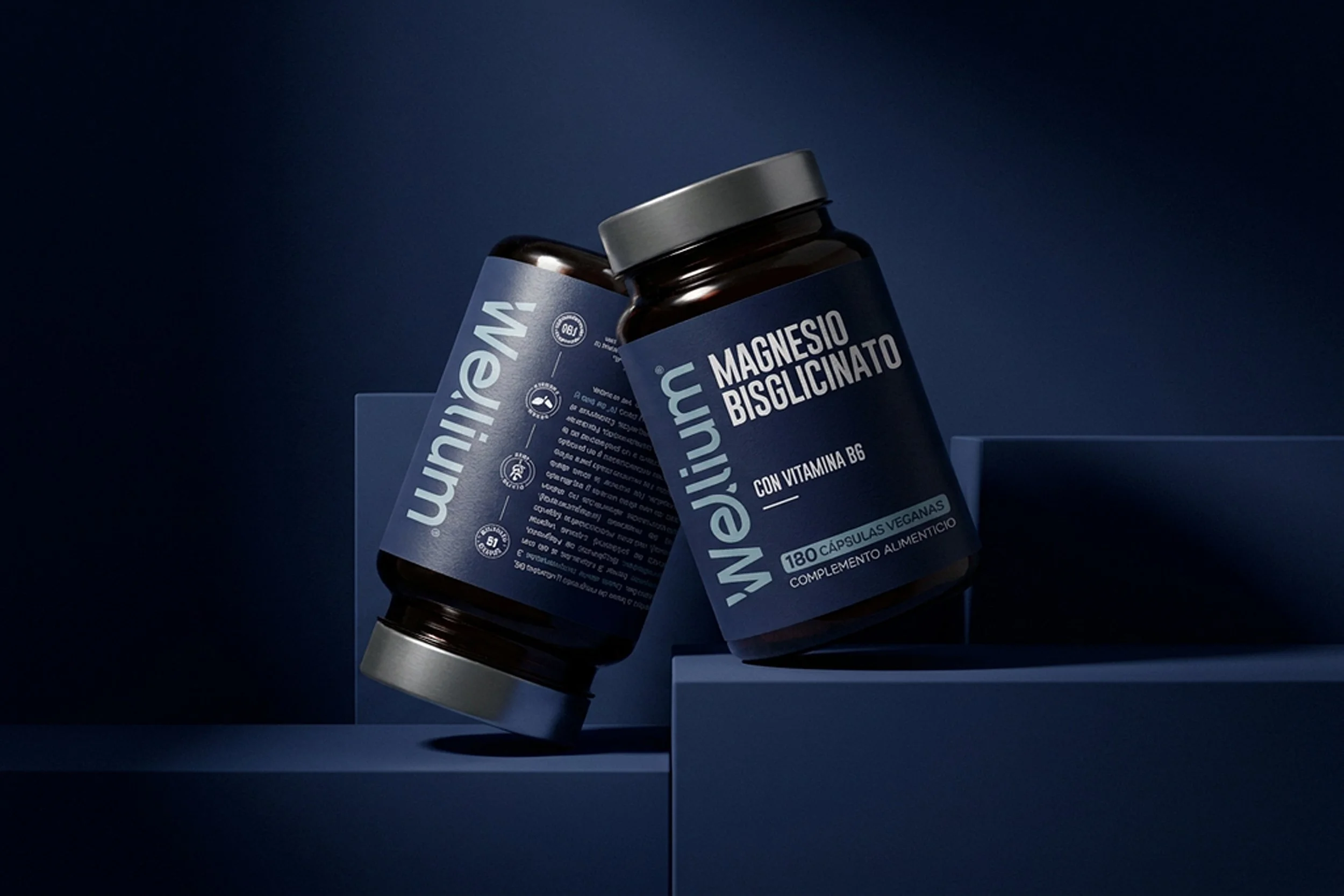
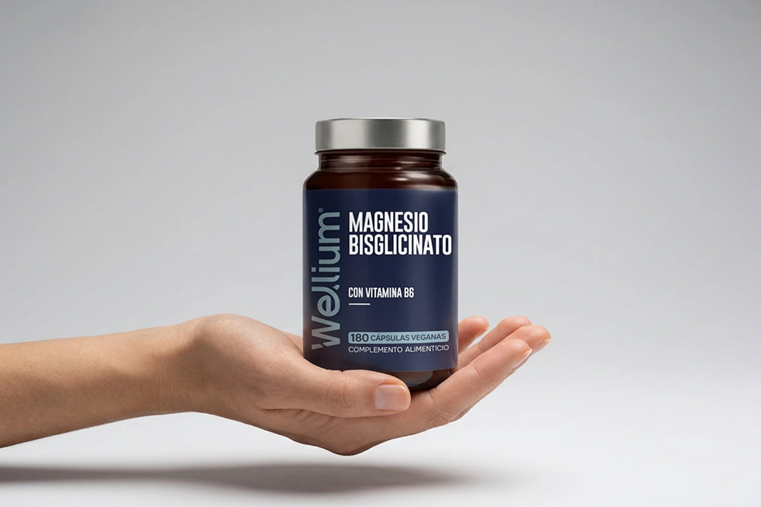
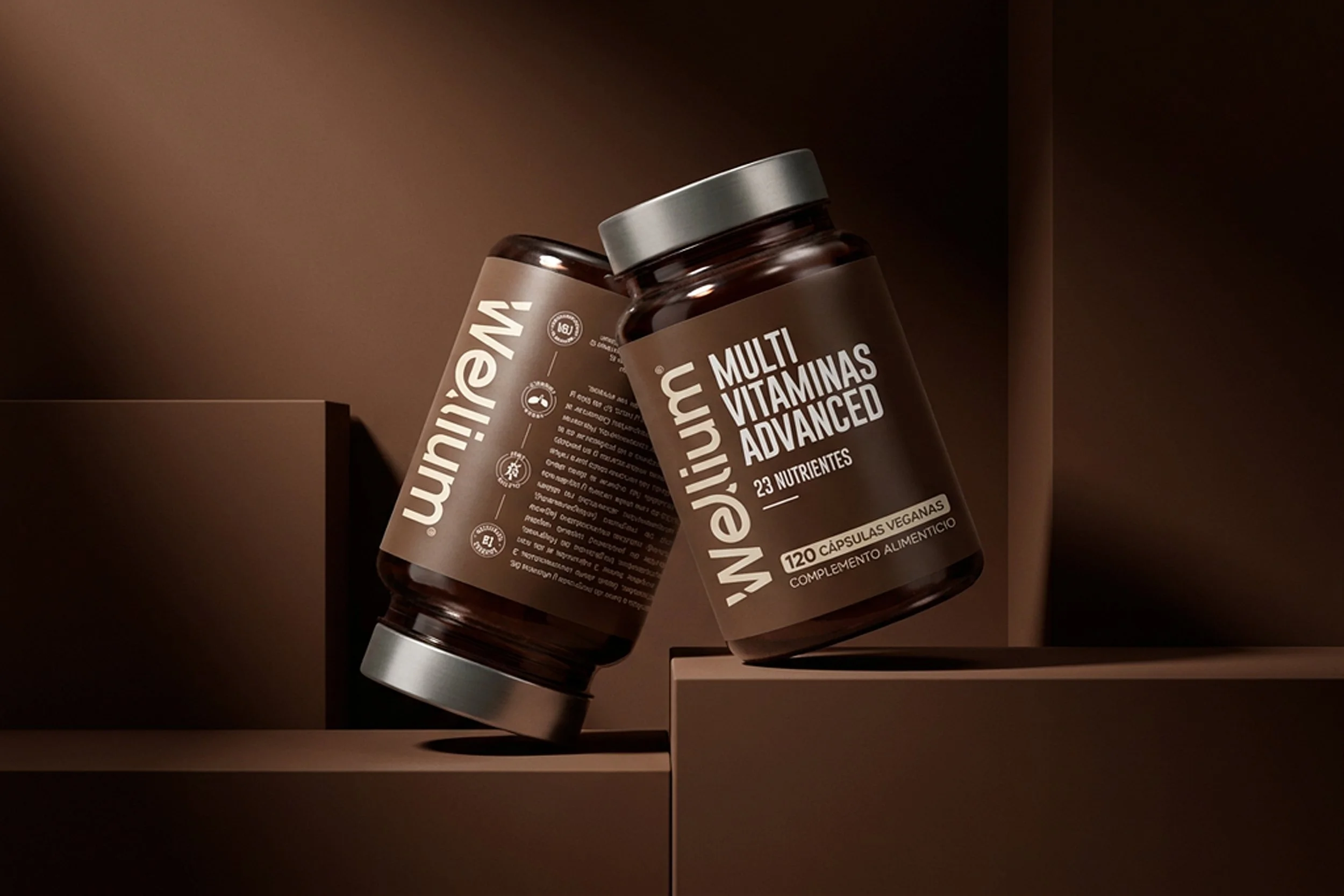
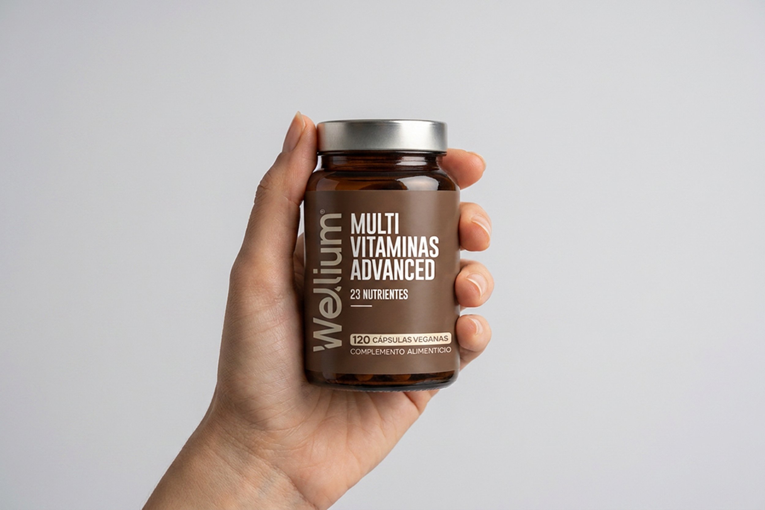
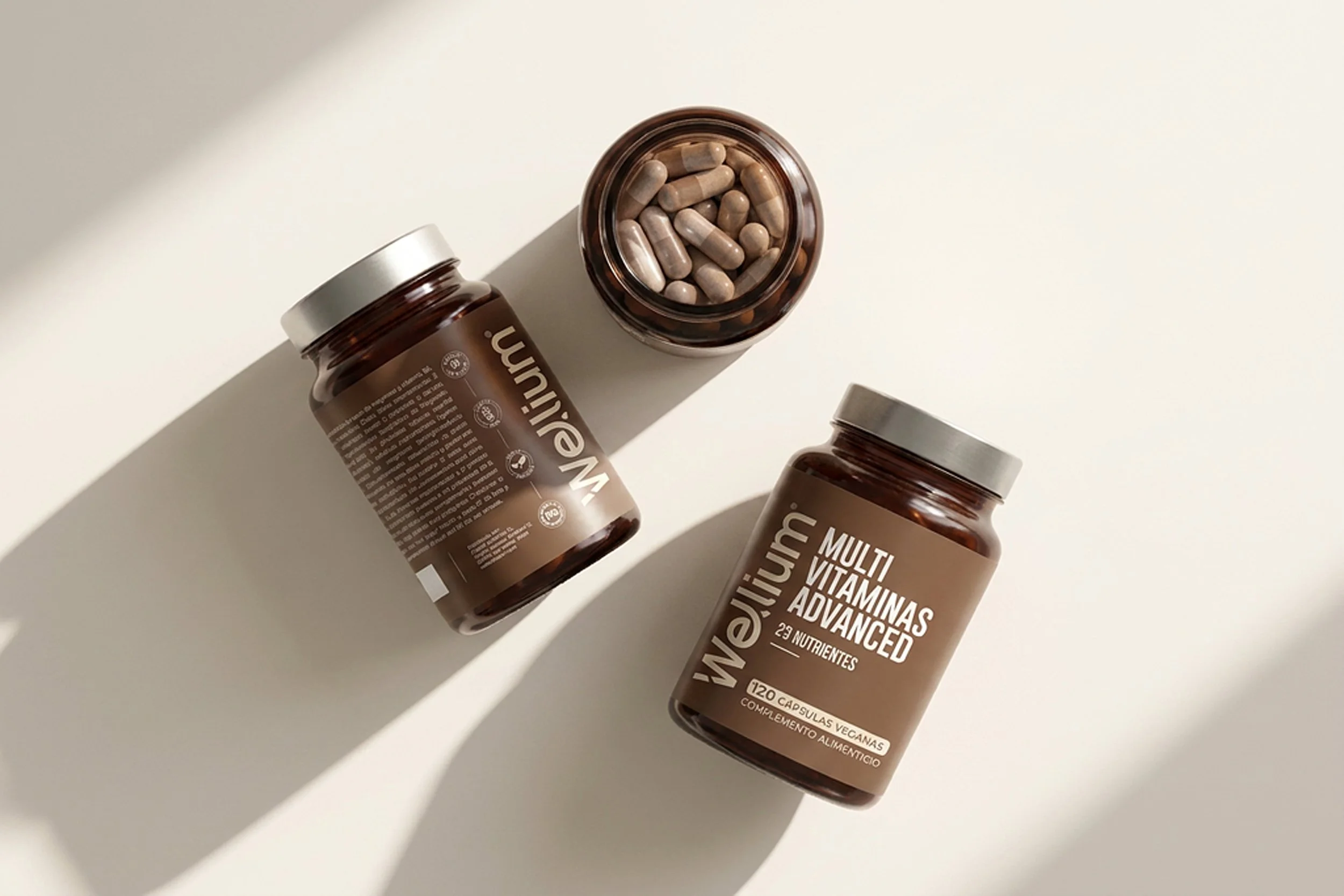
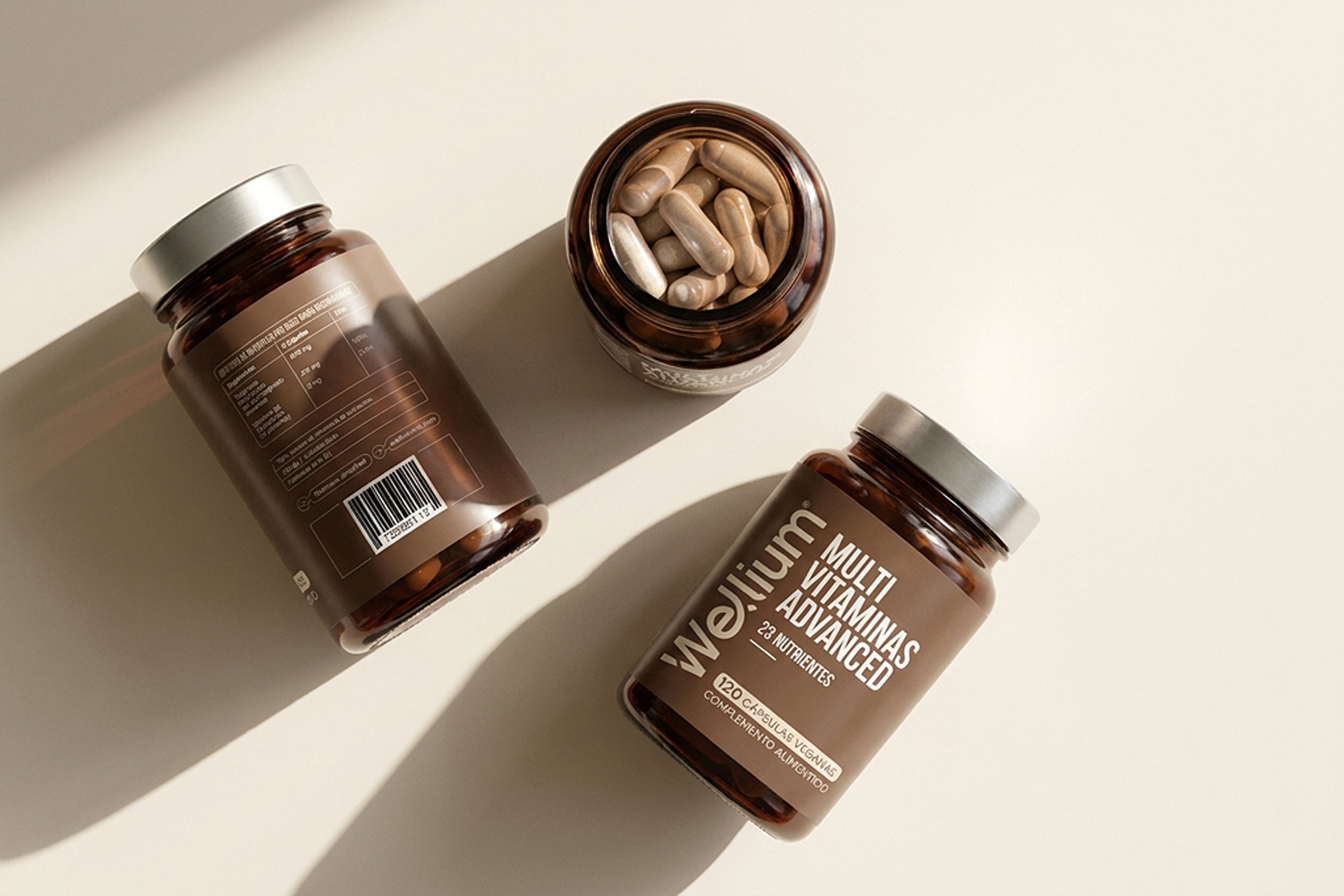
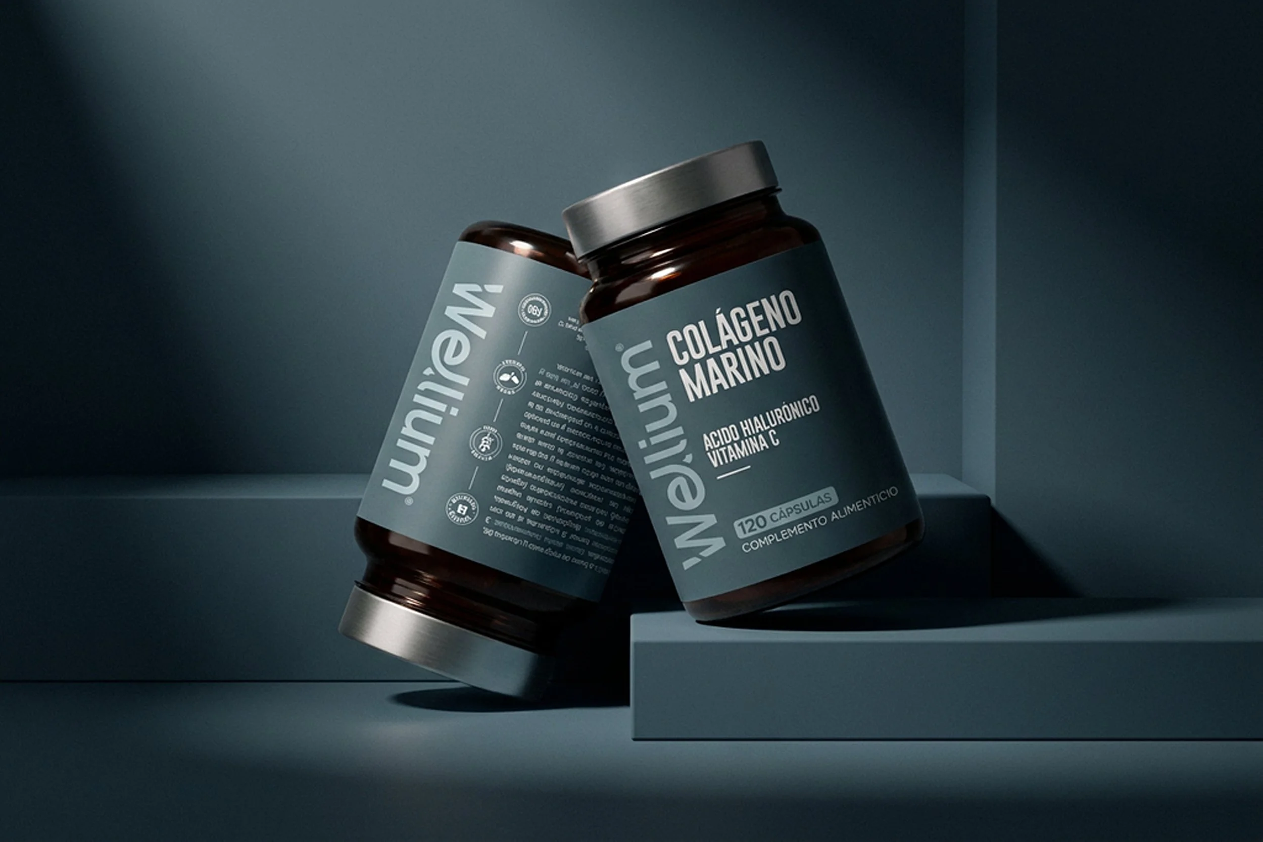
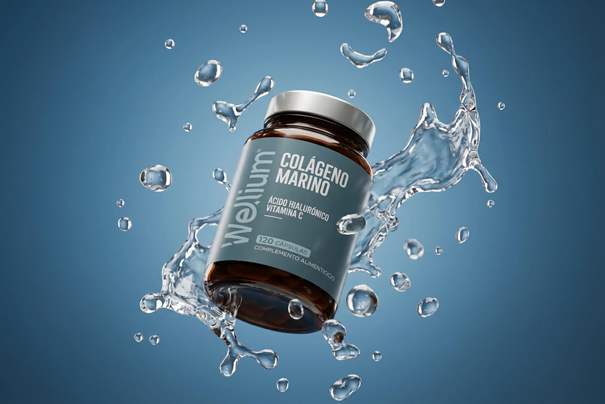
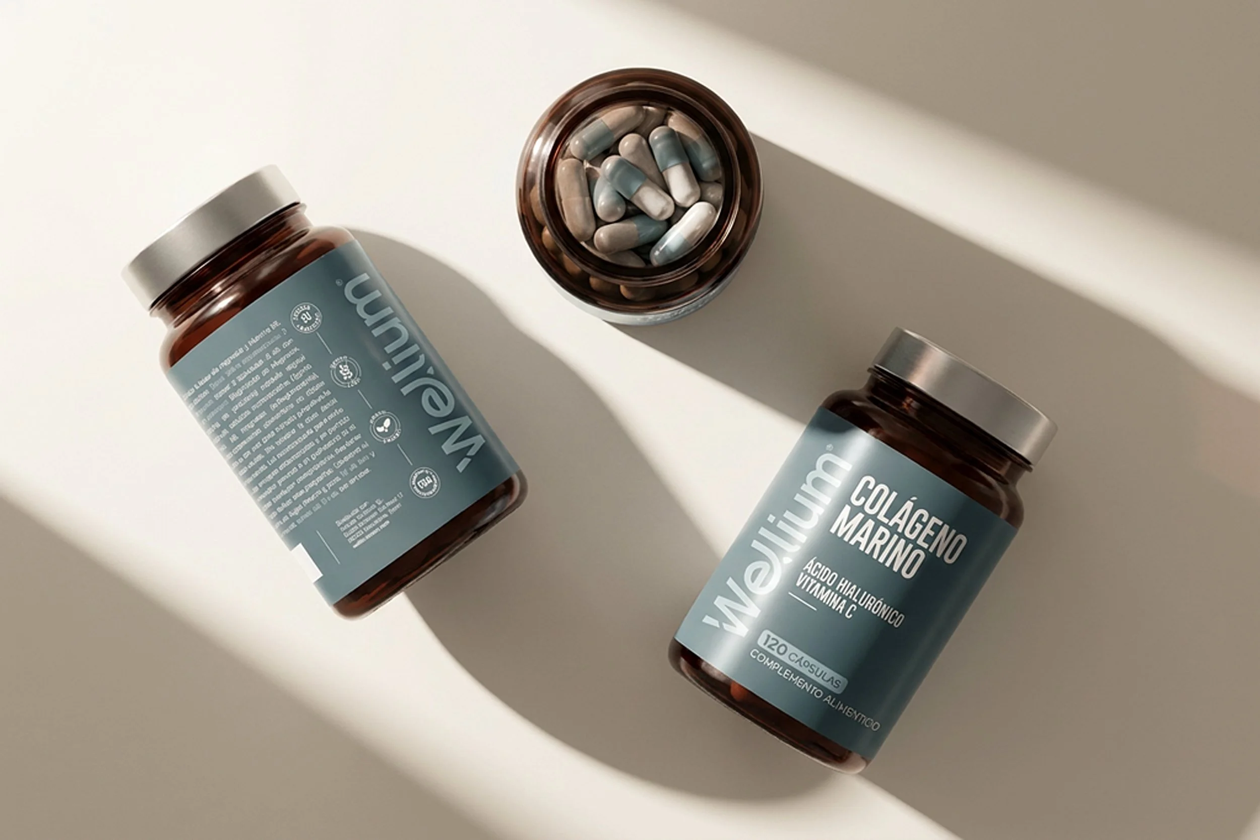
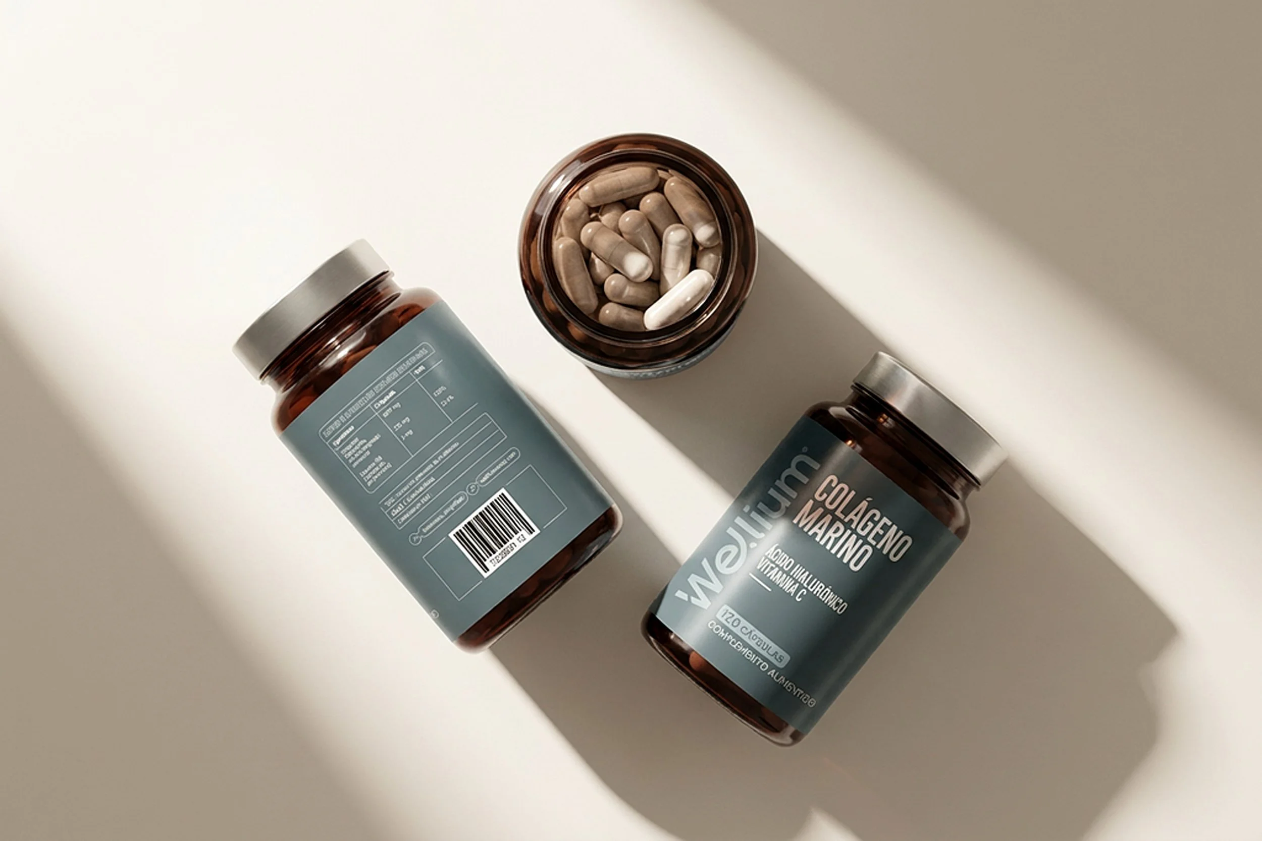
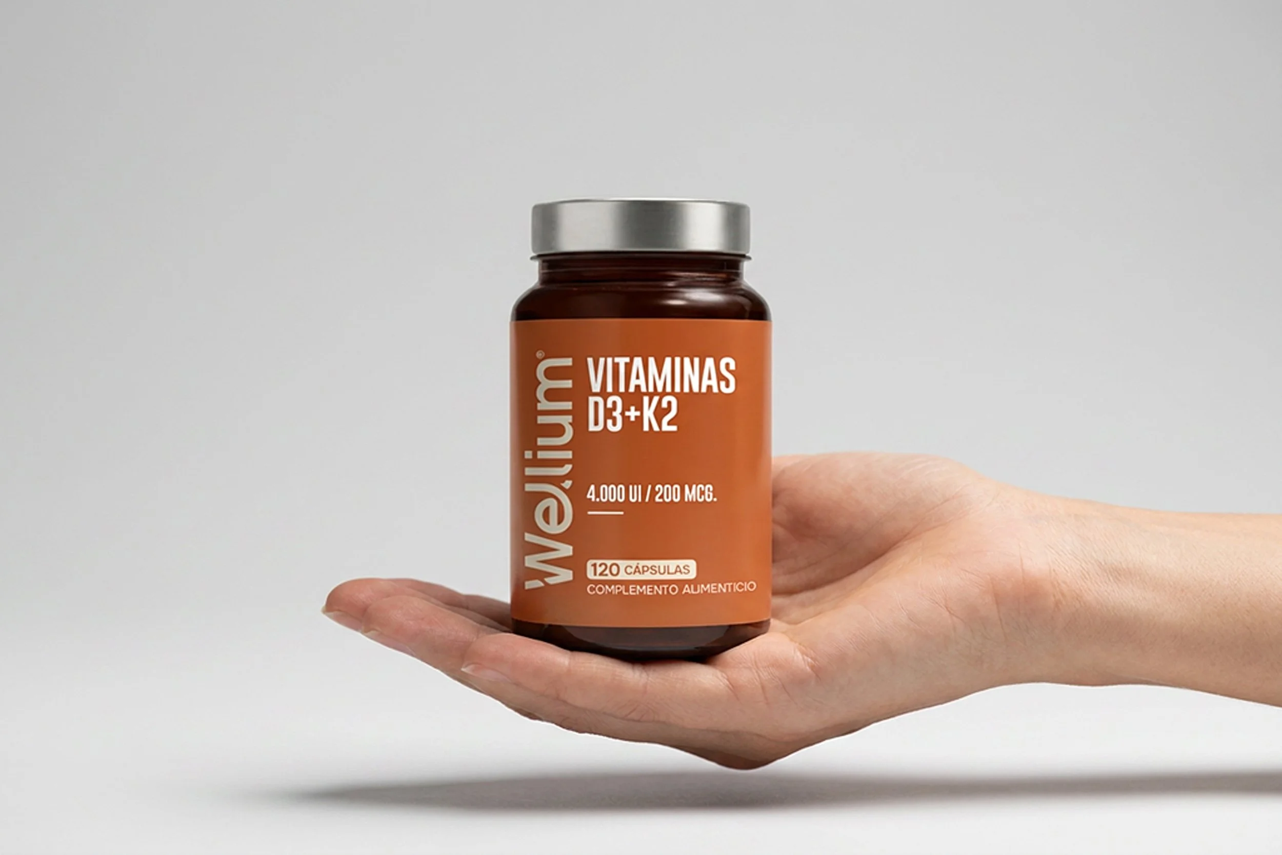
Minimalism became a functional decision.
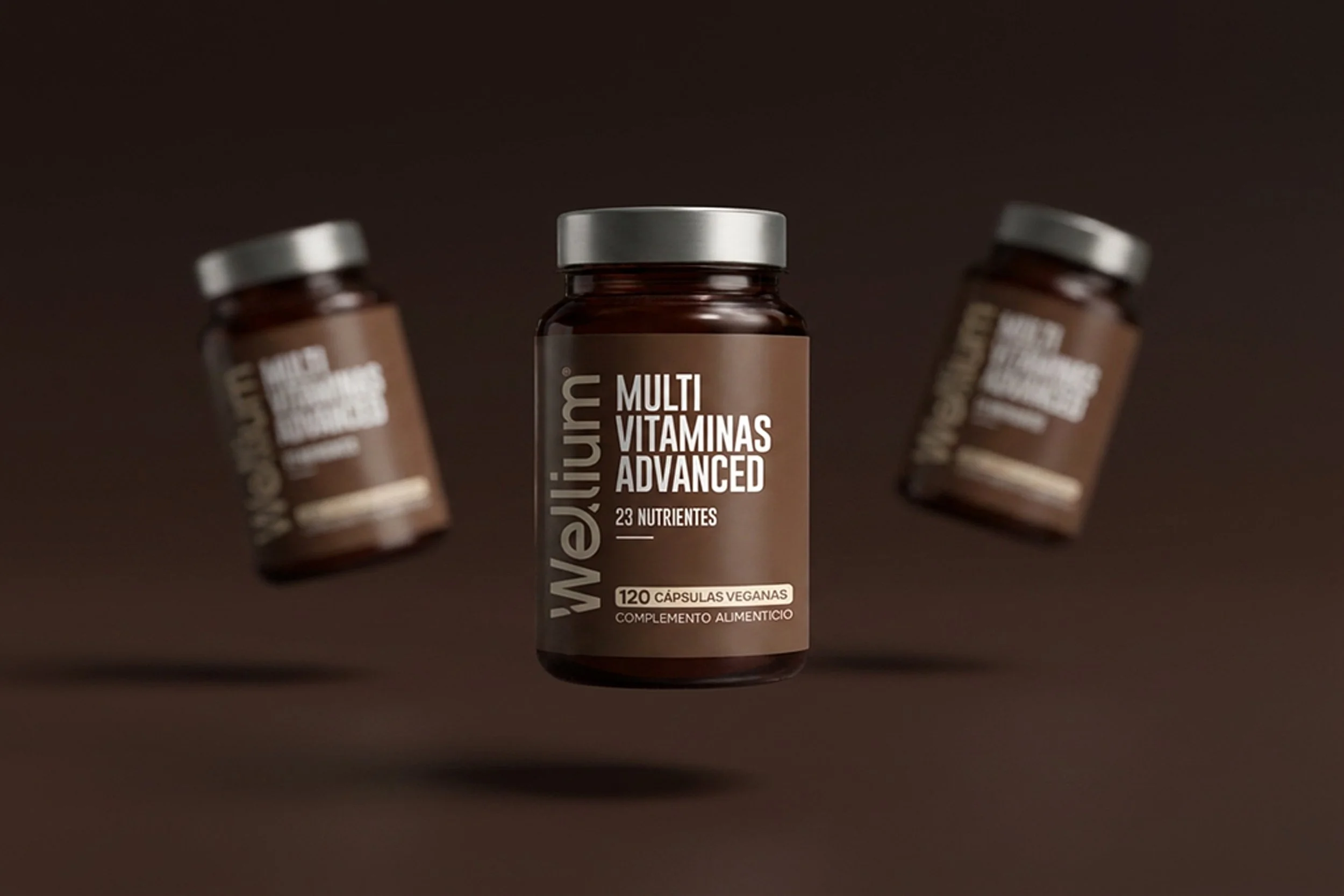
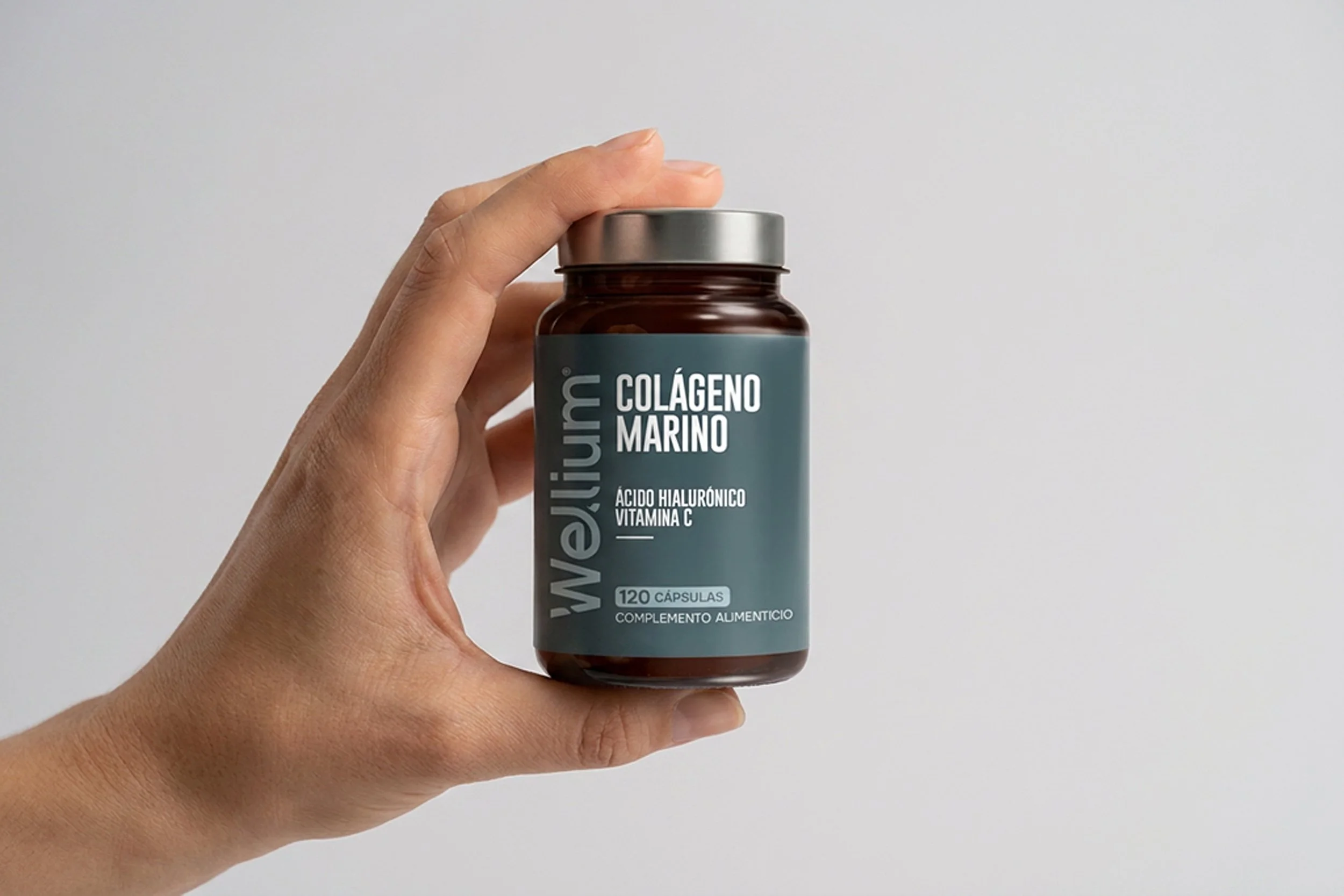
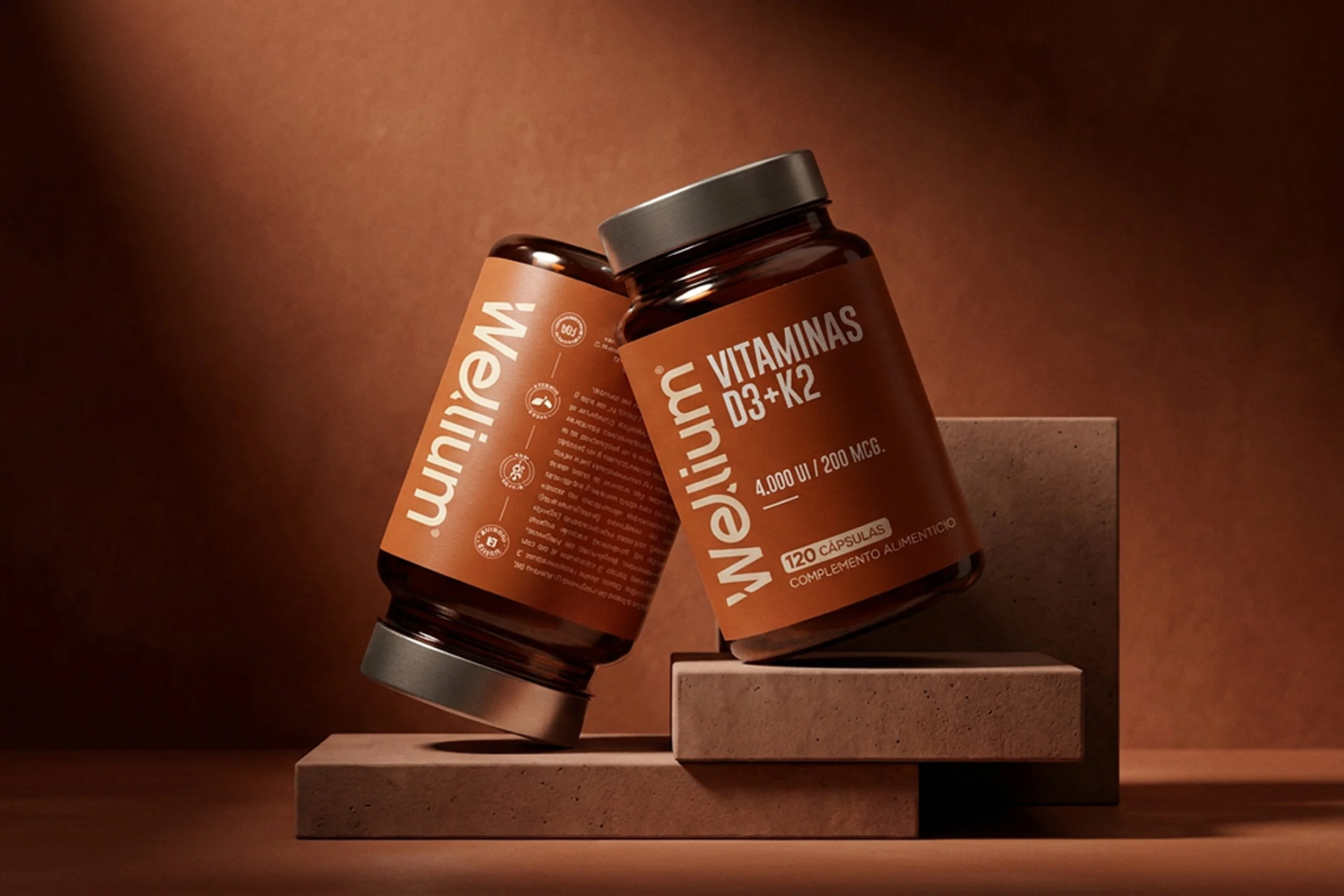
Every element was carefully reduced to its essential role, allowing product information, typography, and color to communicate with confidence, free of visual clutter.
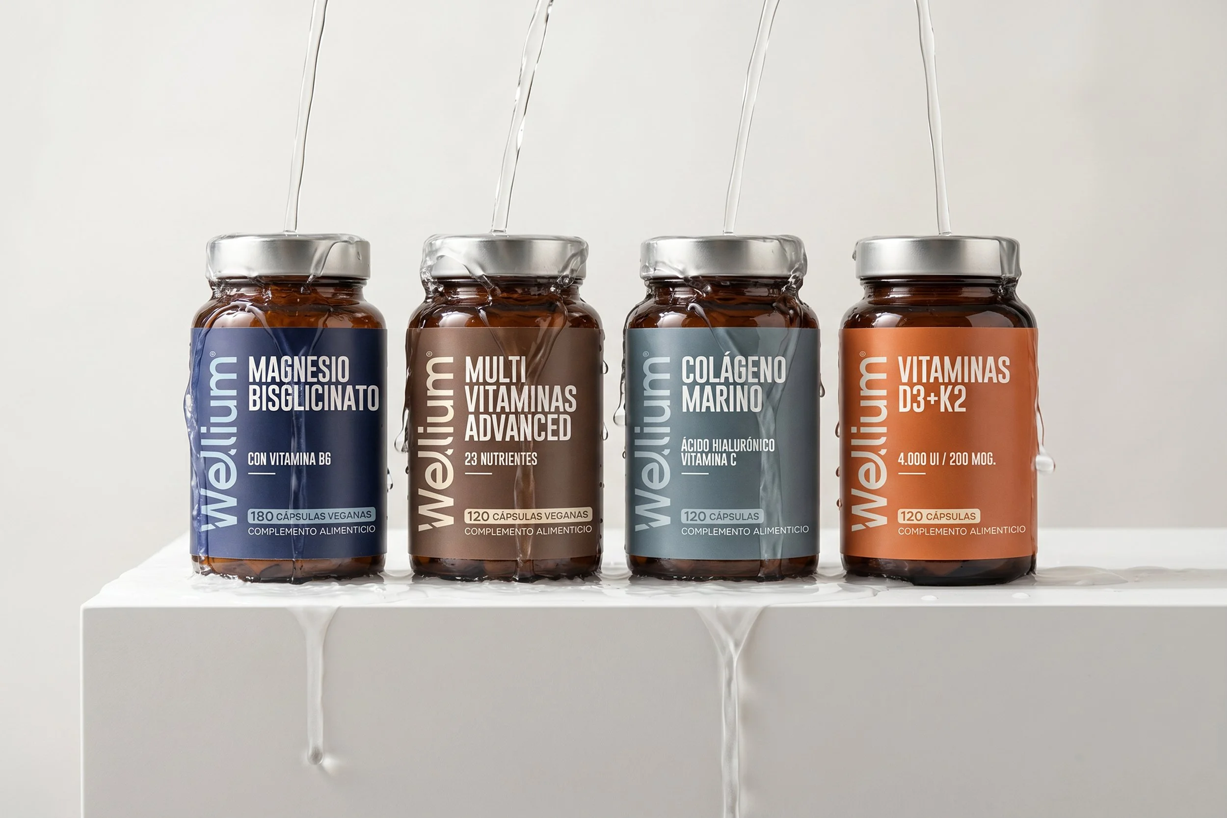
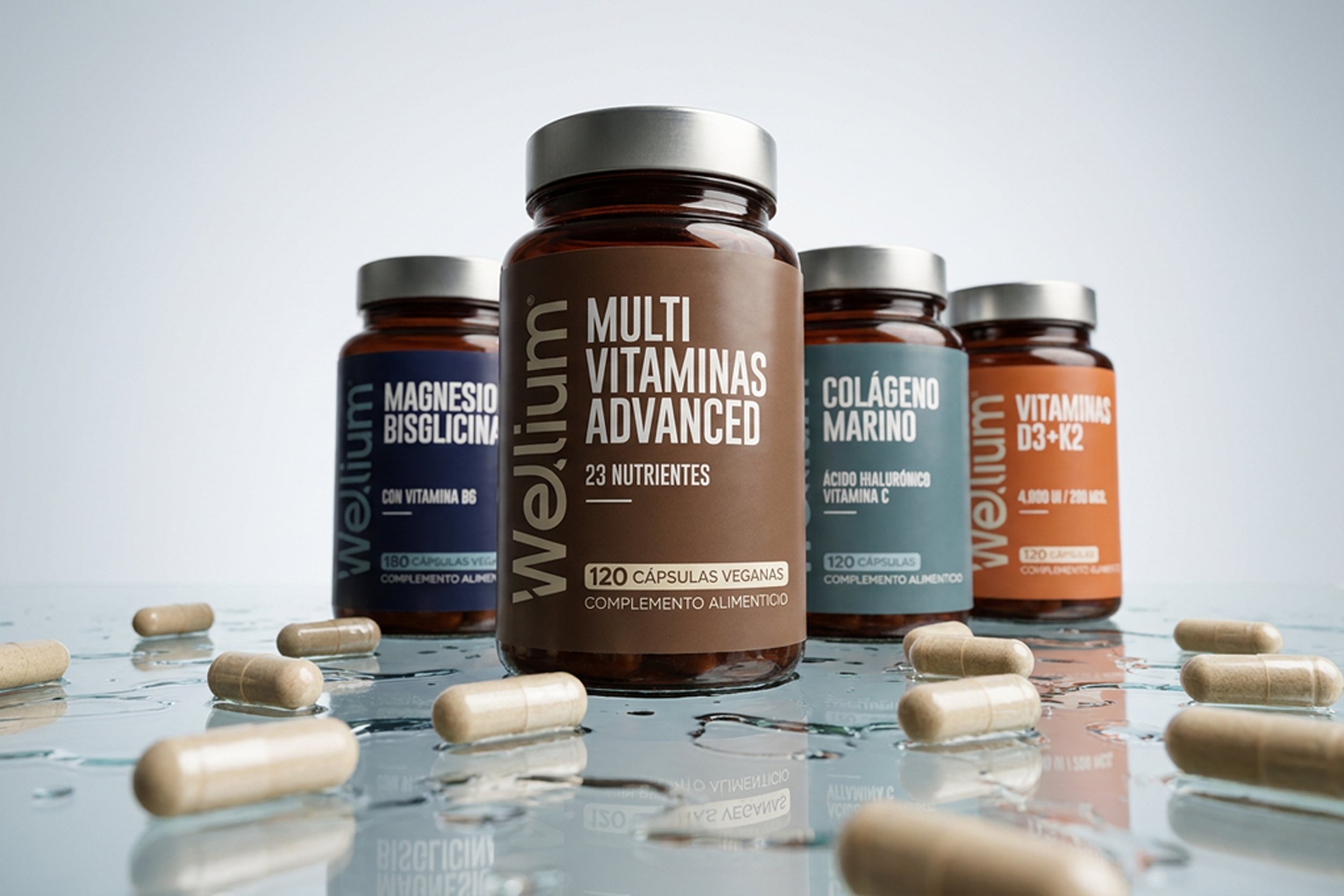
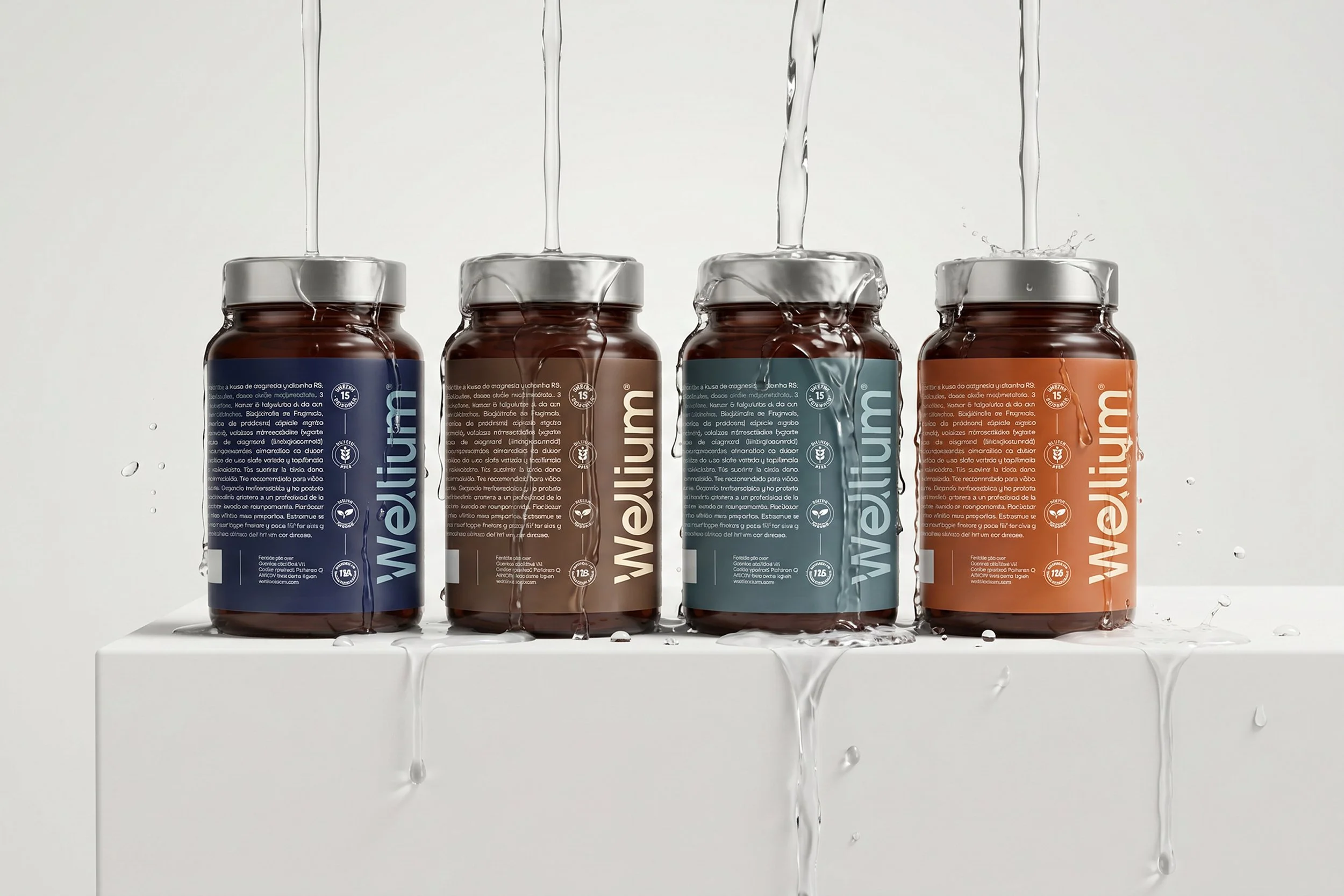
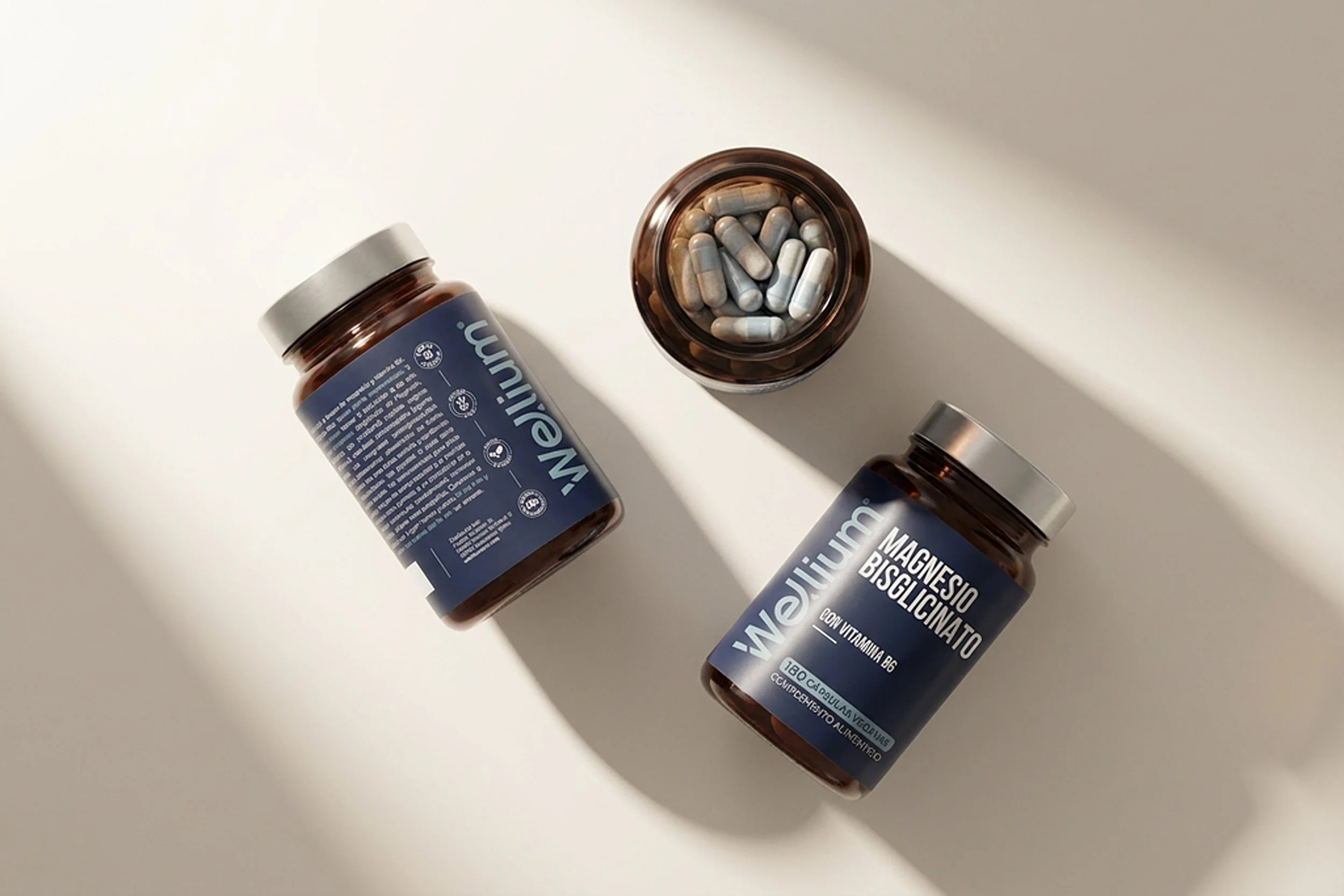
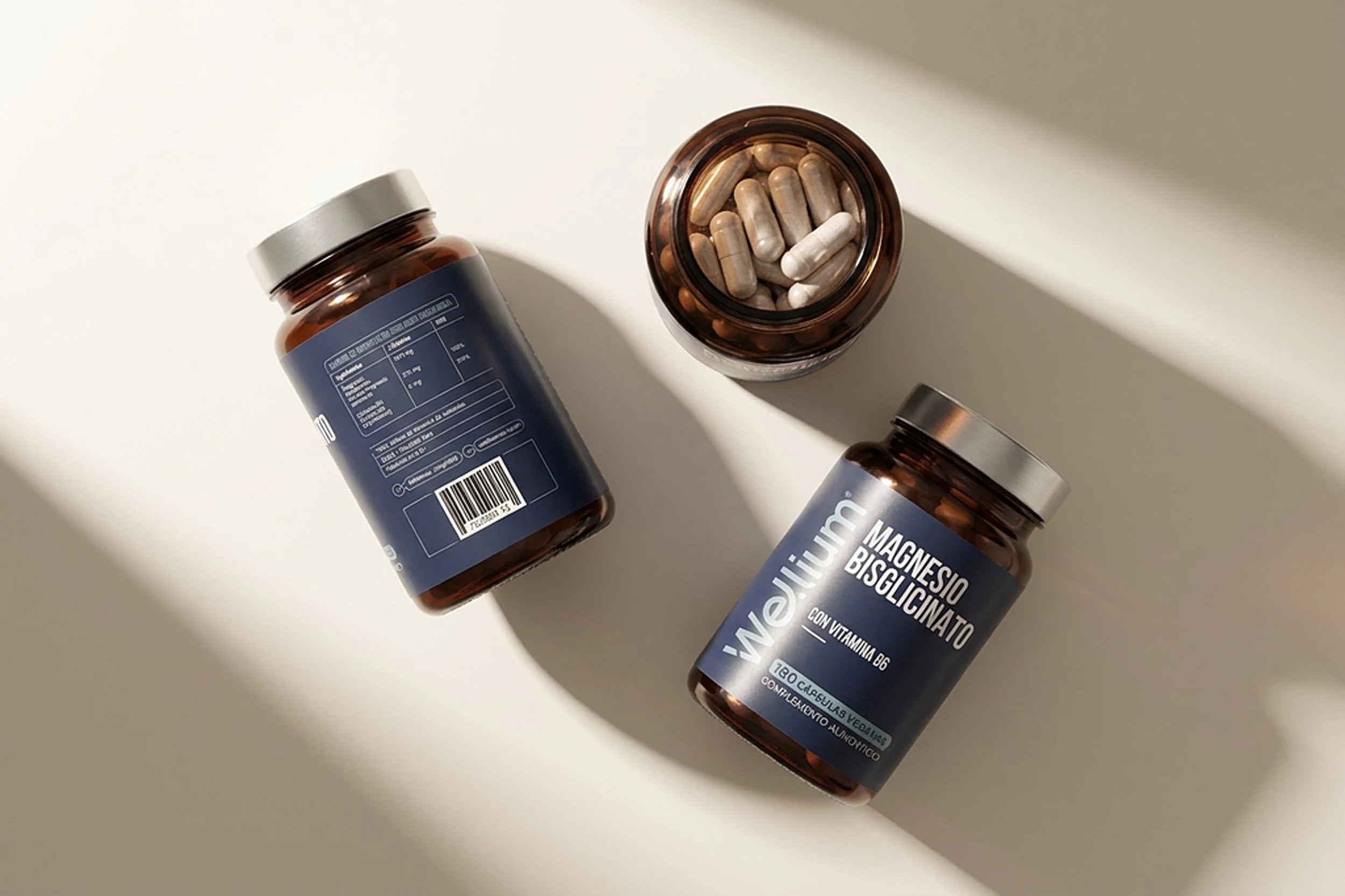
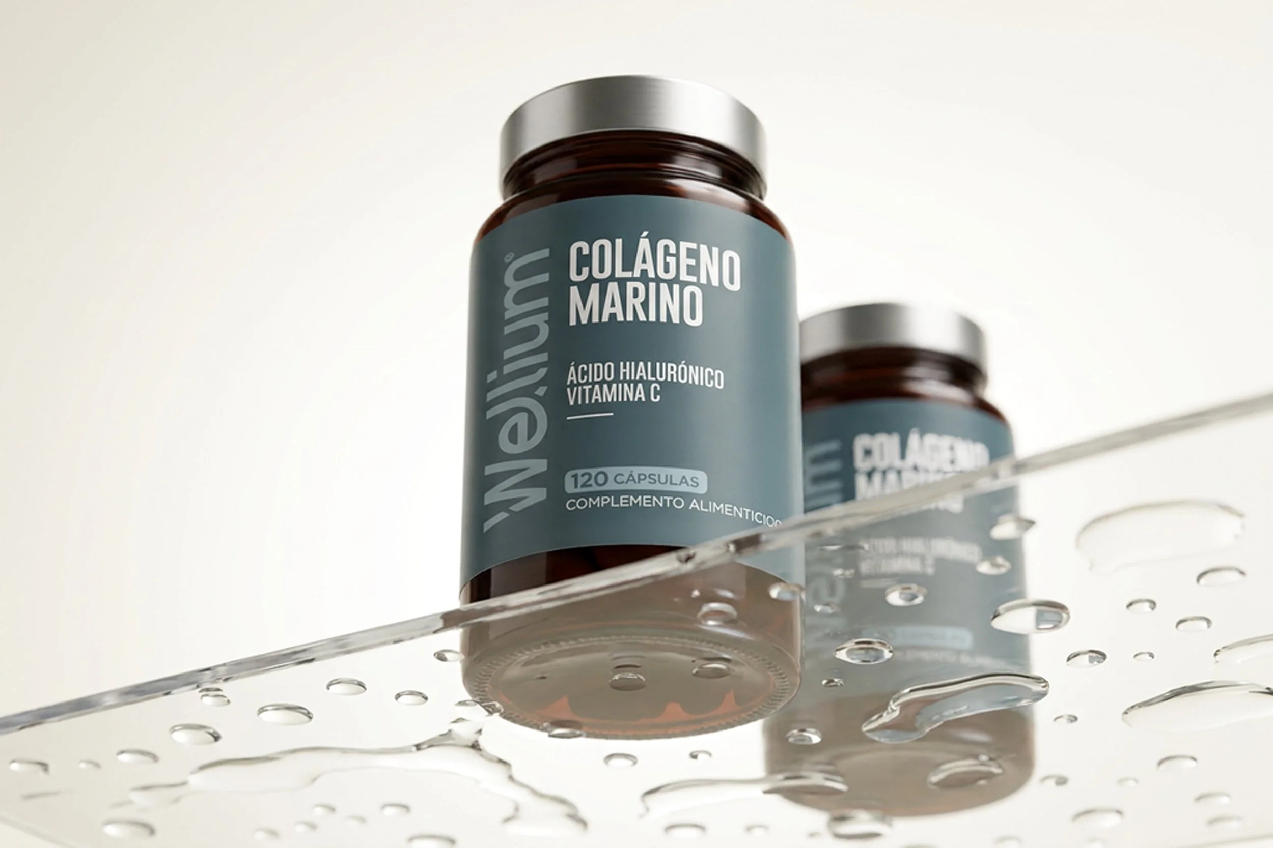
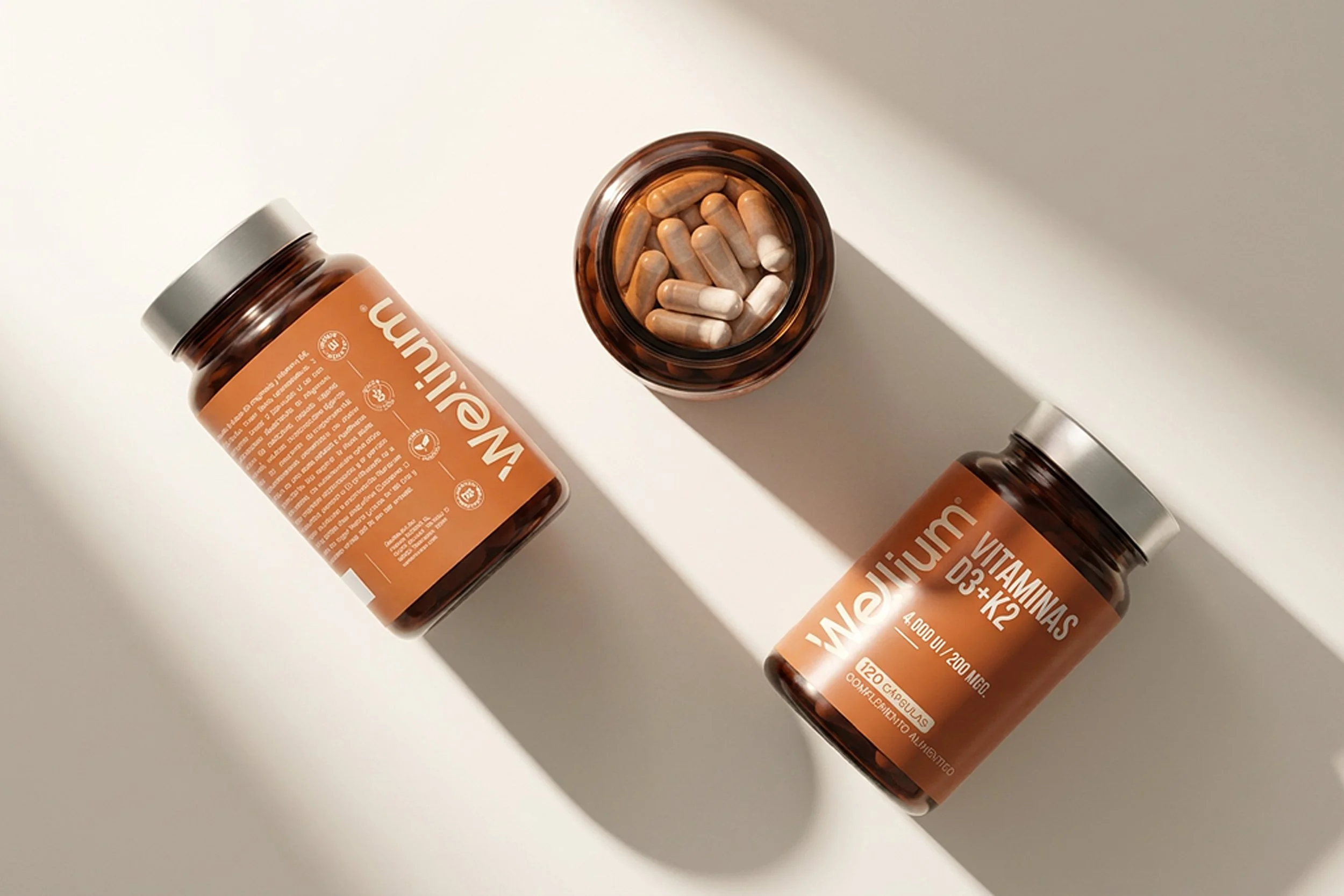
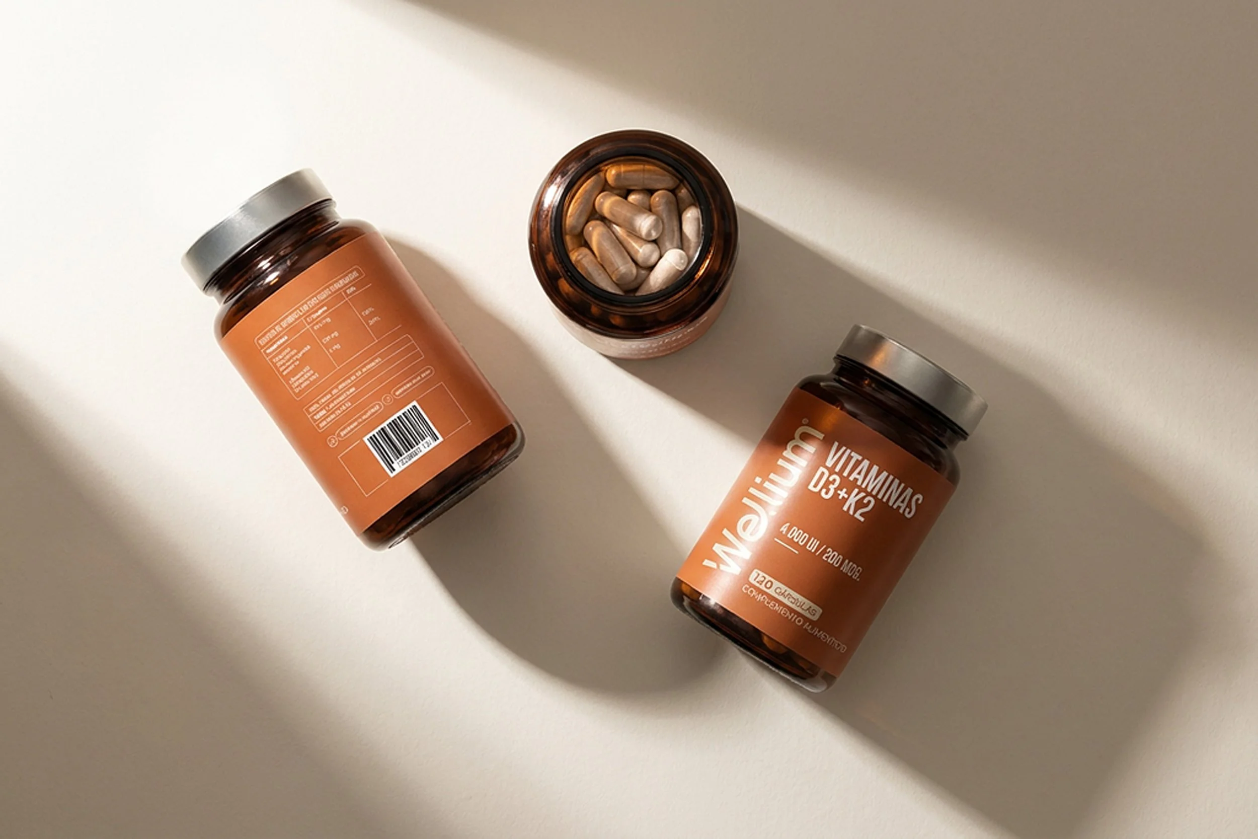
The amber bottle reinforces product quality while providing a warm contrast against the restrained graphic system.
Minimalism became a functional decision.


Typography
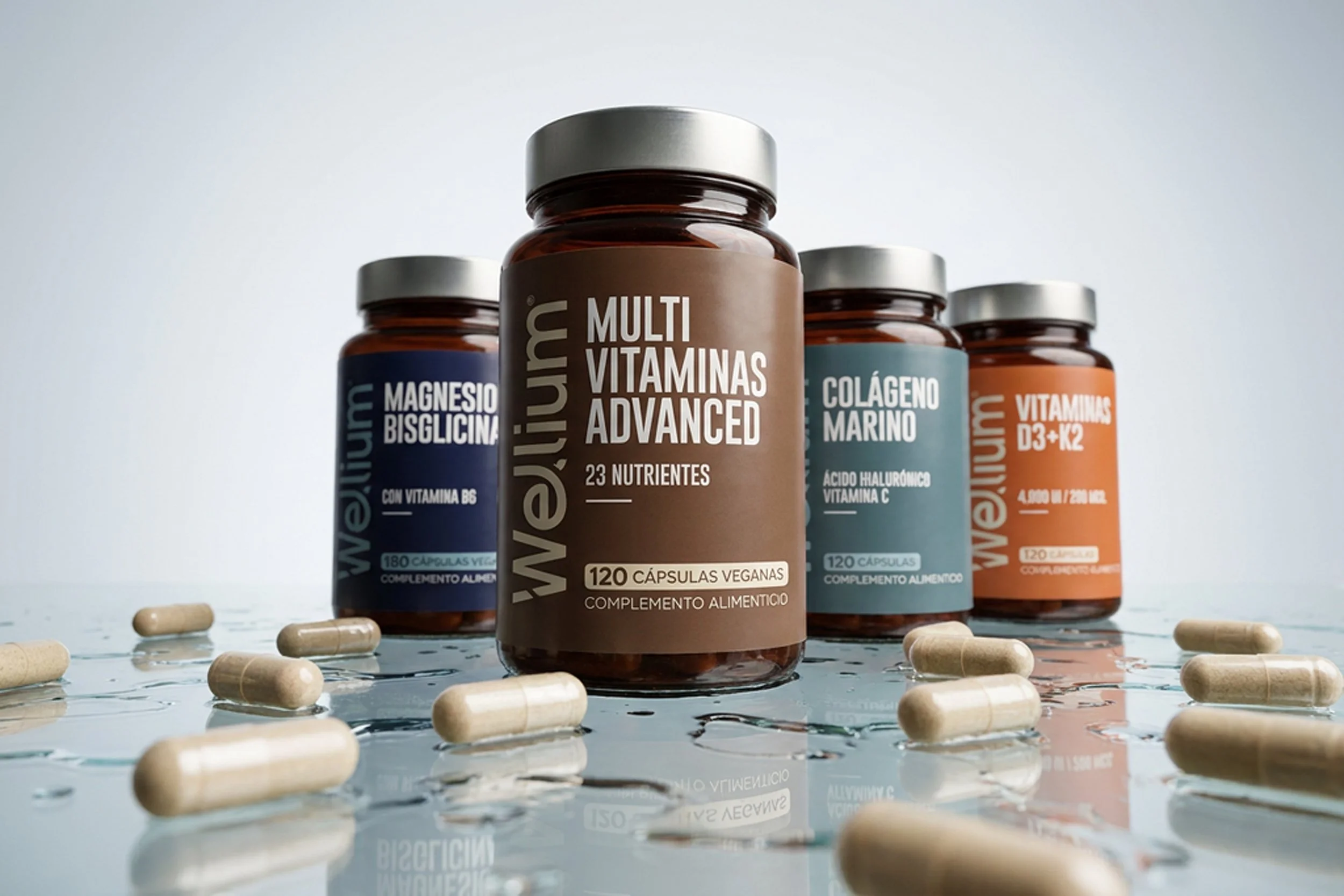
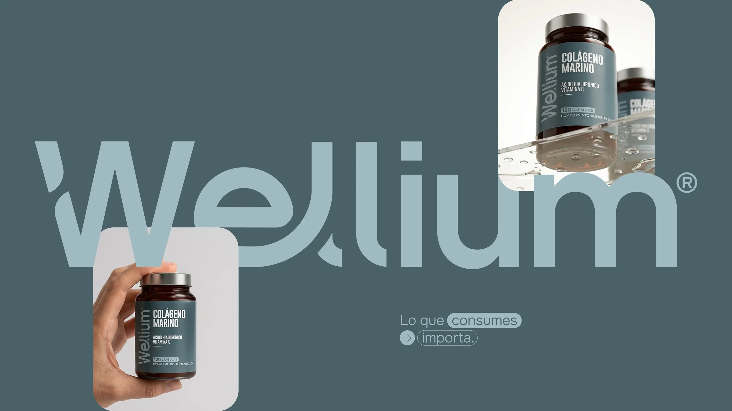
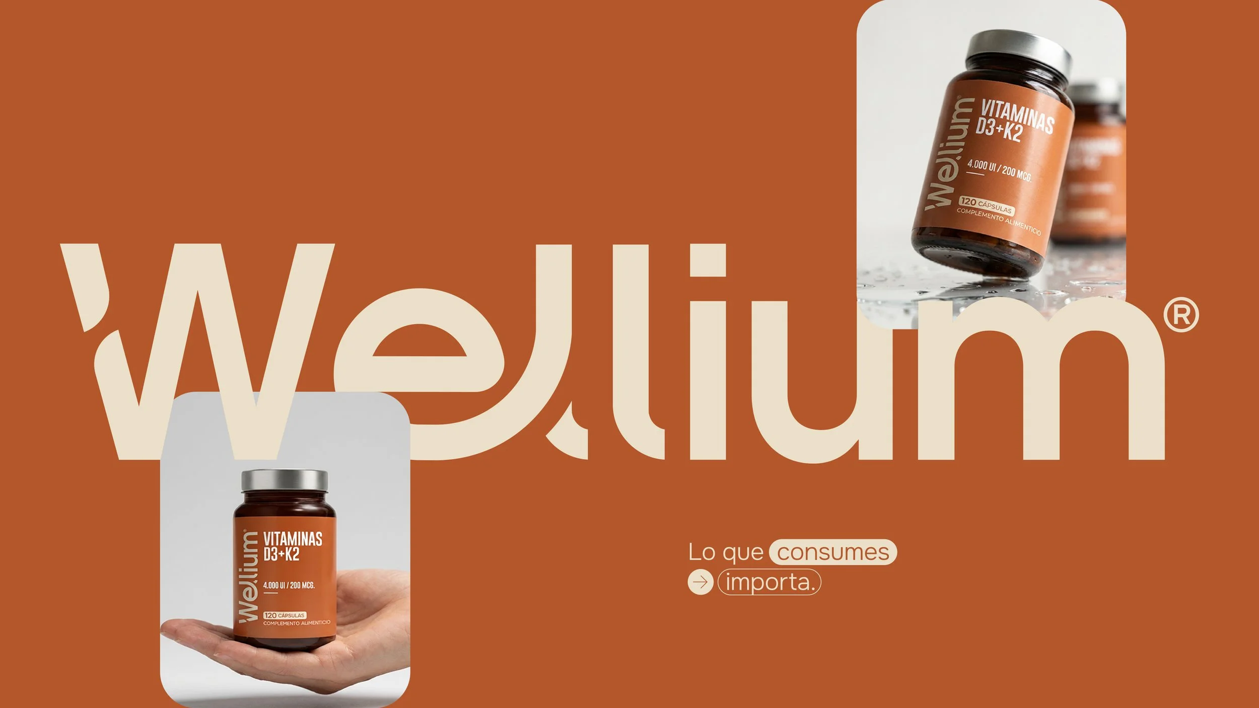
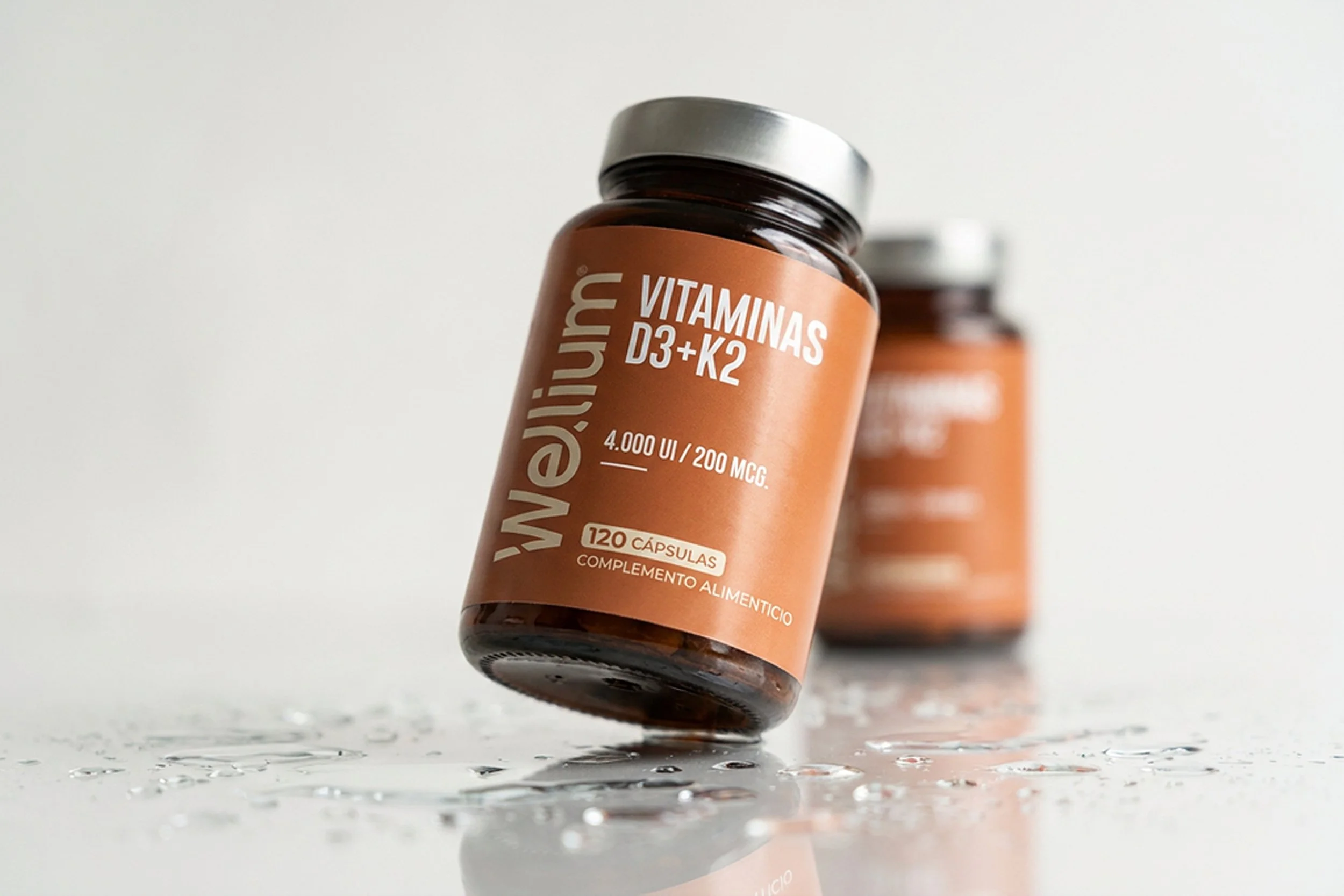
Bold condensed typography creates strong shelf impact while maintaining exceptional readability.
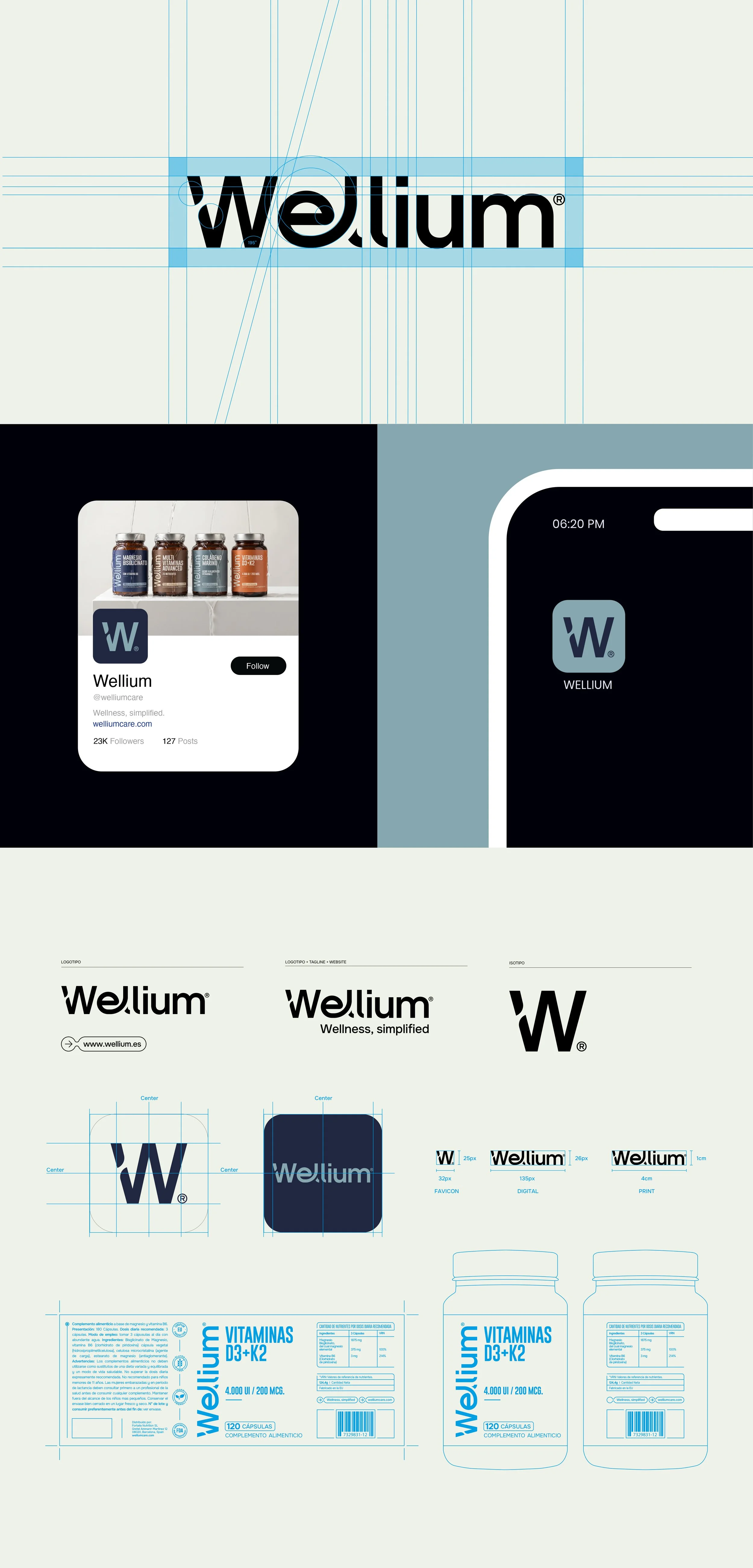
The oversized vertical logotype introduces a recognizable brand signature, balancing editorial elegance with commercial visibility.
Built for Digital
Wellium is conceived as a digital-native brand.
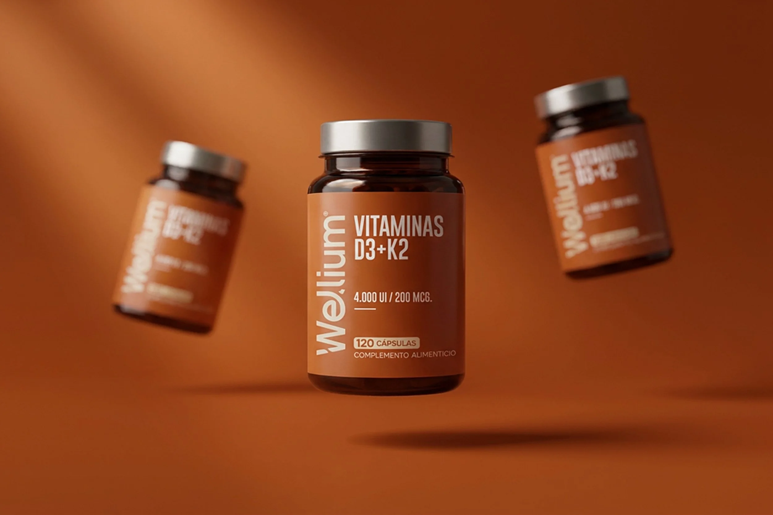
The packaging was designed to perform well across e-commerce marketplaces, social media, advertising campaigns, and mobile interfaces, where clarity and immediate recognition are essential.

Product Family
-
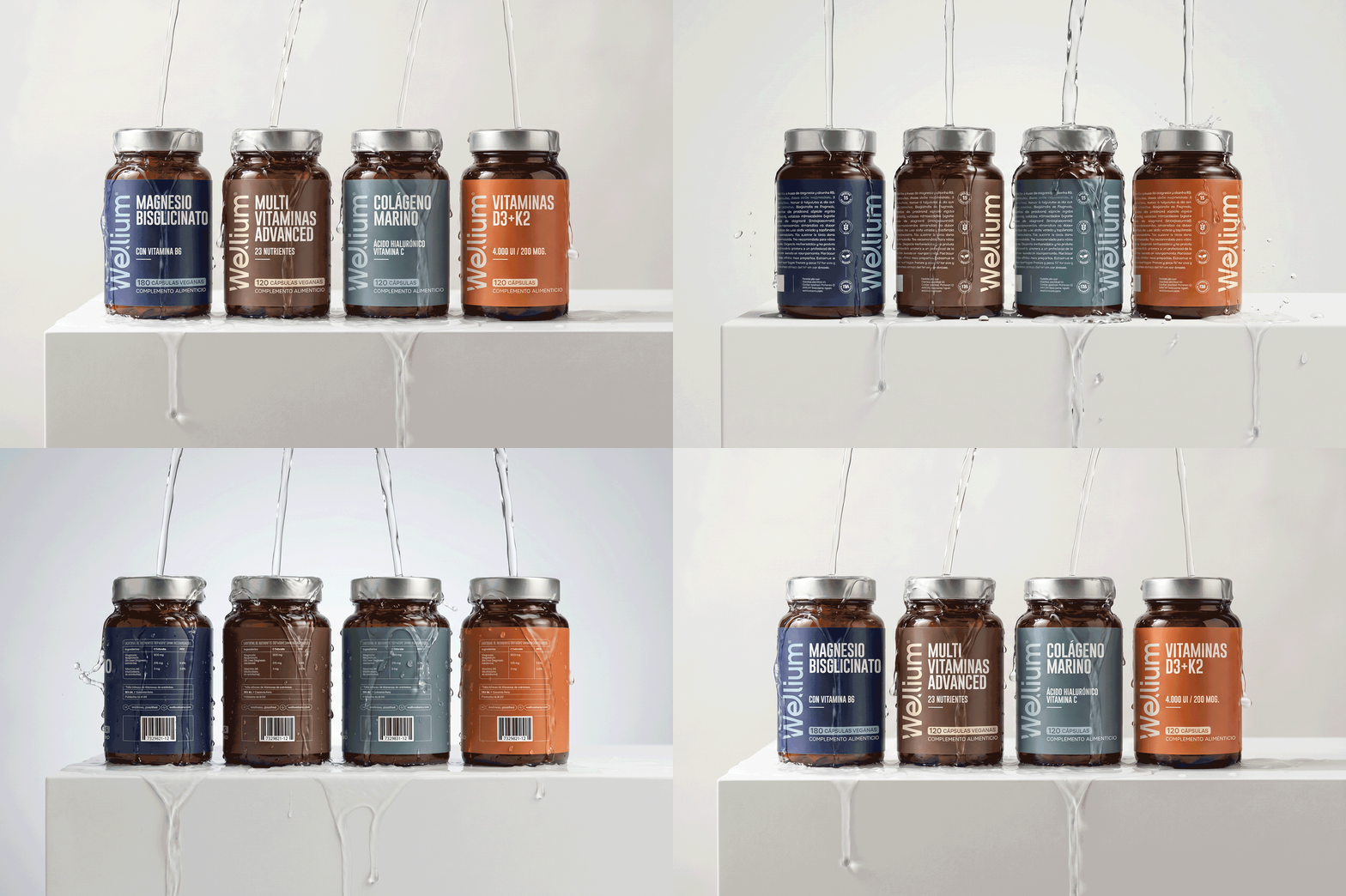
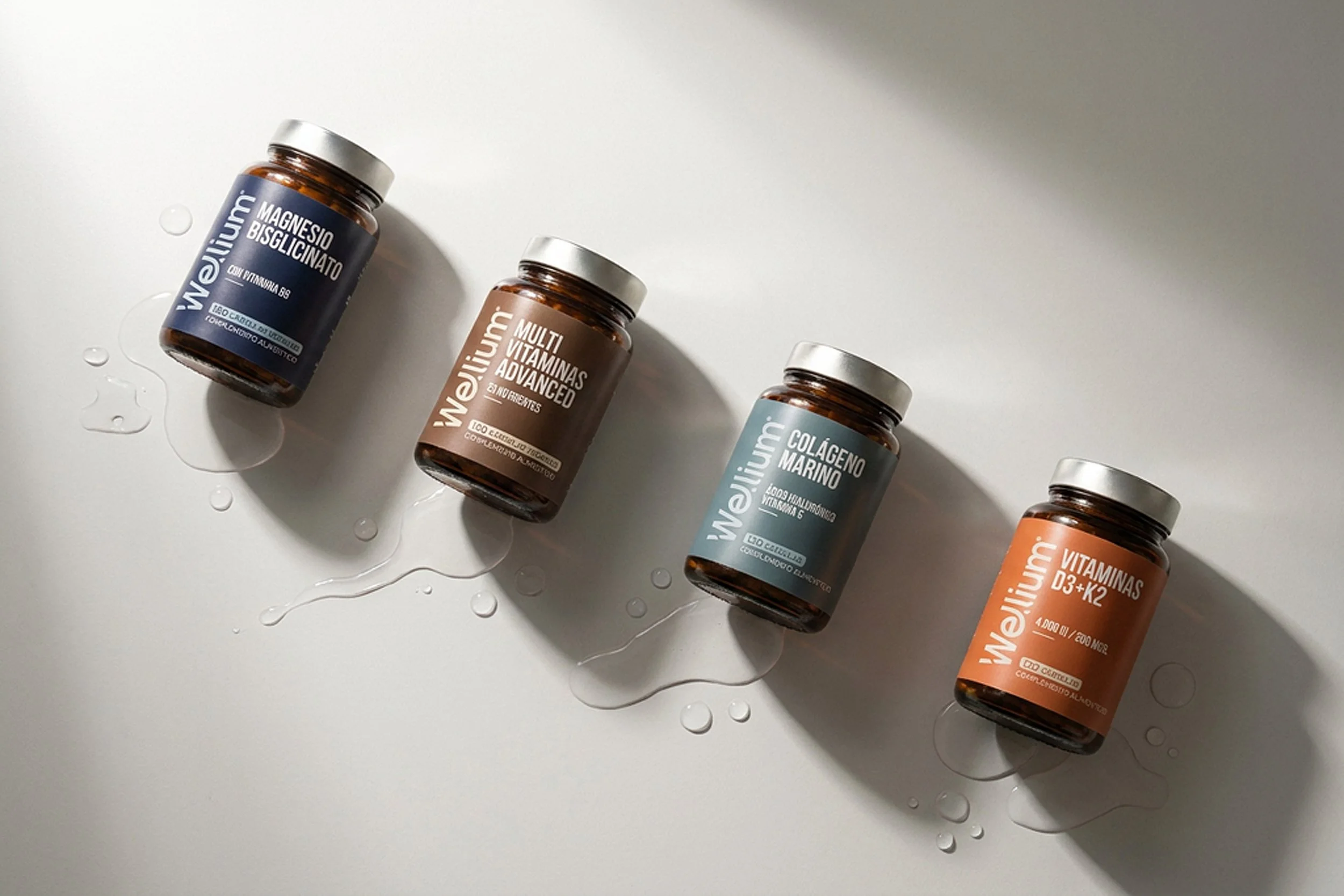
Each supplement maintains its own personality through color while remaining unmistakably part of the same visual ecosystem. The result is a cohesive family that can continue expanding without losing coherence.
Art Direction
-
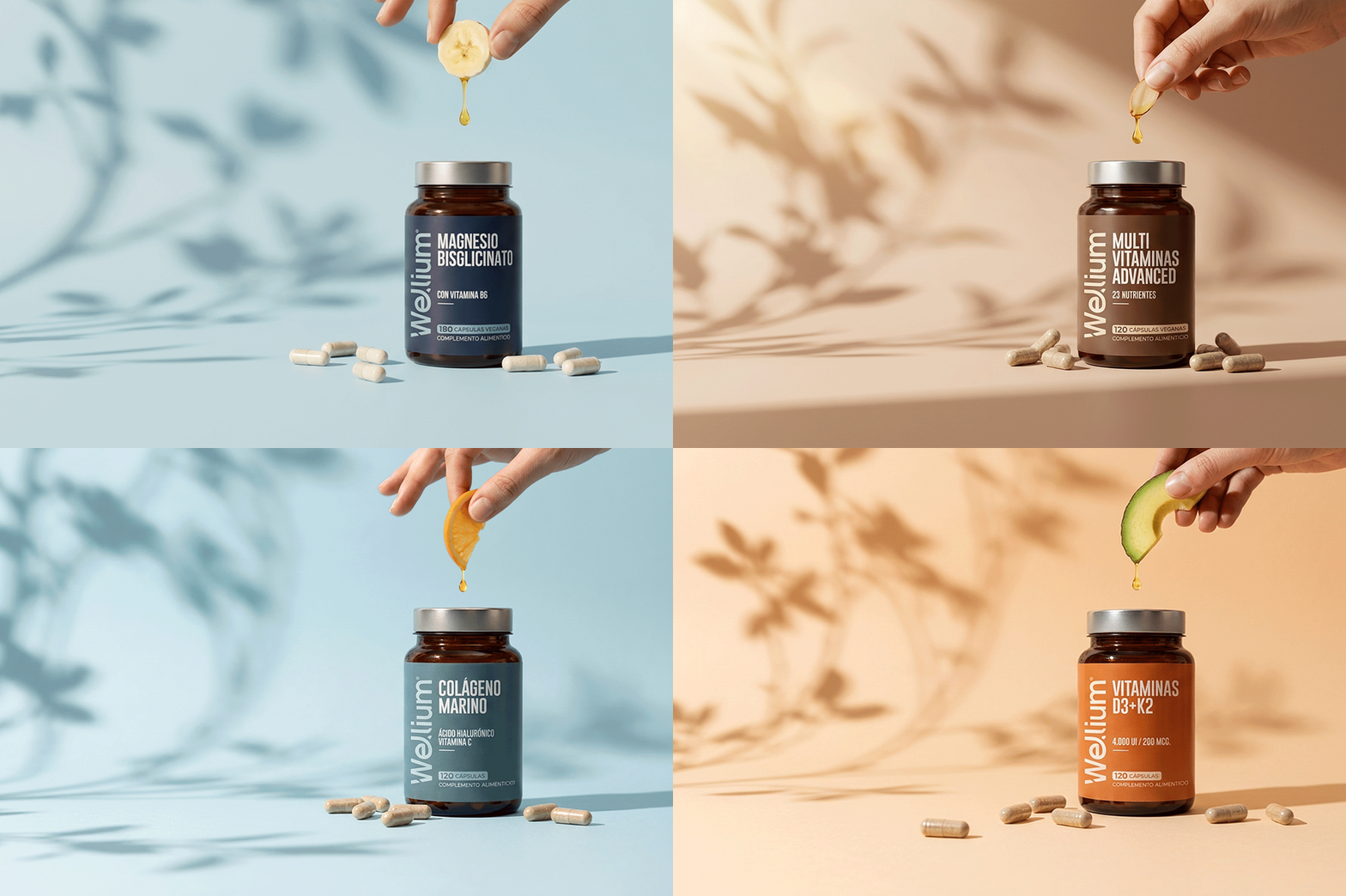
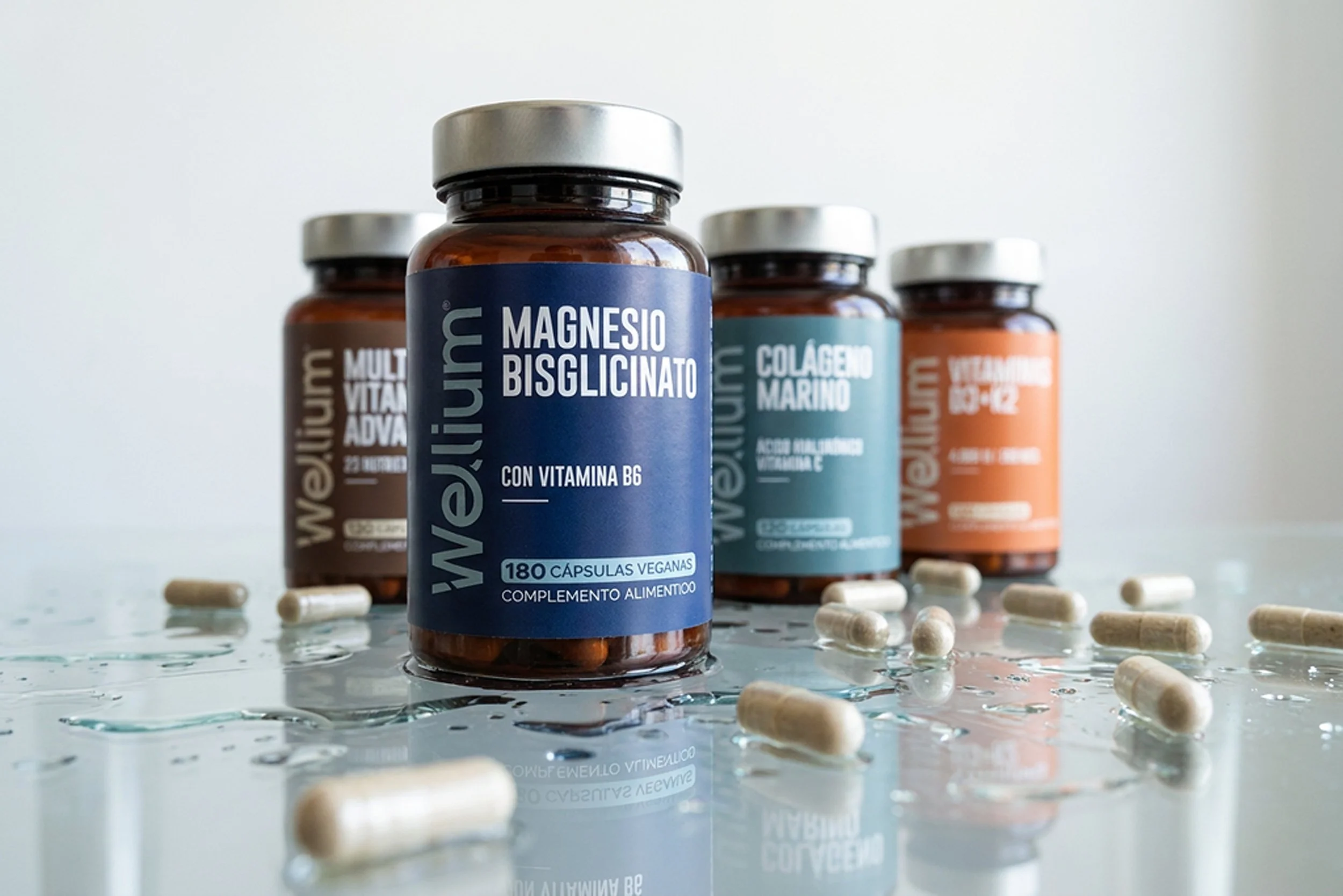
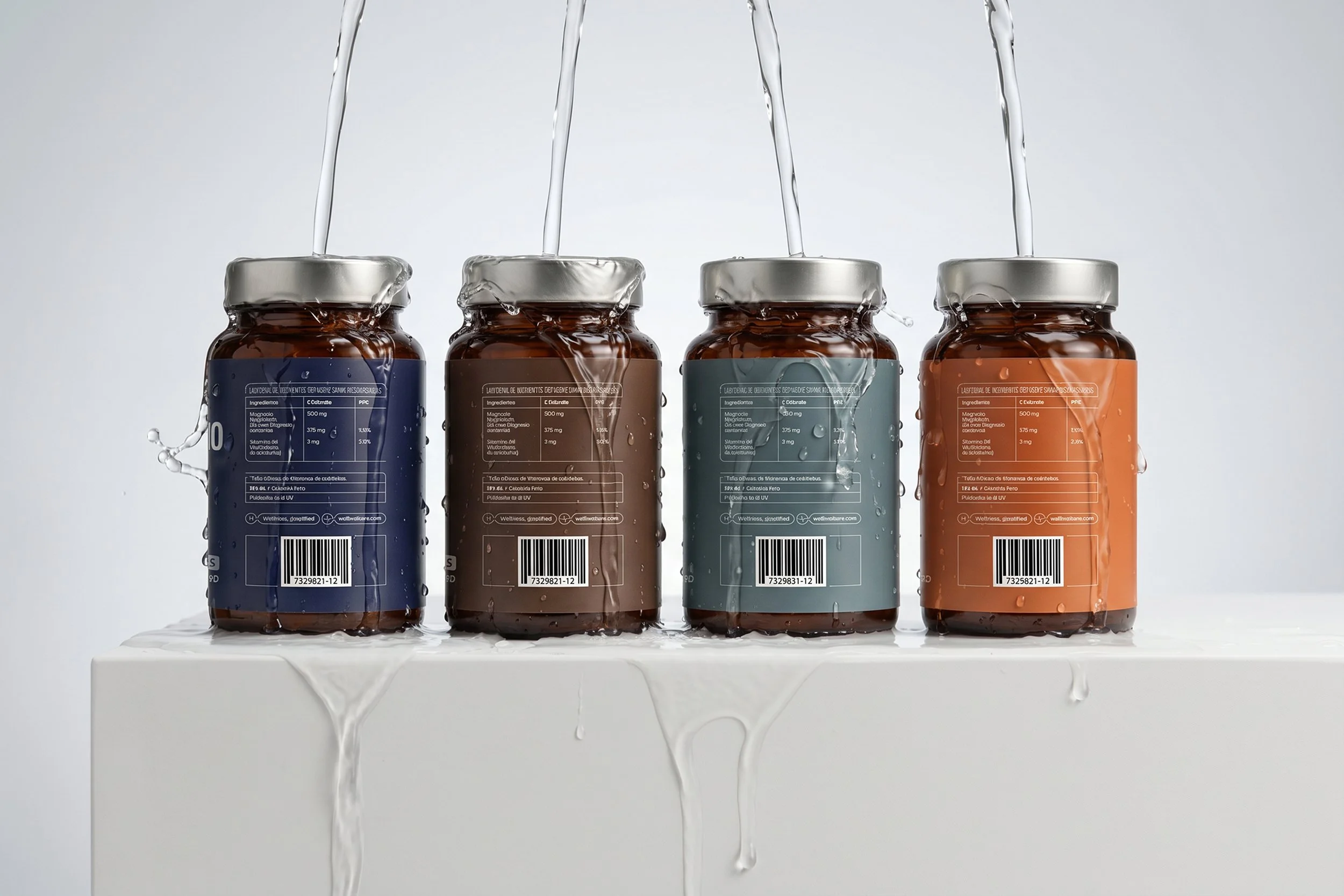
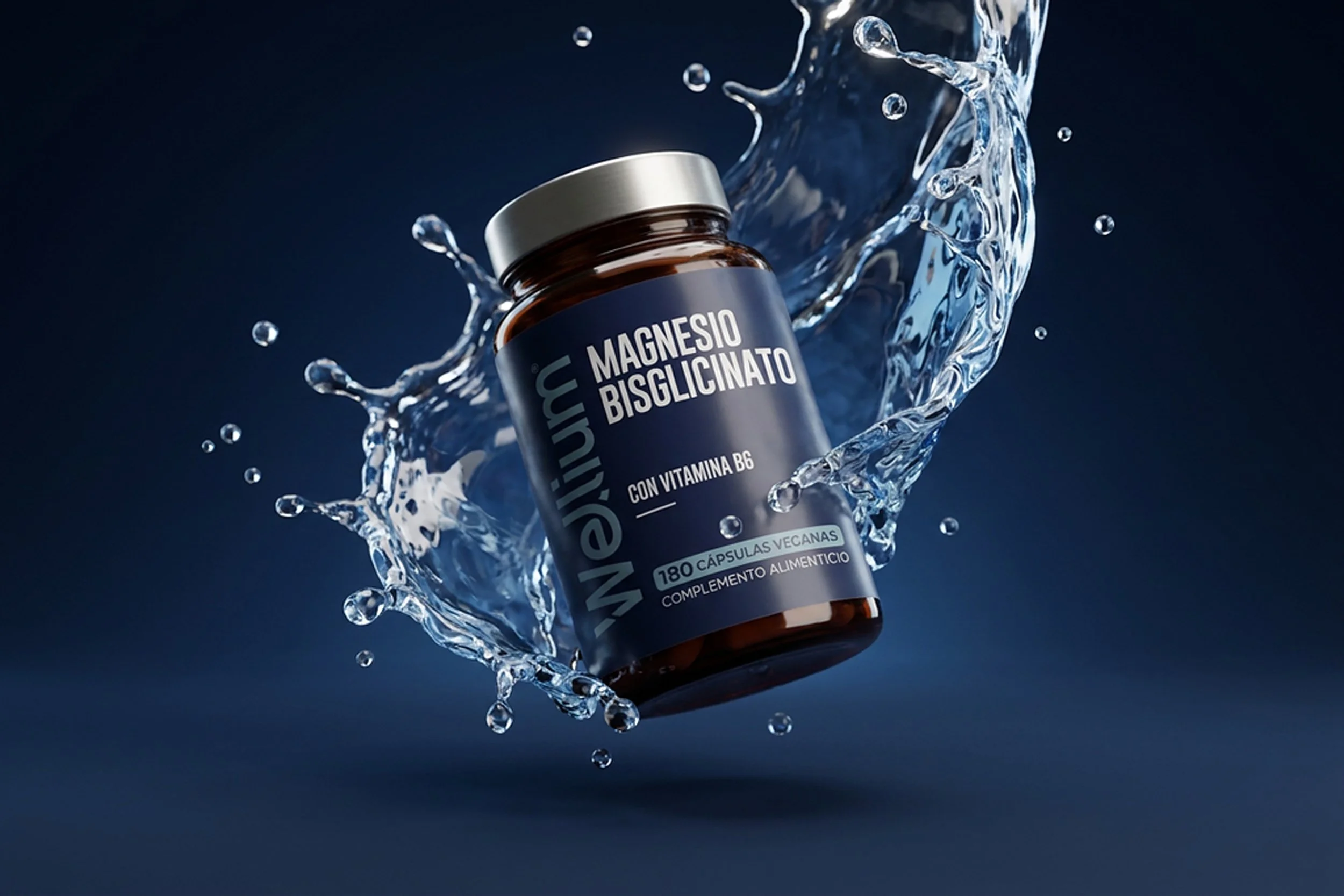
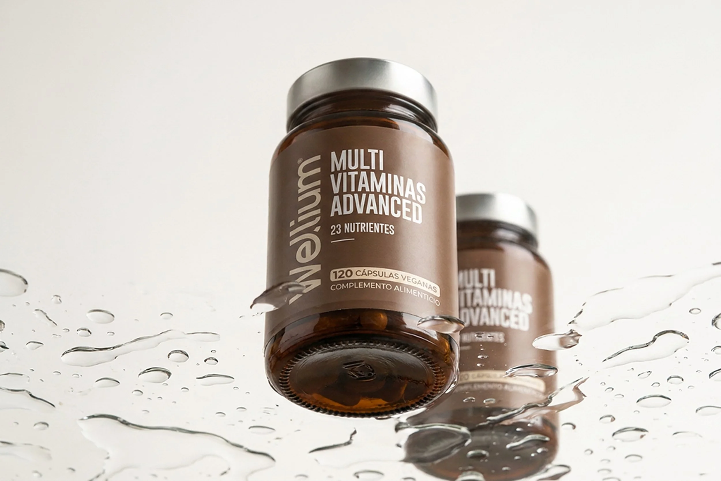
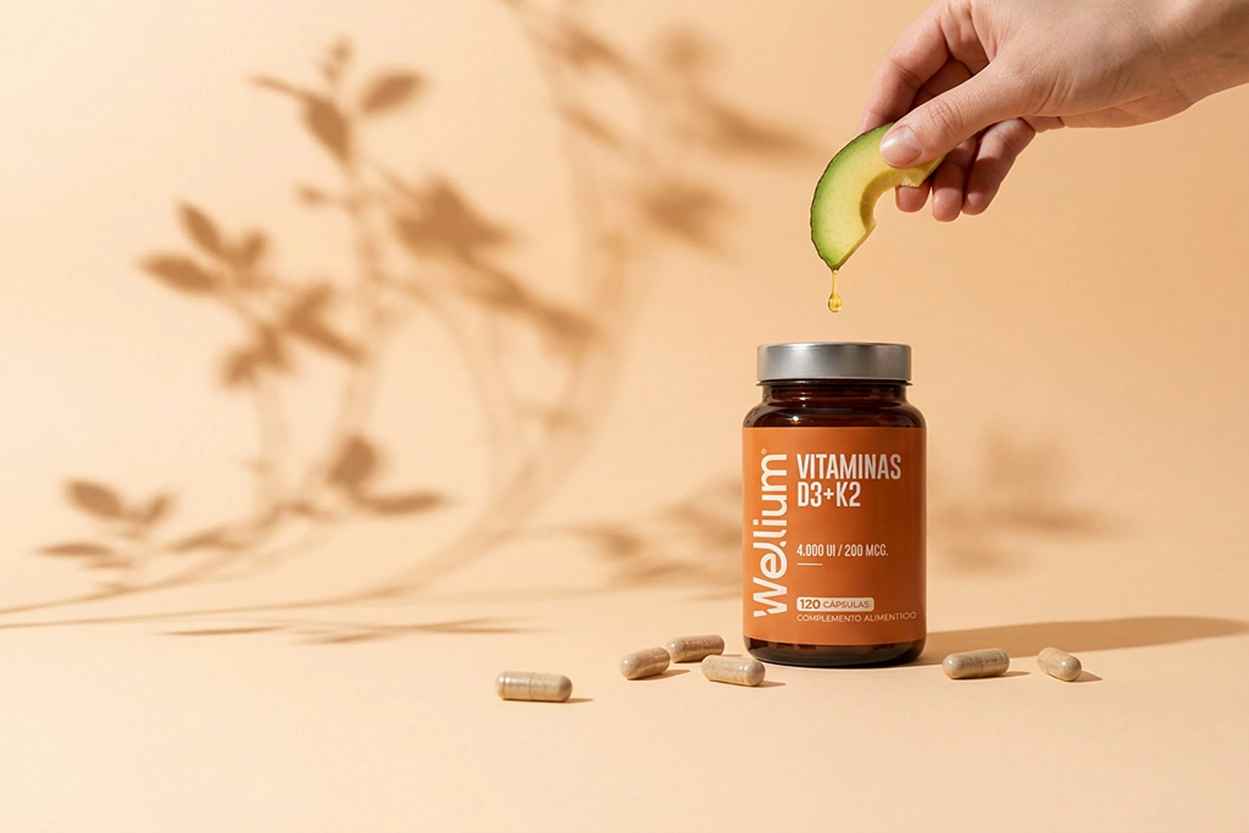
Soft daylight, restrained compositions and subtle interactions with water and capsules reinforce the idea of everyday wellness rather than performance or intensity. The imagery feels honest, contemporary, and quietly premium.